Tagged: color sections, columns, CSS
-
AuthorPosts
-
October 20, 2022 at 11:22 pm #1369682
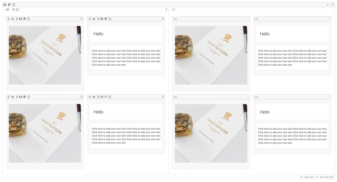
I know that I cannot nest columns. And, I know that I cannot put a grid row in a color section. But, I am trying to achieve an effect like the one below:
In a perfect world, this would be a color section with a blue background (easy to do). Within the color section would be two columns, each with a white background and an orange border (easy to do). Within each column is an image on the left and a text block on the right. (where I am stuck). Can this be done through an Enfold element or via a set of CSS?
Thank you
RogerOctober 20, 2022 at 11:26 pm #1369683I should mention that I can get the effect with a grid row — if only I could put the grid row within a color section.
October 22, 2022 at 8:42 pm #1369814October 23, 2022 at 4:11 am #1369841but you know that you can nest columns in a grid-row cell?
To have the grid-row not as full-width – you can add a snippet to your child-theme functions.php.See result and all code you need: https://enfold.webers-webdesign.de/grid-row-special/
PS: with no gap – there will be no gap !
I prefer to have here 1/4 cells besides each other and style them by grid layout.October 23, 2022 at 10:23 am #1369847October 24, 2022 at 8:12 pm #1370050Wow! These are both great solutions. I have the first one implemented right now, but it is only good if I create different responsive versions. The word wrap doesn’t play at all widths.
@guenni007, your solution looks elegant! I will try that shortly. Thank you so much.October 25, 2022 at 12:40 pm #1370150 -
AuthorPosts
- You must be logged in to reply to this topic.


