
-
AuthorPosts
-
August 26, 2020 at 3:04 pm #1240935
Hello,
sorry for my posting but I’m out of ideas and can’t find a solution here in the forum.
I have to problems but I guess it’s kinda the same. Both are regarding the spaces between layout elements in mobile view.
Here is a giant space I can’t edit in the designer. But I need the same space as between the other elements.

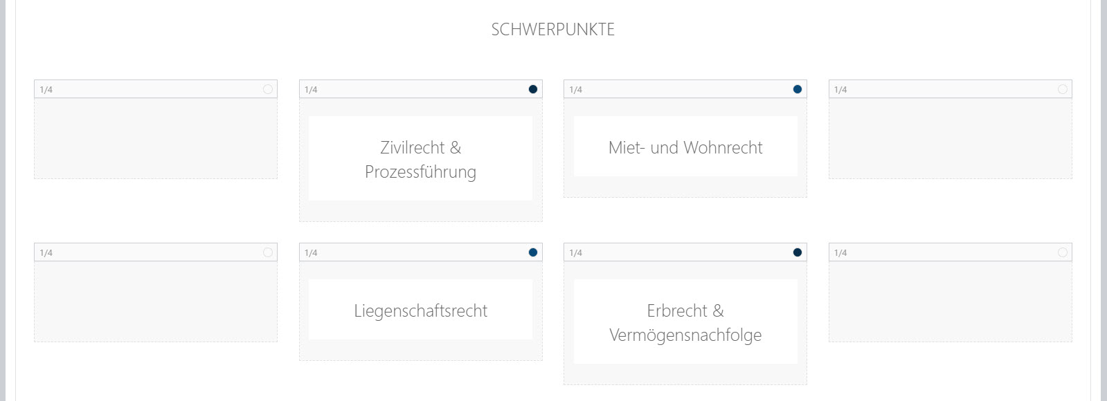
This is how this page looks like in the editor:
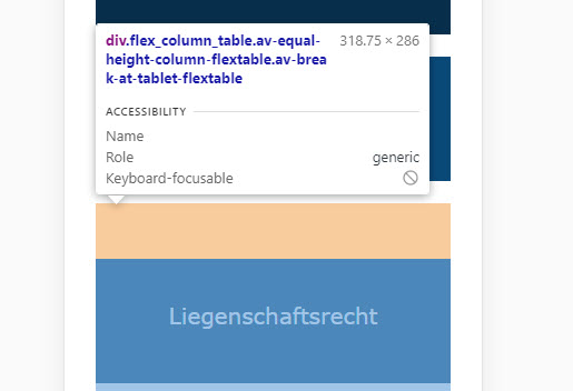
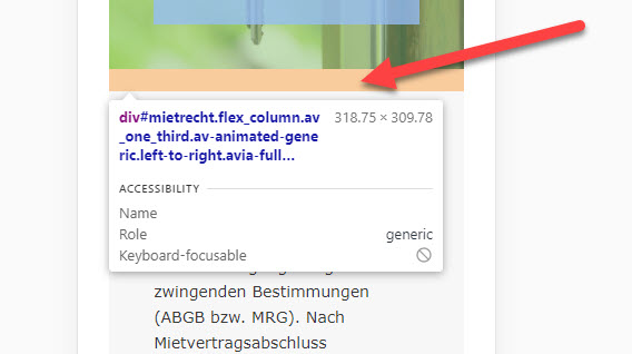
Google Chrome Dev.tools shows this orange space (I don’t know what that is? padding?)
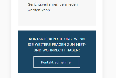
On another page there is also a space (I don’t want any space between this elements):
Can you help me out here?
Thank you very much,
GeraldAugust 27, 2020 at 12:03 am #1241038Hey KatrinHei,
Please provide a link to the site/page in question so we can look into this issue further.
Best regards,
Jordan ShannonAugust 27, 2020 at 12:05 am #1241039Hey KatrinHei,
Please provide a link to the site/page in question so we can look into this issue further.
Best regards,
Jordan ShannonAugust 27, 2020 at 9:15 am #1241135This reply has been marked as private.August 28, 2020 at 9:26 pm #1241707Hi,
Add this to quick css:
@media only screen and (max-width: 767px)  {
#top .flex_column_table.av-equal-height-column-flextable:not(:first-child) {
    margin-top: 0px!important;
}}
Best regards,
Jordan ShannonAugust 28, 2020 at 11:59 pm #1241720Thanks that solved my first problem.
But the bigger one is the second: on this site https://www.heinisch-weber.at/schwerpunkte/ I don’t want any space between the elements in mobile view like it is in desktop view:
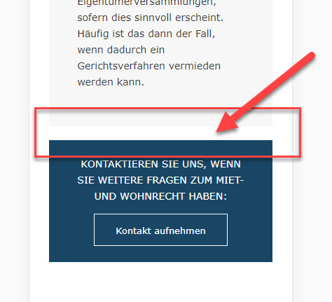
It seems there is also a bottom margin? Why is there no option in the element for it?

and here:
How can I get rid of this space in mobile view? Thank you very much.
August 31, 2020 at 11:22 am #1242095Hi KatrinHei,
Here is the code you can put in Enfold > General Styling > Quick Css, if it does not work, put into themes/enfold/css/custom.css
@media only screen and (max-width: 767px) {
    .responsive #top .container .av-content-small,
     .responsive #top #wrap_all .flex_column,
     .responsive #top #wrap_all .av-flex-cells .no_margin,
     .responsive .content {
            margin-bottom: 0px;
     }
     .responsive .content {
         padding-bottom: 0;
     }
}
If you need further assistance please let us know.
Best regards,
VictoriaAugust 31, 2020 at 1:46 pm #1242177Hi Victoria,
thank you that almost worked. I had to add “!important;” at the end.
For others with this problem. This is the working code:
@media only screen and (max-width: 767px) { .responsive #top .container .av-content-small, .responsive #top #wrap_all .flex_column, .responsive #top #wrap_all .av-flex-cells .no_margin, .responsive .content { margin-bottom: 0px!important; } .responsive .content { padding-bottom: 0px!important; } }-
This reply was modified 5 years, 7 months ago by
KatrinHei.
August 31, 2020 at 10:24 pm #1242290Hi,
Did you need additional help with this topic or shall we close?
Best regards,
Jordan ShannonSeptember 1, 2020 at 7:18 am #1242385Hi,
no thanks the problem is solved. You can close this ticket.
Best regards,
GeraldSeptember 1, 2020 at 7:31 am #1242393Hi Gerald,
We’re glad to hear that :)
Thanks for using Enfold and have a great day!Best regards,
Nikko -
This reply was modified 5 years, 7 months ago by
-
AuthorPosts
- The topic ‘Space between layout elements’ is closed to new replies.