-
AuthorPosts
-
July 13, 2015 at 7:12 pm #472619
Hello,
if you look at the desktop version you will find a menu in the grey socket below footer:

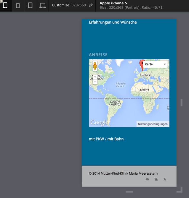
When you look at it with an iphone this Socket menu is not there:

What could I do here?
Glad about Help!
BerndJuly 13, 2015 at 8:33 pm #472660Hi Bernd!
There is not enough space on small phone screens which is why we hide it. Add this to your custom CSS if you wish to display it.
.sub_menu_socket {
  display: block !important;
}
Regards,
ElliottJuly 13, 2015 at 8:43 pm #472670Hi Elliott!
That is fast support, thank you!
Is it possible to have everything in the socket centered?
Thank you
BerndJuly 14, 2015 at 3:04 pm #473212Hi!
Please add following code to Quick CSS
@media only screen and (max-width: 480px) {
#socket .social_bookmarks { right: 40%; }}
Best regards,
Yigit-
This reply was modified 10 years, 9 months ago by
Yigit.
July 14, 2015 at 3:56 pm #473259Hi Yigit,
this did not change anything, it looks like before.
July 14, 2015 at 5:41 pm #473338July 14, 2015 at 9:06 pm #473427Hey Yigit,
I dont know if you understood what I mean:

I want to center the items in the Socket
Thanks for your Help!
BerndJuly 15, 2015 at 4:04 pm #473821Hey!
Try adding this to your custom CSS.
#socket .container {
  text-align: center;
}
#socket .container > * {
  display: block !important;
  float: none !important;
}
#socket .social_bookmarks {
  margin: 0 auto !important;
  width: 100px !important;
}
Regards,
ElliottJuly 15, 2015 at 5:27 pm #473891Hello Elliott,
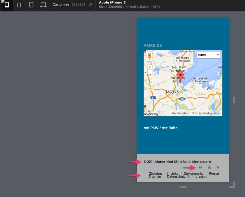
that is much better now, but what about the last two rows with the Footer Menu?

Thanks for Help!
BerndJuly 16, 2015 at 3:10 pm #474358Hi!
Add this.
#socket .menu { text-align: center !important; }
#socket .menu > li { float: none !important; display: inline !important; }
Cheers!
ElliottJuly 16, 2015 at 4:09 pm #474404Hello Elliott,
it is almost perfect, but:
– Social bookmarks are on the left side
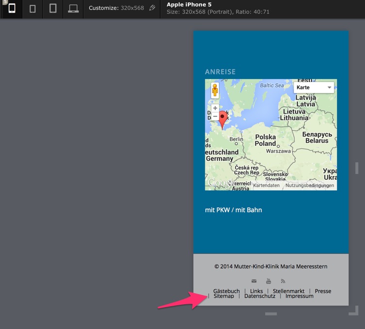
– the Strokes which define the border to the next Menuitem are on the wrong place sometimes. Any Idea about to change that or to delete them?
Thank you very much
BerndJuly 17, 2015 at 3:03 pm #474977Hi!
They were centered as you can see in your previous screenshot but it looks like you added some custom CSS to move them again.
#socket .social_bookmarks {
  right: 40%;
}
I don’t see a way of getting rid of the text separators on the end unfortunately. If you change the screen size then they will change and the same problem presents itself again. We can remove them all if you’d like.
Cheers!
ElliottJuly 17, 2015 at 3:11 pm #474983Hi Elliott
I think the code concerning this looks like this at the moment:@media only screen and (max-width: 480px) { #socket .social_bookmarks { right: 40%; } #socket .container { text-align: center; } #socket .container > * { display: block !important; float: none !important; } #socket .social_bookmarks { margin: 0 auto !important; width: 100px !important; } #socket .menu { text-align: center !important; } #socket .menu > li { float: none !important; display: inline !important; }}If I add additional your code again the social bookmarks will be altered also in the desktop version.
For the Separators: could we remove them completely only in iphone-version?
Thanks for Help!
BerndJuly 19, 2015 at 4:45 pm #475404Hi!
Include this inside the media query in order to remove the separators:
#socket .sub_menu_socket li {
  border-left: 0;
}
And this code to fix the social icons:
#socket .social_bookmarks {
  right: auto;
}
Cheers!
IsmaelJuly 19, 2015 at 5:41 pm #475423Super,
that looks fine nowThank you Ismael!
BerndJuly 19, 2015 at 9:53 pm #475472Hi!
I will close the task here now, please feel free to let us know if you need anything else.
Regards,
Basilis -
This reply was modified 10 years, 9 months ago by
-
AuthorPosts
- You must be logged in to reply to this topic.
