-
AuthorPosts
-
June 9, 2022 at 1:59 pm #1354654
Hallo,
i want to have:
A slider that shows above 767px : landscape orientation
A slider that shows below 767px: portrait orientationSo i created two sliders and made the appropriate settings.
But it always keeps the 16.9 ratio (landscape)This video shows that it does not work and it shows the settings i made.
http://www.simonehirsch.de/slider.mp4Please tell me how to fix this issue.
kind regards
Eva SimoneJune 10, 2022 at 2:02 am #1354737Hey evas49,
Thank you for the inquiry.
Have you tried using the Fullwidth Easy Slider? You can set the slider not to stretch the images by adjusting the Styling > Slides > Stretch image to fit the slideshow size? settings.
Best regards,
IsmaelJune 13, 2022 at 10:30 pm #1355098I did not ask for an alternative.
I asked for a solution for this issueE.S
Meanwhile i added your recommended Slider and you see the issue which needs to be fixed here:
June 21, 2022 at 5:54 pm #1356033Hi E.S,
Thanks for reaching out to us and sorry for the late reply!
The issue seems to be related to slider having 500px width. On my end it is in center with overlay on the sides. I attached a screenshot in private content field below.
Would it be possible for you increase the width of the slider to 767px? :)
Best regards,
YigitJune 21, 2022 at 6:36 pm #1356037the
https://simonehirsch.de/wp-content/uploads/slider-3.jpgis even not a real portrait photo.
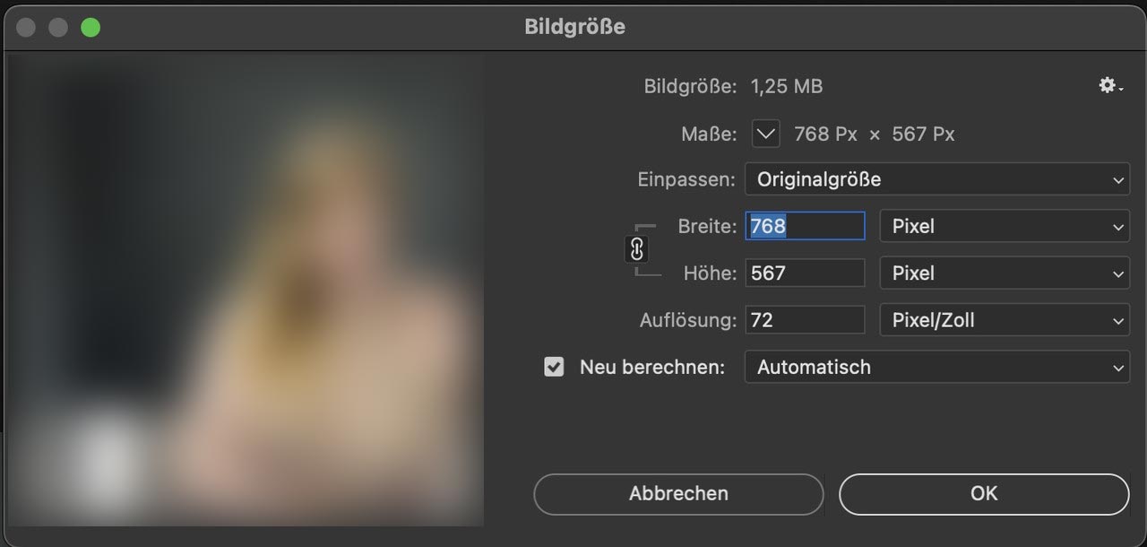
And it is to small – you have it on 300dpi – but if you go and set the the dpi to 72 without recalculating the photo it only got 768px width:Nevertheless – you could use for the smaller screens that image and the fullwidth image slider – and you can stretch it – but go to the alb and open the tab: Styling and choose under : “Slideshow Image and Video Size” no scaling.

If you use a portrait it will show the way you like:
f.e. here with two fullwidth easy sliders: The image detail is not good now due to lack of source material, but it is sufficient for demonstration purposes.
https://enfold.webers-webdesign.de/simone-hirsch/When you have seen the example page i remove that page again.
June 21, 2022 at 6:50 pm #1356039By the way: i like to preserve the ratio it has as landscape photo. This gives the image a better balance. ;)
– next – now i followed the whole video ( sorry ) – you want to do that with two advanced layersliders.
First: is it necessary – think of that a touchscreen has no hover effect – so the parallax effect will not be seen.
Taking this into account – do activate the advanced setting on project settings and mark: “Optimize for mobile”Next: do not activate the “Hide on Mobile” for the desktop slider – because this is for mobile devices meant and not for screenwidth – if you activate it it will not be seen on tabletts – even if they have a bigger screenwidth than 768px.
Second: on advanced layerslider the preview images had to be set by your own.
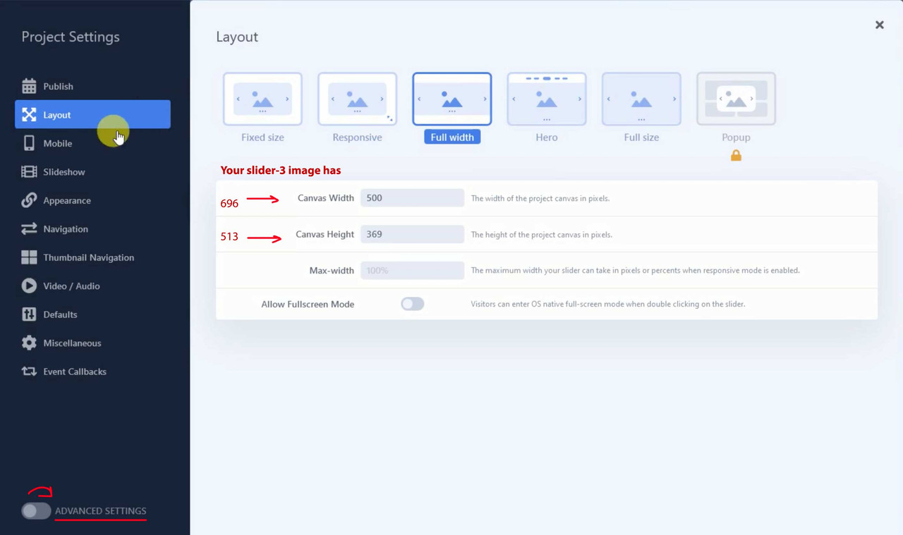
Thrid : you had to choose the right ratio for that responsive slider – in my example case it is the dimension of that portrait image:On your film i see that you have your homeslider mobile on: width : 500px and height: 369px so not the wanted portrait format.
now i will insert it to the example page.
June 21, 2022 at 7:10 pm #1356042June 21, 2022 at 7:19 pm #1356044PS : i don’t like the new outlook of Layerslider 7 – the old slider was much more intuitive to set.
Edit : 10 days ago your last posting – i remove now the example page ( due to copyright )
nearly one month ago : hm – I think actually very detailed – speak noob safe solutions to offer; obviously, however, some fellow here on board are lazy to read. Probably only ways in summary mode are accepted, which present a solution if possible without learning curve.
-
AuthorPosts
- The topic ‘Slider doesnt show correct ratio’ is closed to new replies.

