
-
AuthorPosts
-
December 3, 2025 at 8:38 am #1492047
Dera Sirs,
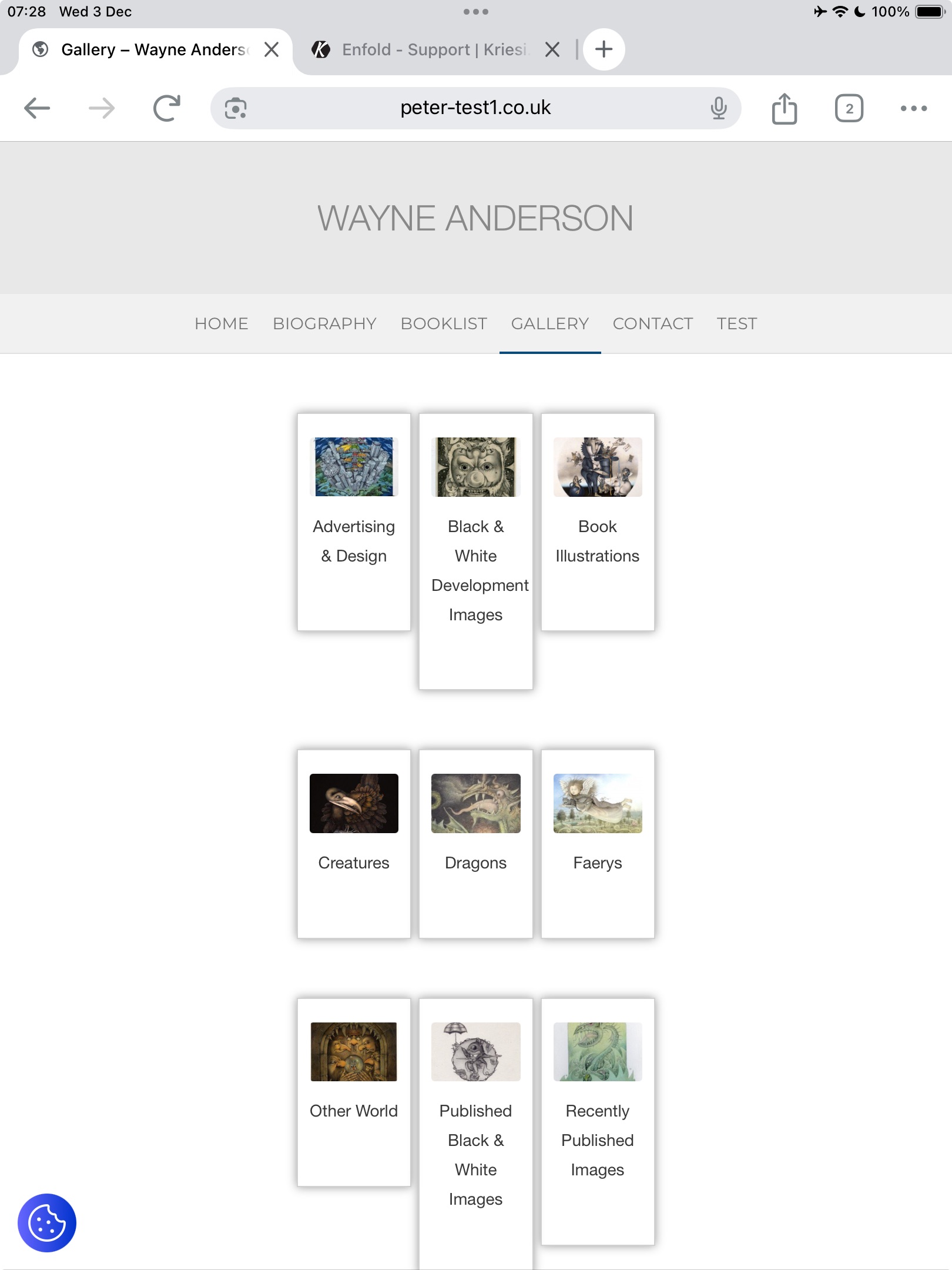
I have an issue with this page https://peter-test1.co.uk/gallery/ on ipad both landscape and portrait the thumbnails seem to have different heights . It is possible to have these heights consistent so all are the same height. See screen shotMany thanks. Pete
December 3, 2025 at 10:41 am #1492051Do you really want it to be that narrow on small screens?
I would set the content differently to narrow. Therefore, remove:#section-width { max-width: 50%; left: 50%; position: relative; transform: translateX(-50%); }and set instead:
#section-width .container {
  max-width: 750px;
}
And here’s the next layout tip.
I would place different design elements in different color sections.
So all gallery images in one section (#section-width) – including the single one that comes last – without empty columns – then the films below in a separate section.If you have done that – i will give you a flex-box code to style your gallery.
December 3, 2025 at 10:42 am #1492052Hey condonp,
Please try the following in Quick CSS under Enfold->General Styling:
@media only screen and (max-width: 1750px) {
#section-width .flex_column {
  height: 300px;
  min-height: 300px;
}
}
You might have to add more media queries with different height values. Simply copy the code above and change the max-width value.
Best regards,
RikardDecember 3, 2025 at 11:19 am #1492054.
-
This reply was modified 4 months ago by
condonp.
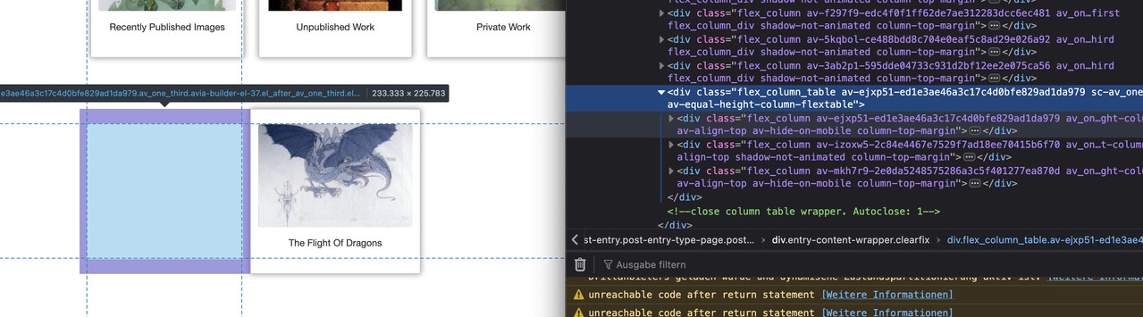
December 3, 2025 at 11:22 am #1492056the better way would be over flexbox layout then …
you got before more than 12 columns inside that section with your images – that should be inside a section –
then the next color-section contains your heading – a separator (f.e. in one 1/1 column) and your videos – maybe inside 1/3 columns
see what happens if you place this to your quick css:#av_section_1 .container { max-width: 800px; margin: 0 auto !important; } #av_section_1 .entry-content-wrapper { display: flex; flex-flow: row wrap; justify-content: center; gap: 20px } #av_section_1 .entry-content-wrapper:before, #av_section_1 .entry-content-wrapper:after { display: none; } #av_section_1 .entry-content-wrapper .flex_column { flex: 0 1 30%; width: unset !important; margin: 0; padding-bottom: 20px; } @media only screen and (max-width: 599px) { #av_section_1 .entry-content-wrapper .flex_column { flex: 0 1 45%; } } @media only screen and (max-width: 359px) { #av_section_1 .entry-content-wrapper .flex_column { flex: 1 1 100%; } }you can now pull all your columns from your color-section: #section-width with your images to that first color section.
December 3, 2025 at 12:42 pm #1492061December 3, 2025 at 1:03 pm #1492064Dear Guenni007,
Many thanks for all your help. I hope I have understood you. I ahve provided a login could you have a look at the page and check that I have understood you. The url is https://peter-test1.co.uk/gallery/.
Many Thanks
Pete
December 3, 2025 at 2:32 pm #1492068yes – but you can even remove those empty columns ( left and right )
just place the “The Flight Of Dragons” the same way as the others – you do not need to fill up the last row with empty columns.
December 3, 2025 at 2:49 pm #1492069Ok many thanks, Just one other issue I want to disable the navigation on the lightbox, so have disabled the arrows using css but see that if you click onto image it still slides to next image. Can this be disabled as client only wants one image at a time to show .
Thanks
Pete
December 3, 2025 at 5:25 pm #1492071I will open a new post on the above
December 3, 2025 at 6:15 pm #1492074if the auto group setting on : avia-snippet-lightbox.js should not be hampered globally – you can give a custom-Class to a parent element or the element itself ( f.e. a img gallery or masonry or the color-section with your images) e.g: noGroup
Then change the behaviour by child-theme functions.php snippet:
function conditional_disable_lightbox_gallery() {
?>
<script type="text/javascript">
(function($) {
    $(function() {
        setTimeout(function() {
            $('.noGroup a.lightbox-added').each(function() {
                var $link = $(this);

                $link.magnificPopup('destroy');

                $link.magnificPopup($.extend({}, $.avia_utilities.av_popup, {
                    gallery: {
                        enabled: false,
                        navigateByImgClick: false
                    }
                }));
            });
        }, 100);
    });
})(jQuery);
</script>
<?php
}
add_action('wp_footer', 'conditional_disable_lightbox_gallery', 999);
see: https://webers-testseite.de/image-masonry/
-
This reply was modified 4 months ago by
Guenni007.
December 3, 2025 at 6:34 pm #1492080ok – ?
December 4, 2025 at 6:04 am #1492087Ok many thanks for this
-
This reply was modified 4 months ago by
-
AuthorPosts
- The topic ‘Responsive Issue’ is closed to new replies.