-
AuthorPosts
-
June 23, 2018 at 12:12 am #976515
Hello
How do I remove the vertical lines between the header topics
For instanceStart | Topics | Resources | Portfolio
These lines are between “Start,” “Topic,” “Resources,” and “Portfolio.”
I was able to change their color to make them match the background and disappear, but my hover effects show them later on. I would like to remove them entirely.
Thank you for the assistance.
June 23, 2018 at 3:56 am #976835Hey acelam714,
Please try changing the color to transparent, this should hide even on hover.
If this doesn’t work please Please include the url to the page in question so we can take a closer look.Best regards,
MikeJune 23, 2018 at 8:43 pm #977077Essentially, I’m trying to put a border around the text
a: hover {border: 1px solid #ffffff; border-radius:100px}
a: active {border: 1px solid #ffffff; border-radius:100px}However, the issue is I have to go into “Advanced Styling” to set up the border for the Main Menu Links, because the color overrides my Quick CSS. But, if it set it to white, then those vertical lines appear again. They appear on the left as you scroll through the header selections. I was wondering if I could somehow fix this so that only the border (and not these vertical lines appear)
Additionally, my active CSS isn’t working at all. The hover state works decently, but the active state is completely nonfunctional. I was wondering if you knew how to fix this.Thank you
June 23, 2018 at 9:54 pm #977086Hi,
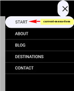
Instead of using the active state, try using the “current-menu-item” class, and try putting the border around the “li” like this:.avia-menu li:hover {border: 1px solid #ffffff!important; border-radius:100px !important; } .avia-menu li.current-menu-item {border: 1px solid #ffffff!important; border-radius:100px !important; }
Is this the style you are looking for?
Here is a similar project that perhaps some of the code will be helpful:Best regards,
MikeJune 23, 2018 at 11:27 pm #977098It works well now. Thank you very much.
I have a minor issue with opening the site up on a phone though (i’ve even cleared the cache). Nothing shows up in the header section. It’s just a black background, and the words do not show up until you click somewhere. I was wondering if you knew anything about this.
June 24, 2018 at 2:17 pm #977148Hi,
Here is a working example, note that the color of the menu items are white, (first rule) unless it has the class “current-menu-item” in which it will be black, (second rule).html_av-overlay-side #top #wrap_all .av-burger-overlay-scroll #av-burger-menu-ul a { color: #fff !important; } .html_av-overlay-side #top #wrap_all .av-burger-overlay-scroll #av-burger-menu-ul .current-menu-item a { color: #000 !important; }
If you already have similar code in your css, use the above to help make the changes, if you don’t have anything similar yet, then go ahead and add the above css.Best regards,
MikeJune 24, 2018 at 9:45 pm #977220The code you provided worked excellently.
I am curious why custom CSS is necessary for this? This was something I changed in the settings within Enfold itself. I even tried taking out all custom CSS and it still was completely black on ONLY the mobile devices (the site worked fine on desktops). Strangely, if I had left the background a lighter color (like white), then the site worked fine on mobile devices. It’s just something about the color black and the mobile version of the site.
Thank you very much for your help, Mike. I really do appreciate you taking the time to help me.
June 24, 2018 at 10:57 pm #977234Hi,
I’m not sure, but sometimes a little css really helps a lot, so I’m glad we were able to help.
Just let us know if we can help again.
Unless there is anything else we can help with on this, shall we close this then?Best regards,
MikeJune 25, 2018 at 9:10 am #977339My apologies. I have another question. I added a search box and ran into some complications. It seems that most of the problems come from the simple fact that I chose to reverse the colors (black background and white words). I figured out what Quick CSS was necessary to solve most of my problems. The Quick CSS is below.
.header_color .avia-tt {
background-color: #11a3bd;
}
.header_color .ajax_search_title {
color: #000000;
}
.header_color .ajax_search_excerpt {
color: #000000;
}
#searchform div input {
color: #000000 !important;
}However, I ran into 3 problems I was wondering if you could help me with.
1) How do I change the outline of the search box? When I click on it, it has this rather thick border. I’d like to know how to edit the size of it (to make it smaller)
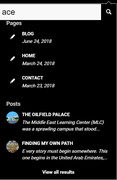
2) Once I click on the search icon, the search box opens below, but the SECONDARY search icon (magnifying glass) to the right of the search box is just a black square (the search icon doesn’t show up until I hover over it). The black background is black (likely mirroring the header). The search icon is black as well, and that’s why I can’t see it. I’d like to know how to edit this search icon and the background of it as well (or have the ability to take it out the secondary search icon)
3) The SECONDARY search icon opens up a new page if I click it. How do I control this (prevent this or be able to edit the contents the page that the search button opens up?My apologies for the questions. I didn’t think a simple color reversal would cause this many complication, but I am learning quite a bit in the process, so I am very satisfied.
June 25, 2018 at 12:20 pm #977394Hi,
I believe this covers all of your requests, please add to your Quick CSS and clear your browser cache, and check:.avia-search-tooltip #searchform>div { margin: 0px !important; } #top .av_minimal_header #s { padding: 8px 47px 8px 5px !important; } .header_color .avia-tt { background-color: #000 !important; } #searchform #searchsubmit { color: #fff !important; } #searchform #searchsubmit:hover { color: #000 !important; } #top .avia-search-tooltip input[type="text"]::-webkit-input-placeholder { color: #000 !important; } #top .avia-search-tooltip input[type="text"]::-moz-placeholder { color: #000 !important; } #top .avia-search-tooltip input[type="text"]:-ms-input-placeholder { color: #000 !important; } .header_color .ajax_search_image { color: #fff !important; } .header_color .ajax_search_excerpt,.header_color .ajax_search_title,.header_color .ajax_search_entry { color: #fff !important; } #top .avia-search-tooltip input[type="submit"].button.avia-font-entypo-fontello { pointer-events: none !important; }Best regards,
MikeJune 25, 2018 at 9:59 pm #977660Can you explain the function of these lines of code? I don’t notice any changes.
#top .avia-search-tooltip input[type=”text”]::-moz-placeholder {
color: #000 !important;
}
#top .avia-search-tooltip input[type=”text”]:-ms-input-placeholder {
color: #000 !important;
}
.header_color .ajax_search_image {
color: #fff !important;
}The code below doesn’t seem to be working for me. The margins are still thick for some reason.
.avia-search-tooltip #searchform>div {
margin: 0px !important;
}1) There also is this strange effect when you click into the placeholder region. It shows some kind of error. I was wondering if that could be eliminated somehow.
2) How do I eliminate the “view all results tab at the bottom.” It effectively takes me to a search page again. The submit button no longer directs me, but the “view more results” does.
Thank you very much for the help, Mike. I couldn’t have done this without you.
June 26, 2018 at 6:15 am #977804Hi,
This code is for the Edge & Firefox browsers:#top .avia-search-tooltip input[type=”text”]::-moz-placeholder { color: #000 !important; } #top .avia-search-tooltip input[type=”text”]:-ms-input-placeholder { color: #000 !important; }to hide the “view all results” please add:
.ajax_search_entry.ajax_search_entry_view_all {
display: none !important;
}
Did you want the background to be blue, or is this the code not working?
What is the strange effect when you click into the placeholder region?Best regards,
Mike -
AuthorPosts
- You must be logged in to reply to this topic.

