
-
AuthorPosts
-
July 1, 2024 at 2:41 pm #1460799
Hi,
i added borders to my columns. Nice.
In the columns i added a textblock with an image.1.) I am trying to place the text right to the image and would like to remove the space between the bottom. of the border and the image.
2.) i would like to remove the space between the columns, so it fits the spce between the rows.
How can i do that?
Kind regards
JakJuly 1, 2024 at 4:12 pm #1460817Hey Jak73,
It looks like you have achieved that already? Please let us know if you should need any further help on the topic.
Best regards,
RikardJuly 1, 2024 at 6:11 pm #1460830Hi Rikard,
i had to change it again and can’t find a solution?
I added some columns. The Columns should all have the same size.
All my images will be in a vertical-format or horizontal-format.
They will all have the same size (only difference is horizontal and vertical format.The columns should be as height as the vertical images (for all images. also for the horizontal-images the columns should have the same height, as for the vertical images).
Next thing is, that i would like to add some space between the images and the text.
Please see screenshot as an example, what i’m trying to do.
kind regards
JakJuly 2, 2024 at 5:26 am #1460873Hi,
Thank you for the update.
The screenshots on ibb and imgbb are not displaying on our end for some reason. Would you mind providing a screenshot using platforms like Savvyify, Imgur or Dropbox?
Using flex box might help in this case. Please check the link below for more info:
// https://www.w3schools.com/css/css3_flexbox.asp
Best regards,
IsmaelJuly 2, 2024 at 7:38 am #1460882Hi,
sure, i just uploaded the screenshot, which shows, how it should look like on Savvyify.
Please see private Content box.
kind regards
JakJuly 2, 2024 at 8:51 am #1460892please send me your screenshot!
Edit: See again that demo page – on usage of image with captions ( scroll to the bottom)
https://webers-testseite.de/blue-bar-above-image/July 2, 2024 at 8:54 am #1460894Hi Guenni,
i just send it to your email.
kind regards JaklJuly 2, 2024 at 11:51 am #1460960You can see how easy it is to influence existing layouts with Gridlayout.
Here it is easier to assign field names to both (the image container and the caption text).
I can then use them in a grid.
This grid now has 2 columns. The rows are created automatically, but their heights are adjusted – and not fixed.
Use this (grid-template-areas: “field2 field1”) to define the order. The other way around, the caption text would be on the left.Responsive Case had to be set in detail look to the real page.
July 2, 2024 at 12:39 pm #1460970Hi Guenni, how can i realize this?
July 2, 2024 at 12:48 pm #1460977see link – css code on that page
https://webers-testseite.de/blue-bar-above-image/here you can see a little inside gridlayout and the power of field definitions on that.
https://webers-testseite.de/grid-layout-modul/i can place the “columns” : fields where i like to have in that grid.
July 2, 2024 at 12:55 pm #1460996Found it, thank you!
Where ca i add this on the page?July 2, 2024 at 1:05 pm #1460997you had to think of the custom class on the image with caption. that has to be done on the image alb.
The Text is the caption text. And the css comes to quick css. Every image with caption will than do this layout.Further reading:
https://css-tricks.com/snippets/css/complete-guide-grid/
https://www.joshwcomeau.com/css/interactive-guide-to-grid/July 2, 2024 at 1:19 pm #1461002Hi Guenni,
i added the css to quick css, added a 1/2 column and added an image with caption in there. But it seems i’m missing something?July 2, 2024 at 1:41 pm #1461009Ah sorry i see that i take an textblock inside that columns- i will switch that now. to image alb support.
Just a moment …or do it like that example – place as you had before ( maybe thats the reason why i startet with it ) a text block inside the column
place one media inside ( your image – but with caption ) .July 2, 2024 at 1:42 pm #1461010Thank you so much!
July 2, 2024 at 1:58 pm #1461013BTW is it possible to change the image size from the given medium 300 x 237 to custom size 340 x 269px (horizontal and 269 x 340px for vertical?
Wordspress reduces the image files and i can’t see an option for individual sizingJuly 2, 2024 at 2:17 pm #1461016I could switch to textblock, if needed?
Where do i need to add the feld1 and feld2?July 2, 2024 at 2:55 pm #1461021Well it seems to be best – to use the text block – because selectors stays the same for image with link or without.
On image alb – the selectors change – and we had to differ than if an image alb is used with or without.See on the bottom of that example page – that on the image with lightbox link it does not work with the same class.
So we had than to make that twice with a different class.PS: the field definitions are only set by css
July 2, 2024 at 3:02 pm #1461024I added texblock elements and the css of your demo on my page (the last one i send you with email), but it seems the css is not effecting it?
July 2, 2024 at 3:11 pm #1461026aha test page – i will have a look
edit: are these images with captions ? No they aren’t.
the text does not come from the text-block – but from the caption.
Otherwise the text will float etc. etc.July 2, 2024 at 3:17 pm #1461028Should i add this in the image class setting or in the column class settings?
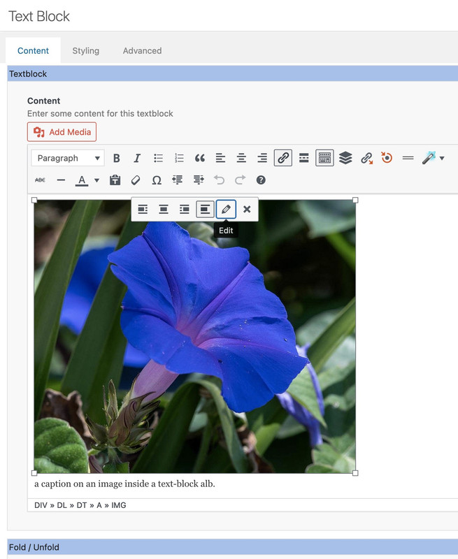
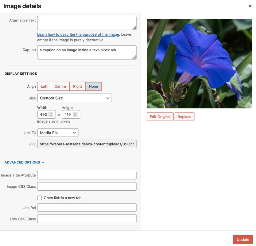
July 2, 2024 at 3:20 pm #1461030after inserting the image – click on that image once – you can see a popup with a little pencil (edit) then a new popup with details to that image opens.
 July 2, 2024 at 3:23 pm #1461032
I think i got it.
July 2, 2024 at 3:24 pm #1461034Do i need to add img-with-caption-right to the css class of the image too?
July 2, 2024 at 3:29 pm #1461036It works for the first image. The other take an effect, but don’t look same?
July 2, 2024 at 3:32 pm #1461038The text-block element got that class. (Each)
but i try now a different solution based on grid-rows …July 2, 2024 at 3:37 pm #1461040Now it works. Looks really great!
Is it possible, to remove the space from the vertical images top and keep the space from the horizontal images adjustable?
July 2, 2024 at 4:25 pm #1461058Hi Guenni,
looks really great now. Thank you very much!
The horizontal images with the space above are perfect. The size of them is 340x269px (width and height).I still have an issue with the image sizes of the vertical images. They have been added with an individual image size of 269x340px (width and height) , But for any reason they are shown much larger. How can i adjust them to 269x340px (width and height)?
I would also like to remove the space above them (only on the vertical images (please see screenshot, how it should look).Screenshot: https://img.savvyify.com/images/2024/07/02/images-size-vertical-and-spacinge0656b6e503bd7bf.jpg
kind regards and many thanks
JakJuly 2, 2024 at 4:41 pm #1461061you like to remove it everywhere – or only on those portrait fotos?
maybe try without equal-height flex-columns.
The equal height is something that will come with the grid-layout automatically ;)July 2, 2024 at 4:42 pm #1461062Only on the portrait.
The landscape is perfect!!! -
AuthorPosts
- The topic ‘Remove bottom space from colum and place text right to image / how to reduce spa’ is closed to new replies.