-
AuthorPosts
-
January 6, 2021 at 5:08 pm #1270666
Hello,
could you please help to remove the space above and below the logo?
Thank you,
MarcoJanuary 6, 2021 at 5:16 pm #1270670I would be interested in that too :)
January 6, 2021 at 6:41 pm #1270689Hi,
Please try adding this CSS code in Quick CSS (located in Enfold > General Styling):
#top .logo img {
    padding: 0;
}
Best regards,
NikkoJanuary 7, 2021 at 6:14 pm #1270932Hi Nikko,
thank you for the answer. Your code worked and removed the white space above and below the Logo but that it not what I need to achieve.
I would like actually to have the top bar lower. Its height lowered. So instead of be this high, I would like it to be as high as the logo height is.
So, its actually height minus the white spaces I showed you.
thanks
MarcoJanuary 8, 2021 at 1:31 am #1270974Hi Marco,
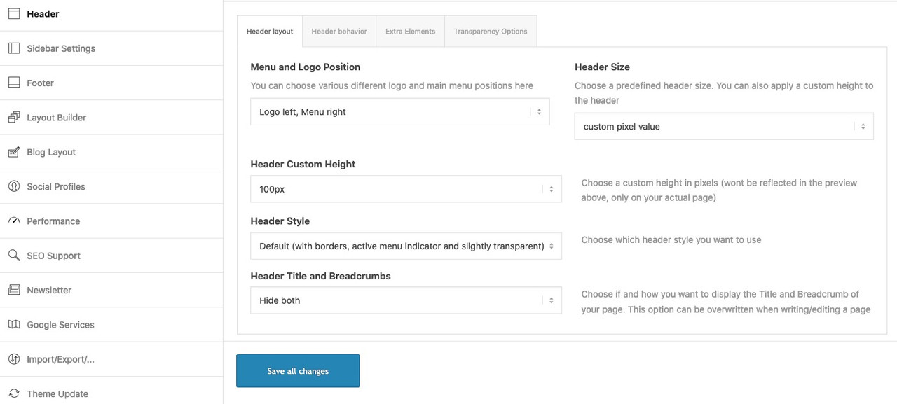
Try to set it in Enfold > Header > Header Size, then set this to custom pixel size and adjust the height.
Best regards,
NikkoJanuary 8, 2021 at 2:13 pm #1271065Hi Nikko,
I had checked this already but I cannot find any setting for adjusting the height here. Look at the screenshoot https://www.screencast.com/t/l6kSXObj
Thanks
MarcoJanuary 8, 2021 at 6:50 pm #1271137Hi Marco,
Thanks for the screenshot, I could not understand the language but I think Header Size is Dimensione Titoli, if you set it’s value to Custom Pixel Size (I’m not sure about the translation) and another field should appear where you can set its value.
Can you give us a screenshot or mockup of how you want it to look like, maybe we can give you some CSS code that might help.Best regards,
NikkoJanuary 8, 2021 at 8:41 pm #1271156Done. however I cannot get to have a lower header.
Any other help?
Below me site details.
Thanks,
MarcoJanuary 11, 2021 at 4:59 am #1271469Hi Marco,
I apologize for the delayed response and thanks for giving us admin access.
I could see that Header Size is working properly, I just add this CSS code in your Quick CSS:#top .logo img { padding: 7px; }Best regards,
NikkoJanuary 11, 2021 at 10:22 am #1271527Hi Nikko,
this is not what I want to achieve.
I had already made the log smaller by using the following code:
/* Space between logo and header OK on desktop
.logo img {
padding-top: 20px;
padding-bottom: 20px;
}
*/
The point is that I still have the white space above and below the loge. And this is the white space that I would like to remove. Small logo, small bar, at the same height of the logo.
Thanks,
MarcoJanuary 11, 2021 at 11:41 am #1271552Hi Marco,
The code you posted should not work because it’s commented out.
Using this code:#top .logo img { padding: 0; }It should result into this: https://imgur.com/Bu01zpJ
Best regards,
NikkoJanuary 20, 2021 at 1:31 pm #1274039Hi Nikko,
let me start from scratch.
This is the bar with NO code at all https://www.screencast.com/t/mnGHgHaFv6NU
This it the bar with a smaller Logo made using the below code with padding 20 https://www.screencast.com/t/cbceAaui5m
#top .logo img {
    padding: 20px;
}
Now, I understand you told me to put the padding to 0 in order to remove the space, but by doing this, I will also restore the size of the logo (BIG) but I would like to keep the logo small.
So, my goal is to keep the logo small and making the bar narrower by removing all the space above and below the logo – not by making the logo bigger.
Thanks,
Marco-
This reply was modified 5 years, 2 months ago by
marcoabis81.
January 20, 2021 at 1:47 pm #1274046January 20, 2021 at 2:08 pm #1274051Hi Guenni,
I cannot believe it was this easy.
The point is the I had already tried it and it did not work and I think I know now why it did not work.
When I selected “custom height” the first time, the value showed was 175px… so I set 140px as a new header height and I did not see any difference.
Now, I can see the difference because you pointed me out with the actual height of my header, 88px, thank you and I set it at 70px and I see now the difference.
Very much appreciated,
Thank you,
MarcoJanuary 20, 2021 at 2:14 pm #1274053Is there any way i can produce a smaller header in the mobile view too?
Thank you,
Marco
January 20, 2021 at 7:27 pm #1274167so not forget to adjust your lang switcher :
.mobile-switcher {
	position: absolute;
	right: 10px;
	top: 50%;
	-webkit-transform: translateY(-50%);
	transform: translateY(-50%);
	z-index: 999;
}
January 23, 2021 at 6:43 pm #1274994Thank you Guenni,
as usual very kind :0)
Can you help me with having a smaller header on the mobile too?
Thanks,
MarcoJanuary 26, 2021 at 2:38 pm #1275492Hi Marco,
Try adding this CSS code in Quick CSS:
@media only screen and (max-width:767px) {
  .responsive .logo img {
    max-height: 60px;
  }
}
Just adjust the max-height value.
Best regards,
NikkoJanuary 26, 2021 at 5:13 pm #1275529Hi Nikko,
I see there is already some code on the CSS but I cannot overwrite it.
See here: https://www.screencast.com/t/W7GwwM7jBi
I have applied this code
@media only screen and (max-width:767px) {
  .responsive .logo img {
    max-height: 60px !important;
  }
}
but it does not work.
Any suggestion?
thanks
MarcoJanuary 26, 2021 at 7:36 pm #1275553It works now :-)
thank you so much.
Thanks,
MarcoJanuary 27, 2021 at 12:33 am #1275629Hi marcoabis81,
Glad you got it working for you! :)
If you need further assistance please let us know.
Best regards,
Victoria -
This reply was modified 5 years, 2 months ago by
-
AuthorPosts
- You must be logged in to reply to this topic.


