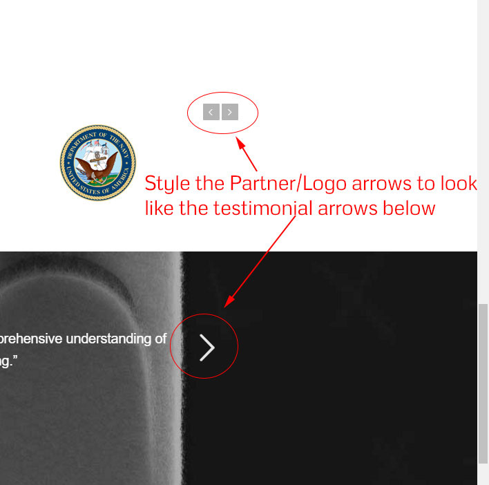
I was unable to find anything on this. Can you please provide CSS for restyling the Partner/Logo arrows to match the arrows used for Testimonials, per image below. You can also view here: http://chrisgallop.com/blog/#about

Hey Rachel,
Please try adding this code to the Quick CSS section under Enfold > General Styling or to your child themes style.css file:
#top .avia-slideshow-arrows a {
    color: #262626!important;
}

.avia-slideshow-arrows a:before {
    background: transparent!important;
    background: rgba(0,0,0,0)!important;
}
Best regards,
Vinay
This changed the arrows but did not make them the larger size and did not place them on either side of the div like it appears in the testimonials content element. Is there a way to make it appear the same?
Hi,
I do not see the arrows on the partner logo element did you make any design changes?
Let us know if you need any help on this.
Best regards,
Vinay
