Hello,
I’ve noticed when viewing my site with Google Chrome that the Colour Section Background image I’ve used looks really poor. However, when viewed using Safari, the images look excellent.
Is there anything I can do to fix this so that images look crystal clear in Google Chrome too..?
See background image here: https://www.phytobalance.co.uk/#pleasefix
Logins provided. Any assistance greatly appreciated :)
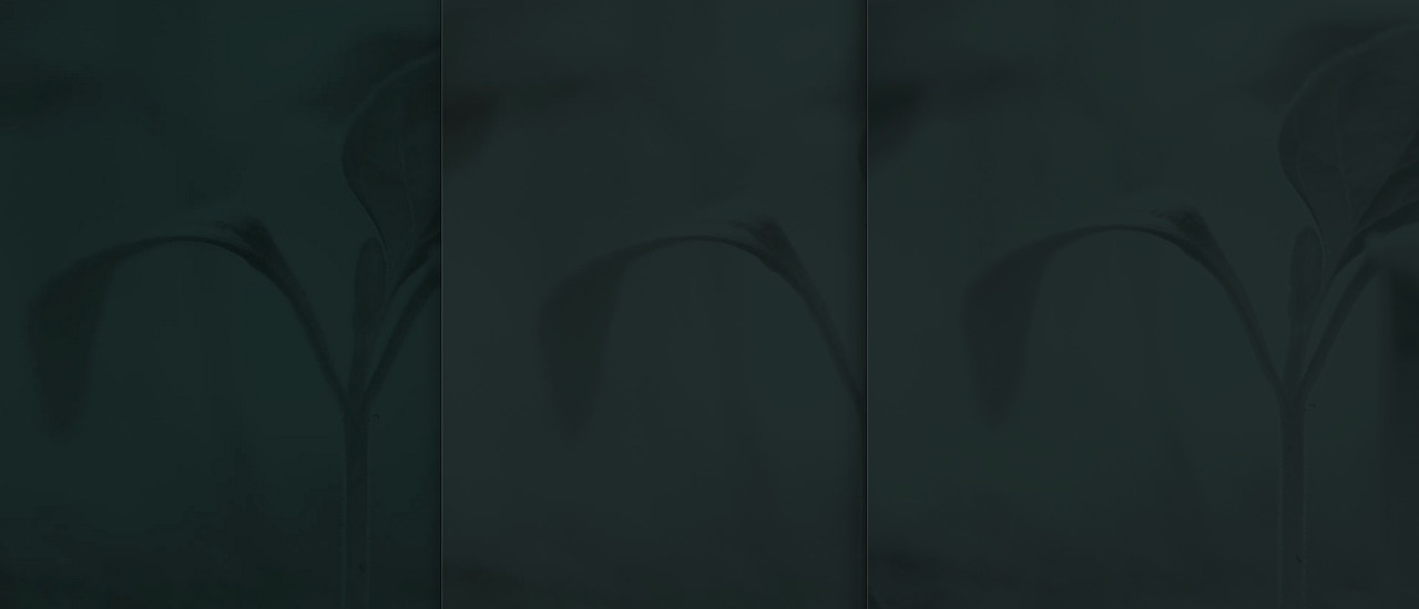
hm – i can not confirm to this: on my opinion the poor rendering is given on firefox – chrome and safari are very near to each other.
Click to enlarge the images:

left to right: firefox, chrome, safari
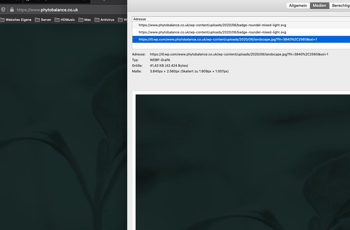
what makes me wonder is that on firefox it shows a jpg but on info about that image there is webp

besides this it seems to be a high compression : an image of that dimension with only 48kb !
Thanks for your feedback Guenni007. So, is there anything I can do to resolve..?
Hello, Is there anyone who’s able to find a fix for this issue, please. Background images look really poor in Google Chrome.
Hi,
Sorry for the delay. We checked the site on Chrome and Firefox Dev on Windows 10, but we don’t really see that much or any difference between the rendered images. Please check the screenshot below.
Screenshot: https://imgur.com/a/yGELLqq
Left is firefox, right is from chrome.
Best regards,
Ismael
