-
AuthorPosts
-
June 20, 2020 at 2:00 pm #1224271
Hi guys,
I read other tickets about but I was not able to work it out.See this page: https://www.viverelondra.com/servizi
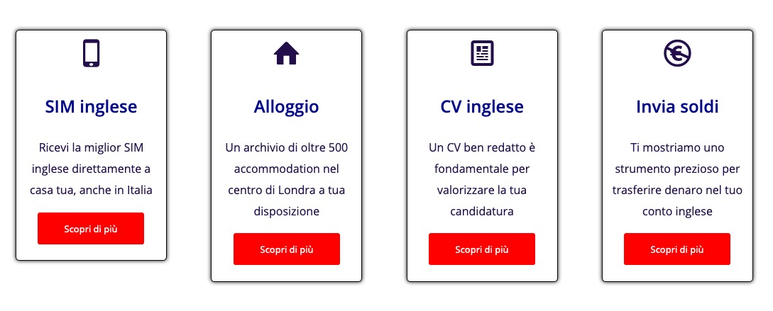
The orange buttons: I would like to put them at the bottom of the column at the same height of all the other buttons of the other columns. The code should apply only to desktop view.Could you please assist?
Regards,
MarcoJune 21, 2020 at 6:40 am #1224369Hey marcoabis81,
Please try the following in Quick CSS under Enfold->General Styling:
@media only screen and (min-width: 1025px) {
.page-id-16223 #av_section_2 .av_one_third section.av_textblock_section {
  min-height: 190px;
}
}
Best regards,
RikardJune 21, 2020 at 10:51 pm #1224445June 22, 2020 at 7:40 am #1224488Hi,
Did you try the CSS I posted? I can’t see it applying on your site.
Best regards,
RikardJune 22, 2020 at 10:51 am #1224550Hi Rikard,
I tested it, I saw it was not working and I removed it.
I put it back now, still, buttons do not go in the bottom of the box.
Thanks,
MarcoJune 23, 2020 at 4:39 am #1224766Hi,
Here’s what I’m seeing when I apply the CSS on your site: https://imgur.com/a/UrsWDXd. You have active caching on the site, did you clear that?
Best regards,
RikardJune 23, 2020 at 11:39 am #1224822Hi Rikard,
Yes, I cleared the cache.
Are you testing the home page? The home page has an ID page number 2 but I see you are using a different ID page. Is it because you are testing it in your environment so it gets a different ID page?Anyway, I changed it with ID page 2, claread the chace and still nothing.

Marco
June 24, 2020 at 5:06 am #1225006Hi,
I’m looking at the page you linked to in your first post: https://www.viverelondra.com/servizi, and the page id is correct in the code for that page. Maybe you could try removing the page id class from the code?
Best regards,
RikardJune 24, 2020 at 10:45 am #1225112Hi Rikard,
Is it possible you are looking at this https://www.viverelondra.com/servizi page? The buttons are orange while you display them red.
I noticed more than once that I have difficulties in overwriting the CSS code. And it takes sometimes days before the changes take effect. Or sometimes they never take effect. I see the old code from the google inspect element while the CSS I have put in the quick CSS is different.
If you check the color of each button from inside the WP panel of the page “i nostri servizi” you will see that each button is set to be orange. I see them orange from my side.
I restore the ID page 16223 and it does not work. And if I remove the ID page this will apply to all pages eventually? tried and it does not have any effect on the buttons.
Thanks,
MarcoJune 25, 2020 at 6:54 am #1225417Hi,
Yes, that is the page I’m looking at. The problem with applying CSS might have something to do with you having active caching on your site. What happens if you clear the cache and disable the plugin or service which is caching your content?
Best regards,
RikardJune 25, 2020 at 7:13 am #1225418i would give a custom class to the section it concerns – i have now only the code for you site specific and with the section ID:
to address the colorsection it concerns it might be nice to have a unique selector.#top.page-id-16223 #av_section_2 .avia-button-wrap { position: absolute; bottom: 10px; left: 50%; -webkit-transform: translateX(-50%); transform: translateX(-50%); } #top.page-id-16223 #av_section_2 .av_textblock_section { padding-bottom: 30px; }June 25, 2020 at 11:20 am #1225451Rikard hi,
It is not about the cache probably (which anyway I cleared more than once).
You are seeing red buttons while my site has orange buttons. I believe you are seeing an old copy of my site (in fact one week ago I had red buttons) :-)
I tried Guenni’s code and it has worked at first, same caching plugin, same settings.
Not sure why I cannot implement your code Rikard.
Marco
June 25, 2020 at 11:50 am #1225458Thank you Guenni, I tried it and it works perfect :-)
Can I ask 1 question?
1) I understand that if I want to use the same code on a different page, I have to change 2 things: the ID page and the section number.
I would like to re-use this code on page ID 2 (my home page http://www.viverelondra.com) at the av_section_6However, I was not able to make the code work. Am I wrong in something?
Thanks
Marco-
This reply was modified 5 years, 10 months ago by
marcoabis81.
June 25, 2020 at 2:23 pm #1225506That is the reason for:
i would give a custom class to the section it concerns
you give a custom class f.e. to the color-section where all those columns are in. Then the selector is the trigger for using this code.
.avia-section.custom-class .avia-button-wrap {
  position: absolute;
  bottom: 10px;
  left: 50%;
  -webkit-transform: translateX(-50%);
  transform: translateX(-50%);
}

.avia-section.custom-class .av_textblock_section {
  padding-bottom: 30px;
}
so whenever you come to an same setting you only had to give that custom-class to the color-section to which the columns belong.
But it has to be the same setting. You see that a little padding is given to the last but one element in the column to have distance to the absolut positioned buttons. If this is something different than a textblock you had to adjust this.by the way – same setting – on your home page are these columns in the second line real equal height columns ?
June 25, 2020 at 4:53 pm #1225591Hi Guenni,
Yes same settings on the home page, same height columns.
i understand now why you mentioned the
i would give a custom class to the section it concerns :-)
However, I did not manage to get the result with the custom class.
Here is how I set it up:
/* Buttons same height SERVIZI page */
.avia-section.box-servizi .avia-button-wrap {
  position: absolute;
  bottom: 20px;
  left: 50%;
  -webkit-transform: translateX(-50%);
  transform: translateX(-50%);
}

/* Buttons same height SERVIZI page */
.avia-section.box-servizi .av_textblock_section {
    padding-bottom: 60px;
}
Thanks,
MarcoJune 26, 2020 at 9:22 am #1225745
if two classes are needed here on that input-field there had to be no dot between the classes – The input field will add it to the element as classes just without dot only with one space between each class.but the class avia-section is allready there so for you only : box-servizi – no dot before that will be done by enfold
___________
the second row of coulumns is not set to equal height !
the first column on the left gives the setting for the rest in the line. Even if you have 8times 1/4 columns- you had to set all left columns.
And even worse, should you ever rearrange the columns and move a column from back to front, you’ll have to edit that column again. Otherwise, it’ll default to the default settings.

-
This reply was modified 5 years, 10 months ago by
Guenni007.
June 26, 2020 at 10:26 am #1225763Amazing,
it works :-) :-)
Very much appreciated Guenni.
Just a technical question. The first part of the class https://www.screencast.com/t/pDyIgMYBabxZ has to be called >>> .avia-section or can I simply use the second part of the custom class name that I want?
Have a great day.
Marco
June 26, 2020 at 12:10 pm #1225781but the class avia-section is allready there so for you only : box-servizi – no dot before that will be done by enfold
avia-section is the standard class for all Enfold color-sections.
a custom-class is added to the section so on css rules there will be no space between them and the dot is the separator on that.avia-section.custom-class { … }I have included the standard class in the rules to keep a better overview. So you can see directly in the Quick css that it is a rule which is applied to an element within a color-section.
but in the input field of the Adavanced Laoyut Builder Element ( color-section etc. pp) there should not be a dot but if you like to add multiple classes to the element – separated by a space.
-
This reply was modified 5 years, 9 months ago by
Guenni007.
June 26, 2020 at 12:29 pm #1225788Best would be to get familiar with developer tools of the browsers. Most ( i guess all ) have them implemented.
You can show with your mouse on a part of your page and via kontext menu ( often the right mouse button ) you can then choose “inspect” or similar.Using the developer tools you can examine the site very well. Where which IDs or classes are; whether an element is a child element or a neighbour etc. pp.
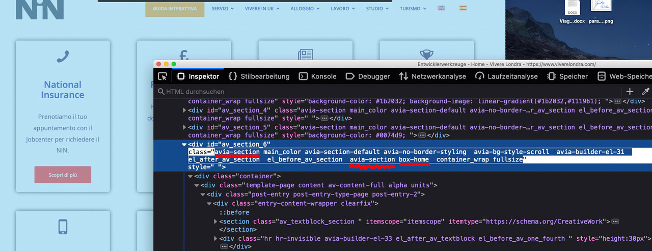
So when I look at your page now, I see that you have unnecessarily reassigned this default class to the color-section. This doesn’t bother in this case, but is obsolete. I can see that you have given the class home-box this time.this is what i see if i inspect the color-section of your homepage:
click to enlarge the image:
 June 26, 2020 at 12:39 pm #1225793
see here an example where it is usefull to have two custom classes on a given element.
i have created a glassy 3D looking styling for Enfold Buttons. The one custom-class is for the styling option ( glass ) the other custom-class is for the color effects ( green , blue, red etc. pp )
When i want to style now an Enfold Button ( light-transparent ) i only had to set these two classes to the button element.
Input field is than on custom-class: glass blue
https://webers-testseite.de/buttons/June 26, 2020 at 1:32 pm #1225802Hi Guenni,
Yes, it is in the Google inspect that I found that it was the color section number 6. Right yesterday I was wondering how you could guess that the color section was the number 2 so I started browsing the developer tools and found that you can actually get these info there :-)
So when I look at your page now, I see that you have unnecessarily reassigned this default class to the color-section. This doesn’t bother in this case, but is obsolete. I can see that you have given the class home-box this time.
This is what I was trying to understand yesterday when I sent you this screenshot. https://www.screencast.com/t/pDyIgMYBabxZ I wanted to understand if the default class was something that I had to use or I could avoid to add it before the custom class name and you just cleared my doubts now: I can avoid to write the default class and write directly the custom one.
Thanks for being this kind and explaining me all this :-)
Appreciated,
MarcoJune 27, 2020 at 3:48 am #1226022Hi Marco,
Great, I’m glad that @guenni007 could help you out. Please let us know if you should need any further help on the topic or if we can close it.
Best regards,
RikardJune 27, 2020 at 2:02 pm #1226049Hi Rikard,
you can close the ticket.
Thank you for the support :-)
Marco
June 27, 2020 at 8:27 pm #1226123Hi Marco,
Great :)
We are closing the thread.
If you need further assistance please let us know in a new one.
Best regards,
Victoria -
This reply was modified 5 years, 10 months ago by
-
AuthorPosts
- The topic ‘Put buttons at the bottom of the columns’ is closed to new replies.


