
Tagged: responsive
-
AuthorPosts
-
March 31, 2014 at 9:35 pm #245737
Hi Guys,
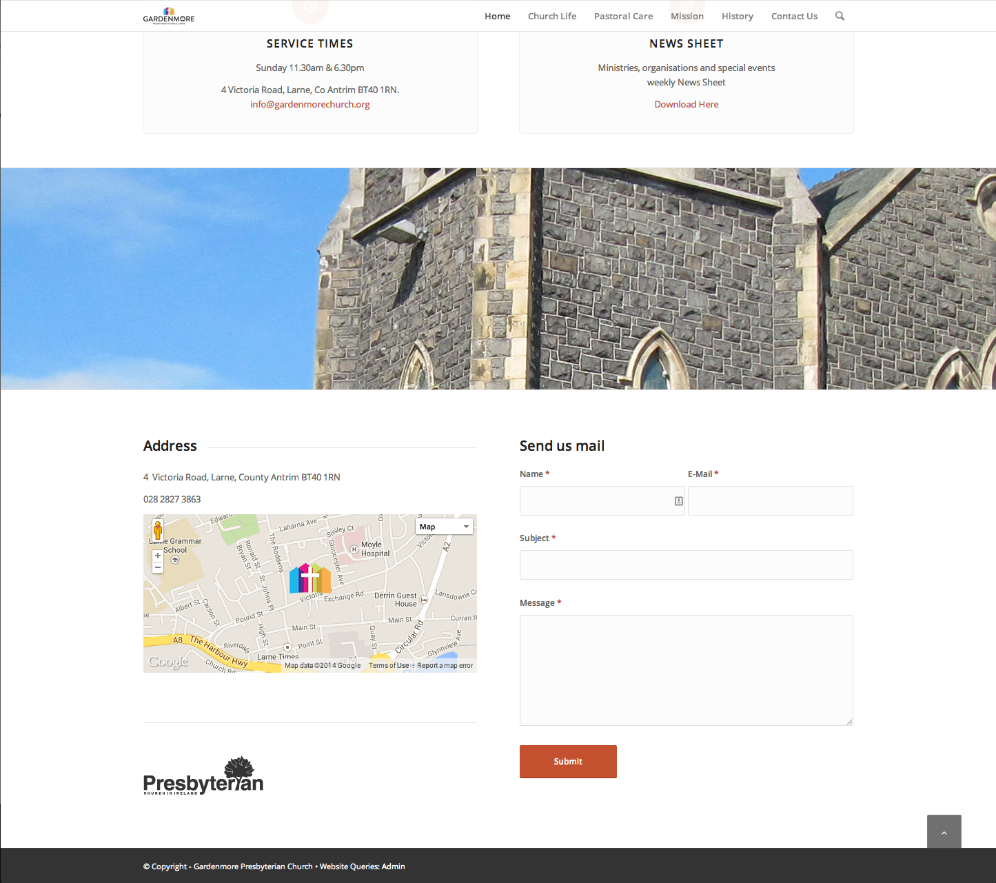
I was wondering if there is a way to push an image on small screen? Or failing that maybe just hide-for-small?
The image in question is the Presbyterian Church logo at the bottom of this page: http://www.gardenmorechurch.org/home (bottom left)Basically I would like it to appear below the contact form on mobile devices…
Thanks
.a-
This topic was modified 12 years ago by
_andym.
April 1, 2014 at 3:22 pm #246069Hi _andym!
Can you post a screenshot of the church logo? I cannot see a church logo on the bottom of your page
Best regards,
YigitApril 1, 2014 at 10:06 pm #246270hmmm, I have an animation left to right on the image which is being temperamental. Maybe because it is so low on the page. I’ve remove the animation so should appear now at http://www.gardenmorechurch.org/home/ I’ve also attached a screenshot just incase.
http://www.gardenmorechurch.org/gm_screen.png
Thanks,
.a-
This reply was modified 12 years ago by
April 2, 2014 at 10:51 am #246471Hey!
Thank you for the link and the screenshot.
You can use this on Quick CSS or custom.css to move the graphic on mobile device:
@media all and (max-width: 767px) {
#contact > div > div > div > div > div.flex_column.av_one_half.first.avia-builder-el-14.el_before_av_one_half.avia-builder-el-first > span > a > img {
position: absolute;
bottom: -600px;
}
}
Adjust the bottom value if necessary.
Best regards,
IsmaelApril 5, 2014 at 7:25 pm #247848Hi, This worked a treat… Had to up it to -700px but did exactly what I needed.
Now all I need is a full width Google Maps widget and I’m pretty much done? Any ideas on this one?
Thanks
.aApril 7, 2014 at 2:37 pm #248190 -
This topic was modified 12 years ago by
-
AuthorPosts
- You must be logged in to reply to this topic.