
-
AuthorPosts
-
April 30, 2020 at 6:47 pm #1208608
Hello all ^^
This promo box looks very narrow at resolution 1024 and below. How can I make the promo box responsive sooner, starting at 1024px resolution?
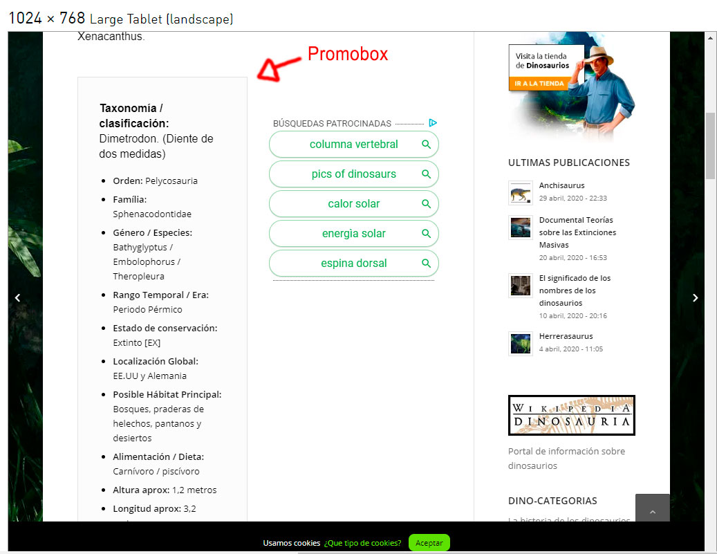
Thank you :)
May 1, 2020 at 8:56 pm #1208947Hey Ganubis,
Are you looking to make it go full-width or just want it wider?
Best regards,
Jordan ShannonMay 3, 2020 at 3:21 pm #1209289Hello,
Make it responsive sooner. something like that…. make the right sidebar becomes responsive sooner or earlier, for example at 1024 resolution.
Best regards,
-
This reply was modified 5 years, 11 months ago by
Astrobiologic.
May 4, 2020 at 11:53 pm #1209761Hi,
Are you able to re-enable right click so I can inspect the page?
Best regards,
Jordan ShannonMay 5, 2020 at 1:08 am #1209770ups sorry, it’s already disabled.
May 5, 2020 at 10:51 pm #1210108Hi,
Thanks, add this to quick css:
@media only screen
and (min-device-width : 768px)
and (max-device-width : 1024px) {
.flex_column.av_one_half.flex_column_div.first.avia-builder-el-1{
width:100%!important;
}}Best regards,
Jordan ShannonMay 6, 2020 at 5:25 pm #1210399Hello, thank you very much for your help,
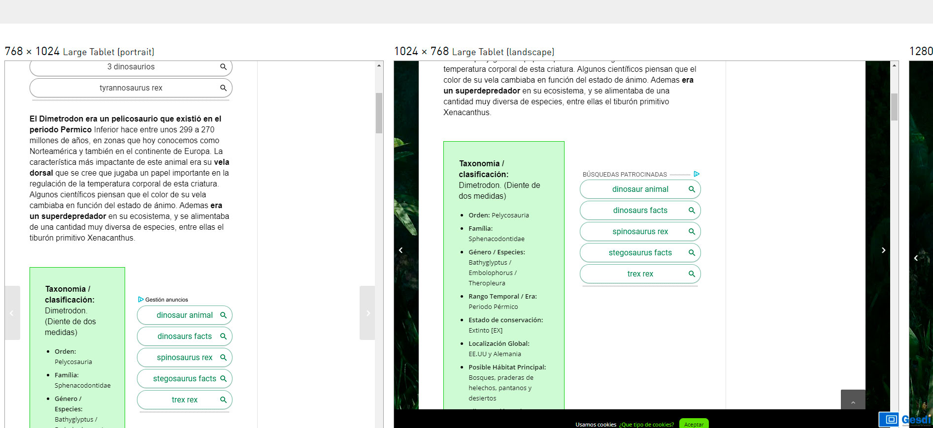
What I want is for the sidebar to become responsive sooner (shown below the content).
Currently the right sidebar disappears (and is displayed below the content) in resolutions 480 pixels wide. I need the sidebar to disappear (and be shown under the content) a little earlier, from resolutions of 1024 pixels.
Best regards,
May 6, 2020 at 9:57 pm #1210494Hi,
So the code I gave is fine for the promobox? You just need the sidebar (ad area) fixed now?
Best regards,
Jordan ShannonMay 6, 2020 at 11:12 pm #1210528yes, I want the sidebar become responsive sooner.
Best regards,
May 6, 2020 at 11:22 pm #1210538Hi,
Add this to quick css:
@media only screen and (max-width: 1024px){
.sidebar.sidebar_right.smartphones_sidebar_active.alpha.units{
width:100%!important;
}}
Best regards,
Jordan ShannonMay 7, 2020 at 2:47 pm #1210728Hello,
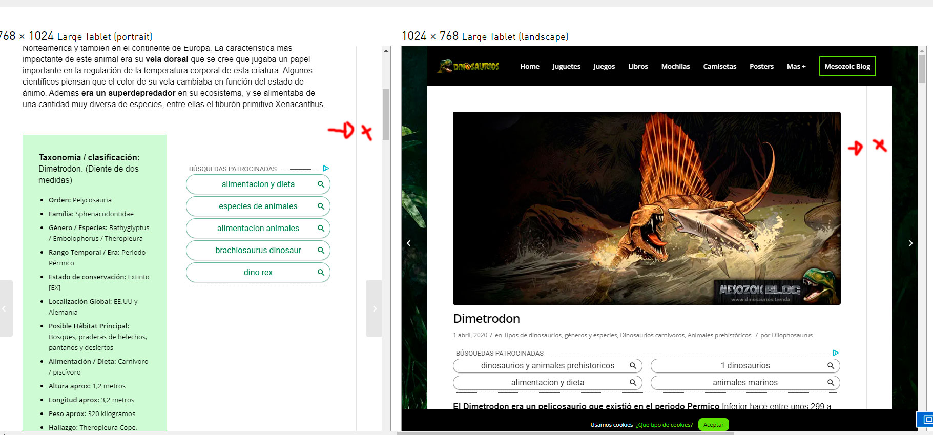
It works halfway, the content becomes responsive but the sidebar remains empty.
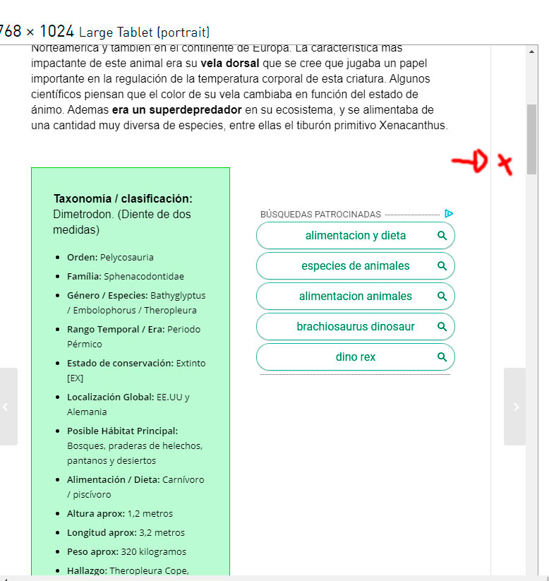
Attached screenshot where you can see it better (you can see the line and the empty sidebar):
Best regards,
May 8, 2020 at 10:10 pm #1211254Hi,
Adjust css to this:
@media only screen and (max-width: 1024px){
.sidebar.sidebar_right.smartphones_sidebar_active.alpha.units{
width:100%!important;
}
.container .av-content-small.units {
    width: 100%!important;
}}
Best regards,
Jordan ShannonMay 9, 2020 at 12:55 pm #1211380Hi Jordan, thank you very much for your help.
It’s almost done, it works, but that part of the container needs to be hidden.
A greeting and thank you very much for your help
May 12, 2020 at 4:47 am #1211988Hi,
Apologies, which part is being hidden? The ad?
Best regards,
Jordan ShannonMay 12, 2020 at 3:05 pm #1212193Hello, ^^
if you look, the sidebar container and the sidebar line are still visible.
everything is fine, it just needs the sidebar container and sidebar line to be hidden too, like the rest of the sidebar.
thank you!! and Best regards,
-
This reply was modified 5 years, 10 months ago by
May 12, 2020 at 9:24 pm #1212363Hi,
Okay I see. Add this to the quick css as well:
@media only screen and (max-width: 1024px){
.content.units.av-content-small.alpha {
border-right:0px!important;
}}
Best regards,
Jordan ShannonMay 13, 2020 at 7:49 pm #1212729Work Perfect!! Thank you Jordan +100… Best regards and have a nice day!!!!
 May 13, 2020 at 7:54 pm #1212734
Hi,
HAHA Thank You! I’m glad to have helped, and if you need anything else please let us know here in the forums!
Best regards,
Jordan Shannon -
This reply was modified 5 years, 11 months ago by
-
AuthorPosts
- The topic ‘Promobox Responsive at 1024px’ is closed to new replies.