Hi,
Please try this code in the General Styling > Quick CSS field or in the WordPress > Customize > Additional CSS field:
@media only screen and (max-width: 767px) {
#top.home #av-tab-section-1 > div > div.av-tab-section-inner-container.avia-section-small {
width: auto !important;
}
}
If this doesn’t help then please try this solution
Best regards,
Mike
Hi,
Sorry, this doesn’t seem to be going well for mobile, how would you feel about using a different element for mobile? Perhaps we could use a more mobile friendly element and write some css to hide one and show the other only for mobile?
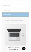
One idea might be to use the “Content Tabs” because they work well for mobile and we can add the product grid to the tabs as shortcode, here is a screenshot of a test I did:

Best regards,
Mike
