-
AuthorPosts
-
August 13, 2018 at 1:20 pm #996660
We have maor problems
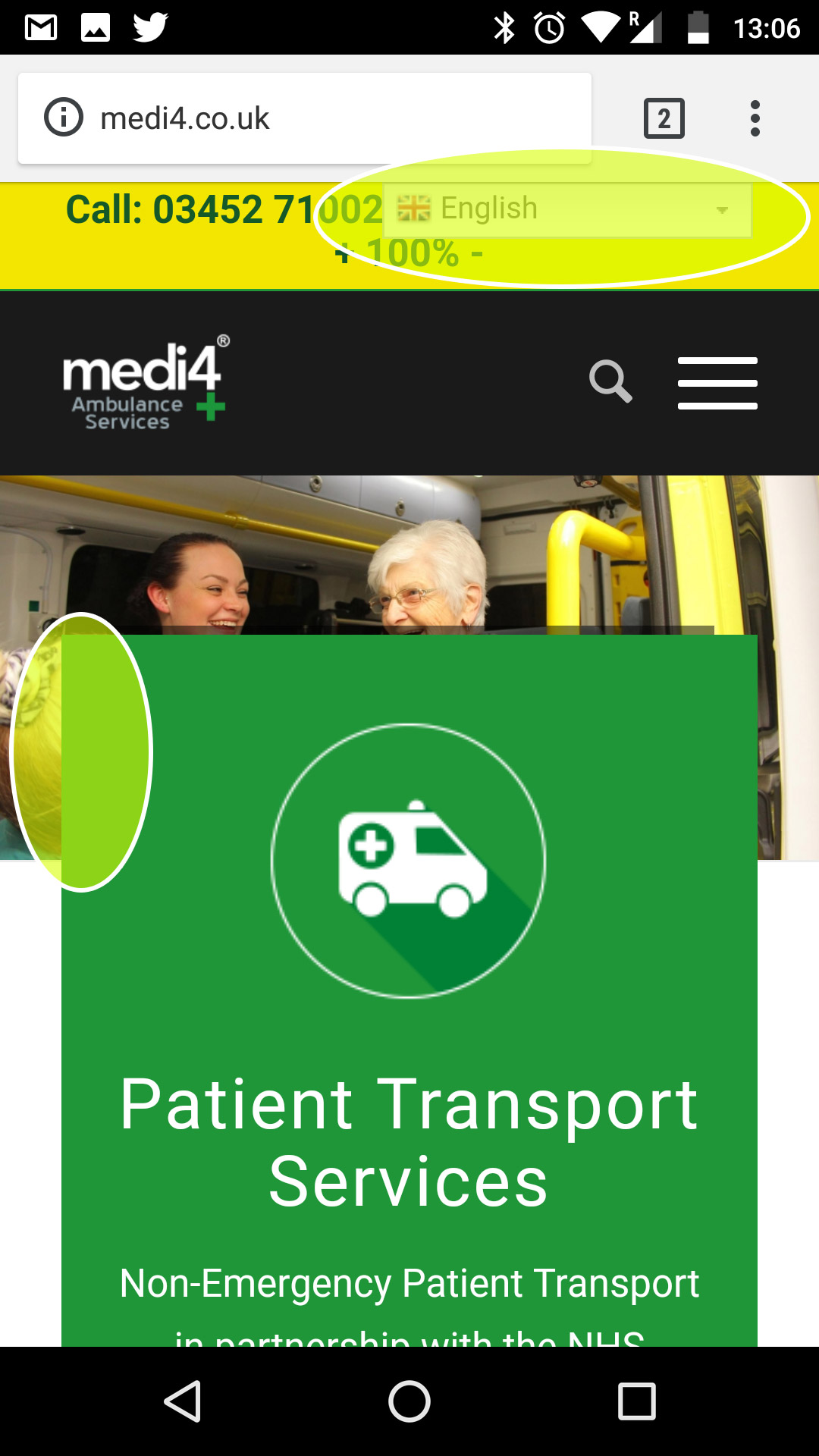
Is there a way to NOT have negative margins in mobile view (sub 960px wide) – see image link

Also, when in mobile view, can the phone info be above the language selector?
August 13, 2018 at 3:16 pm #996725Hey whdsolutions,
Here is the code you can put in Enfold > General Styling > Quick Css, if it does not work, put into themes/enfold/css/custom.css
 @media only screen and (max-width:767px){
    #gtranslate_wrapper {
        top: 25px !important;
        right: 3% !important;
    }
 }
If you need further assistance please let us know.
Best regards,
VictoriaAugust 13, 2018 at 5:58 pm #996797Thank you – any news on the negative margin problem covering the slider on MOBILE ONLY
August 13, 2018 at 5:59 pm #996798Thank you – any news on the negative margin problem covering the slider on MOBILE ONLY
Also this does nothing
@media only screen and (max-width:767px){
#gtranslate_wrapper {
top: 25px !important;
right: 3% !important;
}
}August 13, 2018 at 6:11 pm #996802Actually it does work so thank you – but why is it not scrolling up the page with the rest of the content on a mobile?
August 14, 2018 at 8:14 am #997002In fact I am thinking about buying a plugin
https://codecanyon.net/item/ajax-translator-revolution-wordpress-plugin/1108823?s_rank=1
Hopefully this will reside above the top-socket
August 14, 2018 at 8:30 am #997003Any news on how to NOT have negative margins on Mobile Only?
August 14, 2018 at 7:31 pm #997254Hi,
I’d recommend to set a custom css class for the element where you want to remove the negative margin (i.e. use the class “av_no_negative_margin_mobile” without the quotes). Also see: https://kriesi.at/documentation/enfold/intro-to-advanced-layout-builder/#turn-on-custom-css-class-field-for-all-alb-elements
Then add this code to the quick css field or child theme style.css file:
@media only screen and (max-width: 767px){
.responsive #top #wrap_all .av_no_negative_margin_mobile {
margin-top: 50px;
}}
You can replace 50px with any other px value – a higher value will shift the element to the bottom. If the code doesn’t work you can try to add !important to the value like:
margin-top:50px !important;Best regards,
DudeAugust 15, 2018 at 10:17 am #997489Thanks Dude
But that has NOT worked
`@media only screen and (max-width: 767px){
.responsive #top #wrap_all .av_no_negative_margin_mobile {
margin-top: 50px !important;
}
}August 15, 2018 at 10:31 am #997490Would it be possible if we give you access you can do this for us, it seems VERY complicated.
August 15, 2018 at 9:13 pm #997680Hi,
Please post us your login credentials (in the “private data” field), so we can take a look at your backend.
- Install and activate ” Temporary Login Without Password “.
- Go to ” Users > Temporary Logins ” on the left-side menu.
- Click ” Create New “.
- Add the email address for the account ( you can use (Email address hidden if logged out) ), as well as the ” Role ” making that the highest possible and the expiry about four days
( do be sure that we have enough time to debug ). - Click ” Submit “.
- You’ll now have a temporary account. Please provide us here in the private section the URL, so we can login and help you out.
When your issue is fixed, you can always remove the plugin!
If you prefer to not use the plugin, you can manually create a admin user and post the login credentials in the “private data” field.Best regards,
Basilis -
AuthorPosts
- You must be logged in to reply to this topic.
