Tagged: footer, mobile version
Hi!
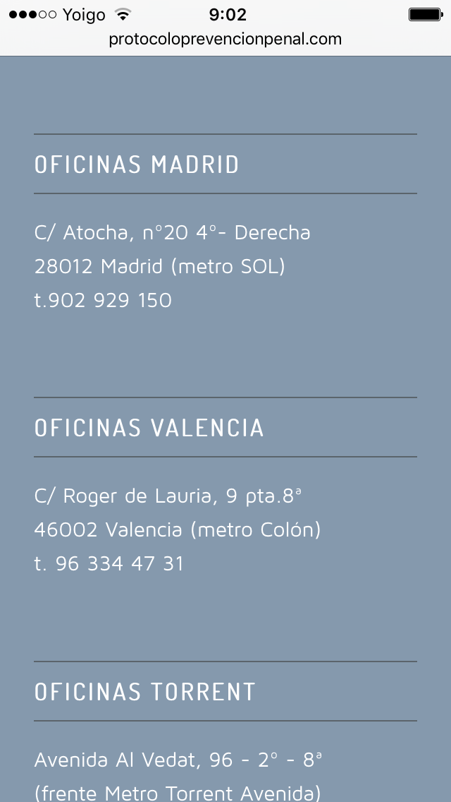
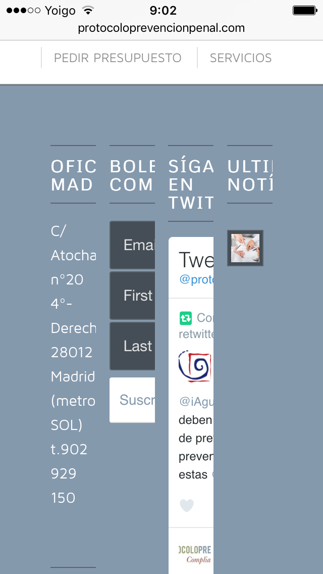
I’m finding some problems to see properly the 4 columns footer on the mobile.
In some pages its shown right (first the first column, then the second…) but in other pages it tries to show it like on the website version, the 4 columns at the same time.
I’ve attached examples.


Thanks!
Hey alquadrat!
Please add following code to Quick CSS in Enfold theme options under General Styling tab
@media only screen and (max-width: 767px) {
#footer .flex_column {
    width: 100%!important;
    margin-left: 0!important;
}}
Best regards,
Yigit
Nice!
Thanks
