-
AuthorPosts
-
January 16, 2015 at 9:57 pm #381094
Hi,
I would like the featured Image not above the Header, but beside.
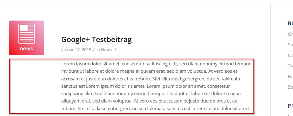
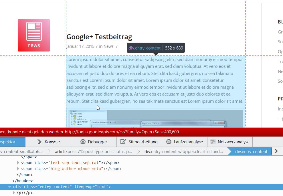
Actual the side is like this:

Now it should look like this:

Another point is that if anybody click on this Feature Image the come to the side with als posts from that category: http://www.url.de/blog_category
How can I do that?
January 17, 2015 at 5:26 pm #381263Hi sunshineh!
Try adding this to your custom CSS.
.template-blog .big-preview { float: left; margin-right: 20px; }Or you can also try the “single author small” style in Dashboard > Enfold > Blog Layout.
If that’s not what your wanting then send us a link and we’ll take a look. You can set your reply as private if you wish.
Cheers!
ElliottJanuary 17, 2015 at 10:29 pm #381319This reply has been marked as private.January 19, 2015 at 7:46 pm #382053Hey!
Try adding this.
.single .entry-content-header {
  margin-top: 110px;
}
If that’s not correct then take another screenshot and highlight what your trying to do so we can get a better idea.
Cheers!
ElliottJanuary 21, 2015 at 1:19 am #382804Hi,
thanks for your help.I put your code into my css-file and it looks like this:

Now I only what to write the text here over hole the width (below the picture)January 21, 2015 at 11:28 am #382959Here I have another Picture, perhaps it is clearer

But I only what this width on blog-article, not in the blog overview with the blog excerpts and not on the normal pages. Is this possible?
January 21, 2015 at 9:37 pm #383359Hi!
I checked your single post views but it’s already displaying like that so I’ll assume you figured it out.
Regards,
ElliottJanuary 21, 2015 at 11:22 pm #383411Hi, no it doesn’t the second screenshot should only help to understand what I mean. I want the text over the hole page (without right sidebar). Sorry for the circumstances.
January 22, 2015 at 2:30 pm #383683Hi!
Add this on Quick CSS to increase the width of the excerpt container:
.template-blog .blog-meta {
position: absolute;
}

header.entry-content-header {
padding-left: 120px;
}

.template-blog .entry-content {
padding-top: 20px;
}

.post_author_timeline {
display: none;
}
Regards,
IsmaelJanuary 23, 2015 at 11:46 pm #384714Great! Thank you very much!!
-
AuthorPosts
- The topic ‘Post with featured image not above but beside the header’ is closed to new replies.
