
-
AuthorPosts
-
May 25, 2021 at 5:19 pm #1302263
Hi there,
on my start page there are two columns below the hero slider.
These should partially overlay the hero slider below.
In the portrait view on the smartphone, the left column should preferably be displayed a little higher and above the hero.But now I can’t pack the two 1/2 columns into one 1/1 column.
As a result, the negative margin causes the two elements to overlap.Is there a way to pack two 50% columns into one full-width column?
Then I could give the surrounding 100% column the negative distance to the hero slider and it would be displayed on the smartphone as desired.Or is there another option?
Thanks in advance.
Regards,
KnutnikMay 27, 2021 at 8:27 am #1302546Hey Knutnik,
Thank you for the inquiry.
The columns break into full width when we checked the site on mobile view. Please check the screenshot below.
Screenshot: https://imgur.com/MaxckPJ
Would you mind providing a screenshot of the issue? If you want to adjust the break point, try to edit the first column in the row, go to the Row Settings > Row Screen Options toggle and set the Fullwidth Break Point to the second option.
Best regards,
IsmaelMay 27, 2021 at 10:46 am #1302567here is a layout made for another participant : https://webers-testseite.de/steviger/
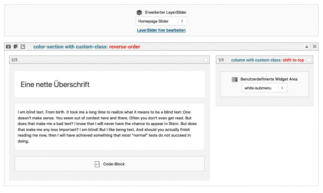
The Reverse Order is only to have the second column ( with that navigation in it ) on top in responsive case.
May 27, 2021 at 10:54 am #1302571here are some other overlapping samples:
https://webers-testseite.de/overlapping/
or https://webers-testseite.de/overlap-to-followed-section/you see here too – that you can even use the animation of enfold for those overlapping columns.
May 29, 2021 at 5:10 am #1302919July 4, 2021 at 5:06 pm #1308655Thank you Guenni007.
Z-index: 0 already solved my problem, but that looks very interesting.
Maybe I’ll add that later.Best regards
Knutnik -
AuthorPosts
- You must be logged in to reply to this topic.