Hello,
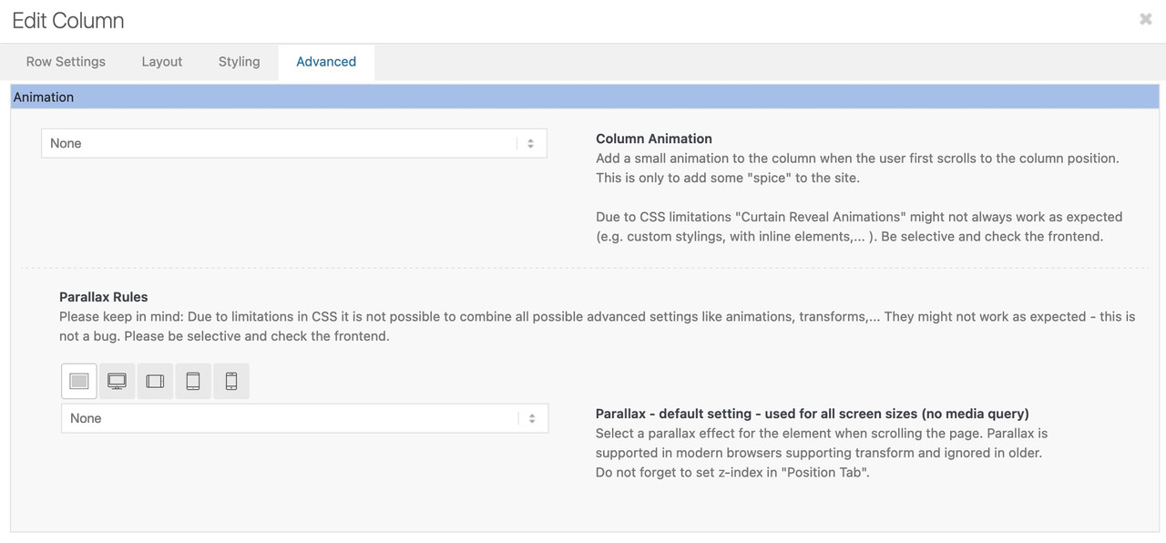
how can I shut the parallax effects on mobile screens? before there were the checkboxes for different screen sizes to hide, but now I only got the option to hide something on mobile phones and not to hide something on other screens.
thx in advance
F
Hi FokeOne,
Here’s how you can turn off parallax effects on a mobile screen (add this CSS code in Enfold > General Styling > Quick CSS):
@media only screen and (max-width:767px) {
  #top .av-parallax {
    transform: matrix3d(1, 0, 0, 0, 0, 1, 0, 0, 0, 0, 1, 0, 0, 0, 0, 1) !important;
  }
}
As for hiding elements in different screen sizes, it is still there, go to Advanced (tab) > Responsive and you should see four checkboxes.
Best regards,
Nikko
Your question doesn’t quite make it clear where the parallax effect was used on your part. Does it affect the color sections (background-images)? Or do you already have the latest Enfold installed and mean the parallax that can be activated for columns and images.
______
if you are talking about that last parallax setting:
the first screen on the left is for the default setting and therefore applies to all screen widths. If you leave it on “none” no parallax will be applied. Only if you then edit the individual “Media Query Screens” the effect is applied there. ( Same with positioning – on “use theme default )

