
-
AuthorPosts
-
October 13, 2025 at 10:34 am #1490110
Hi guys, i add different padding on my website for each devices but i wanted to add it to the search results page and i don’t know how to dot it. I tried in CSS but i don’t make it work. Can someone help me on that please ?
October 13, 2025 at 4:03 pm #1490127Hey Alexandre,
I’m not sure what you are referring to, since you haven’t linked to anything for us to look at? If you have a screenshot highlighting your intentions, then please share that with us as well.
Best regards,
RikardOctober 13, 2025 at 7:34 pm #1490150Like this please to add space on all sides of content of the page
 October 14, 2025 at 8:48 am #1490178
Hi,
Thanks for that. Please post a link to the actual page as well, so that we inspect the elements in question.
Best regards,
RikardOctober 14, 2025 at 9:45 am #1490183October 14, 2025 at 4:52 pm #1490205Hi,
Thanks for that, but the search result page that you linked to already has vacant space in the indicated areas. Could you try to explain a bit further what you are looking to achieve please?
Best regards,
RikardOctober 15, 2025 at 9:24 am #1490240I want to change the original spacing created by the theme to choose mine.
October 15, 2025 at 9:37 am #1490241something like this:
.responsive #top.search #main .container {
  max-width: 100%;
}

.responsive #top.search #main .page-heading-container {
  max-width: 1310px !important;
  margin: 0 auto 50px;
  padding: 0 50px 50px;
}

.responsive #top.search #main .post-entry {
  margin-left: 50px;
  margin-right: 150px;
}
October 15, 2025 at 10:00 am #1490246Hi,
Thanks for helping out @guenni007. Did that answer your question @VachetAlexandre?
Best regards,
RikardOctober 15, 2025 at 10:30 am #1490249Thanks @guenni007 for the code, that’s what i wanted to get for my website but can you tell me how i can do to put different spaces on all devices ?
The code modified with my values is :
/*Ajout de marges personnalisées dans les sections spécifiques de la page de résultats de recherche*/
.responsive #top.search #main .container {
  max-width: 100%;
}

.responsive #top.search #main .page-heading-container {
  max-width: 1310px !important;
  padding-right: 100px !important;
	padding-left: 100px !important;
}

.responsive #top.search #main .post-entry {
  margin-left: 100px !important;
  margin-right: 100px !important;
}
October 15, 2025 at 12:12 pm #1490251What do you mean by ‘devices’ – there are no restrictions regarding different devices in the CSS rules above?
By the way, you should not set this for mobile devices, as it looks terrible (it is not easy to read with these settings).
f.e.:/*Ajout de marges personnalisées dans les sections spécifiques de la page de résultats de recherche*/ @media only screen and (min-width: 768px) { .responsive #top.search #main .container { max-width: 100%; } .responsive #top.search #main .page-heading-container { max-width: 1310px !important; padding-right: 100px !important; padding-left: 100px !important; } .responsive #top.search #main .post-entry { margin-left: 100px !important; margin-right: 100px !important; } }October 16, 2025 at 9:30 am #1490280By devices i mean like, put different margin on tablet and mobile etc
October 16, 2025 at 4:15 pm #1490299Hi,
You can add different CSS depeding on screen size if you use media queries: https://www.w3schools.com/css/css3_mediaqueries.asp
Best regards,
RikardOctober 16, 2025 at 4:17 pm #1490301I tried but it won’t work so i need a code for this and i think @Guenni007 has the solution because he helps me a lot !
October 17, 2025 at 8:48 am #1490328Hi,
Thanks for the update. What exactly is not working and on which screen resolution?
Best regards,
RikardOctober 17, 2025 at 9:51 am #1490329I tried but it won’t work so i need a code for this.
– i do not see what “this” means”
you should be more precise what you like to have – ” tablet and mobile etc” tablet and mobile are not well defined as screen width.
F.e. there are so many iPad versions (
iPad mini 768×102; iPad 800×1080; iPad 11inch 834×1194; iPad 12.9inch 1024×1366 etc. )
then there are different media queries for screen orientations ( portrait or landscape)
then there are different media queries for screen resolutions to differ between Retina Displays to normal one. etc. etc. pp
for example:@media screen and (min-width:600px) and (-webkit-min-device-pixel-ratio: 2), screen and (min-width:600px) and (min-resolution: 192dpi), screen and (min-resolution: 2dppx) { /* an example rule: */ div {background:url( (Email address hidden if logged out) );} }Therefore, I would focus on a few screen widths, e.g., the 767px and 989px used by Enfold.
Incidentally, Enfold also uses various classes on the html tag that can be used to target only mobile devices (avia_mobile) or devices with touch screens (touch-device).By the way: The link provided by Rikard leads to a more detailed page with my above-mentioned notes:
https://www.w3schools.com/css/css3_mediaqueries_ex.aspOctober 17, 2025 at 10:04 am #1490331I want to have same rules but for different devices (mobile, tablet and desktop) to get different custom margins on this elements of search results page. It’s more precise like that ?
October 17, 2025 at 10:08 am #1490332” tablet and mobile etc” tablet and mobile are not well defined as screen width.
and “this elements” is clear for you what you are belonging to, but for us it is hard to find out what you are talking about.
October 17, 2025 at 10:10 am #1490333the sizes are : 1010px, 989px and 767px
October 17, 2025 at 10:22 am #1490334@media only screen and (min-width: 1010px) { /* your rulesets here */ } @media only screen and (min-width: 990px) and (max-width: 1009px) { /* your rulesets here */ } @media only screen and (min-width: 768px) and (max-width: 989px) { /* your rulesets here */ } @media only screen and (max-width: 767px) { /* your rulesets here */ }It is good practice (as Enfold also does) to use even values for the min-width and odd values for the max-width.
October 17, 2025 at 10:24 am #1490335next:
to get different custom margins on this elements
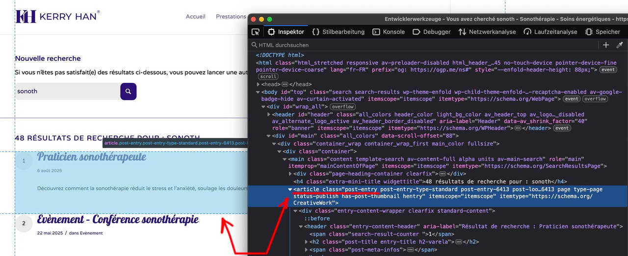
Get familiar with your browser’s developer tools! Does “this” belong to the articles?
 October 17, 2025 at 12:56 pm #1490347
You can now close ticket that’s all good for me and thanks to @Guenni007 for the solution !
October 17, 2025 at 5:10 pm #1490354Hi,
Thanks for the update, and thanks @guenni007 for helping out :-)
Please open a new thread if you should have any further questions or problems.
Best regards,
Rikard -
AuthorPosts
- The topic ‘Padding on search results page’ is closed to new replies.