-
AuthorPosts
-
January 8, 2018 at 7:03 pm #894846
on the top of the page, when the size of the browser is resized manually, the logo that is set as the default icon for the site overlaps with the menu and it looks awful
issue does not happen via mobile view
provided video of what is happening for context
I sent a support request about this issue about a week ago
January 8, 2018 at 7:04 pm #894849Hi,
Please refer to this post – https://kriesi.at/documentation/enfold/menu-overlaps-logo-on-tablets/
Cheers!
YigitJanuary 8, 2018 at 7:10 pm #894854this is not happening via tablet
it is happening via desktop computer
January 8, 2018 at 7:14 pm #894857Hey!
Have you checked this post – https://kriesi.at/documentation/enfold/switching-to-mobile-menu-on-higher-resolutions/ which is also linked in the link i posted? I believe it would help.
Regards,
YigitJanuary 8, 2018 at 7:17 pm #894860again, this is not a problem with a tablet or a mobile phone
this has to do with accessing the menu via a desktop computer
a lot of our customers still use desktop computers. I know that seems rare these days.
thank you for your upcoming assistance to help us out
January 8, 2018 at 7:38 pm #894872Hi!
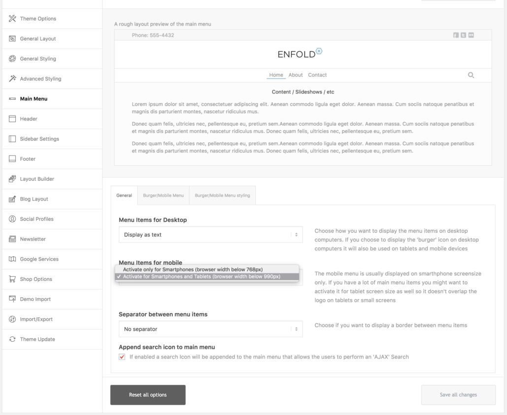
I can reproduce the issue below 1045px and i believe the most convenient way to solve the issue would be displaying mobile menu on tablets too

Which would be triggered at 990px and you can use the code provided here – https://kriesi.at/documentation/enfold/switching-to-mobile-menu-on-higher-resolutions/ to switch it to 1045px. Other alternative workaround would be decreasing font size of menu and size of logo but in my humble opinion switching to mobile menu would be a better user experience for your visitors.Regards,
YigitJanuary 8, 2018 at 8:01 pm #894889so if we were to switch the desktop site to have a mobile menu, then it would be our icon and then people could not view the options of software, hardware, support, contact, etc without clicking something?
I am not going to test this out during business hours in case it breaks something on our site
we also do not want to make it hard for our customers to figure out our menu. a lot of our demographic is not up to par with recent internet technology or have technology limitations in their places of business.
January 10, 2018 at 12:19 am #895428Hi,
Sure, let us know if there is anything else we can do from our side.
Thank you
Best regards,
BasilisJanuary 11, 2018 at 6:48 pm #896212UPDATE: it did not fix the problem. it makes it impossible to use the search bar because other items in the menu essentially overlap it.
we need another solution. not everyone who uses a website is looking at it via mobile or tablet. there needs to be solutions for desktop visitors.
thank you.
January 15, 2018 at 11:27 pm #897741 -
AuthorPosts
- You must be logged in to reply to this topic.
