-
AuthorPosts
-
July 6, 2018 at 4:18 pm #982119
I am using the Enfold “One Page Portfolio Demo” and have the following questions:
1) How can I make the menu display initially? Now it only shows after a scroll and I need it to always display but cannot find an option for this. I would also like the initial menu to be transparent at first and then turn dark when scrolled like it does now.
2) How do I make the logo area in the menu wider so I can include a longer company name without it being tiny? I saw where to change the header height but not the width of the logo. The size for the logo is 340w x 156h and it shrinks a 4-word company name to being almost unreadable in the menu.
3) How can I add a drop-shadow to the caption title & caption text in the full-screen slider so the white text is visible on a lighter background image?
4) Is there a way to add more text objects in front of the full-screen slider? I’ve tried dropping a text block and special heading but they appear above the slider, not in front of it.
Thanks!
July 7, 2018 at 5:10 pm #982512Hey David,
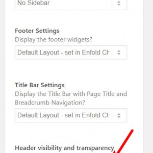
1: please change the “Header visibility and transparency” option in the “Layout” options in the sidebar of the editor, right now it should be set to “Header is invisible” try “transparent header”

2: to make the logo area wider, Try this code in the General Styling > Quick CSS field:#top #header_main .logo img { width: 340px !important; }3: for the text shadow, Try this code in the General Styling > Quick CSS field:
.slideshow_inner_caption {
text-shadow: 3px 1px 2px rgba(255, 255, 255, 0.7);
}
Here’s a Text Shadow Generator to try different settings.
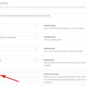
4: To add more text elements over the slider, first enable custom classes by checking the option at: Enfold Theme Options > Layour Builder > Show element options for developers
Then add your text element under the slider, such as a “special heading” element, and add a custom class, such as “text-overlay”

then use a negative top margin in the quick css to move the element up, like this:.text-overlay { margin-top: -200px !important; }Please adjust to suit.
Best regards,
Mike -
AuthorPosts
- You must be logged in to reply to this topic.
