
-
AuthorPosts
-
January 24, 2026 at 12:39 pm #1494264
Hello support-team,
i have a text-block and would need either two columns with different width or a table with two rows (also different size – size dependent on content) without any frames or background.
I´m having on this page a curriculum vitae with dates on the left and some text on the right. It should also be responsive, so that the text on the right on small screens is changing into a second line below (see example).example:
2005 – 2010 Influencer in Austria with a lot of followers2005 – 2010 Influencer in Austria
with a lot of followers
Thanks for your help!
JohannesJanuary 25, 2026 at 3:44 pm #1494284Hey Johannes,
The login is not working so we can’t see your “About Me” (Über mich) page. Once you correct the login can you also include a mockup image so we can have a better idea of what you want to do?Best regards,
MikeJanuary 25, 2026 at 8:20 pm #1494298Hey Mike,
sorry there was a spelling mistake with the user, with the one below it should work !
Here ist the mockup image https://freeimage.host/i/fPFK4gs
I hope this helps! It even would be better (different to the mockup), if the year would be in the same line with the first line of the text.
The text should be responsive, that means in one line on lager screens.
Thx JohannesJanuary 27, 2026 at 4:56 am #1494352Hi,
Thank you for the inquiry.
Instead of using paragraph tags in a text block, you can use this html to create an actual table element with your required format.
<table class="av-custom-table">
<tr>
<td class="av-custom-year">2005 – 2010</td>
<td>Influencer in Austria with a lot of followers</td>
</tr>
<tr>
<td class="av-custom-year">2011 – 2018</td>
<td>Physiotherapist specializing in sports rehabilitation</td>
</tr>
</table>
Then add this code in the Quick CSS field to adjust the style of table.
.av-custom-table {
  width: 100%;
  border-collapse: collapse;
}

.av-custom-table td {
  padding: 0.3em 0;
  vertical-align: top;
}

.av-custom-year {
  white-space: nowrap;
  padding-right: 1em;
  font-weight: 600;
}

@media (max-width: 600px) {
  .av-custom-table tr {
    display: block;
    margin-bottom: 1em;
  }

  .av-custom-table td {
    display: block;
  }

  .av-custom-year {
    padding-right: 0;
  }
}
Best regards,
IsmaelJanuary 27, 2026 at 8:46 pm #1494391Hello Ismael,
thanks for your reply!
I´m very sorry, but I don´t know anything about html at all! Where do i have to insert this html?
Do I have to write the other parts of the table into the html then in the same way like you showed me above?
Thanks for your help!
JohannesJanuary 27, 2026 at 9:16 pm #1494394Hello again!
I found it! Did it with the code-block and it worked! Sorry, that i didn´t find earlier!
But I still have following problems/questions:
1. When the screen size gets small (mobile), the year switches above the text and doesn´t stay beside the text. The text can switch into a second line but should stay beside the year. Do you know, what i mean? How can i change this?
2. How can I remove the frame and the grey background of the table? I would need a table without any frame and background.
3. How can I edit the font and the font size?
Thanks for your help
JohannesJanuary 28, 2026 at 5:43 am #1494409Hi,
Thank you for the update.
Where did you add the table? Please provide a direct link to the page, or create a test page so we can properly check the element — screenshots will also help.
Best regards,
IsmaelJanuary 28, 2026 at 11:01 am #1494424make a unordered list in a textblock – give a custom class to it – f.e.: my-listings
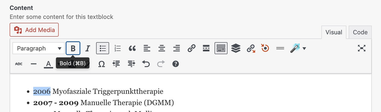
mark the years and make them bold via tiny-mce button
then just put this to your quick css:
.my-listings ul {
  list-style: none !important;
}

.my-listings li {
  display: grid;
  margin: 0;
  gap: 0 30px;
  grid-auto-flow: row;
  grid-template-columns: 140px 1fr;
  justify-content: start;
}

.my-listings li strong {
  font-weight: normal;
  justify-self: end;     /** now your years "float" right. **/
}
and:
/* === responsive styling === */
@media only screen and (max-width: 469px) {
  .my-listings li {
    grid-template-columns: 1fr;
    justify-content: center;
  }

  .my-listings li strong {
    font-weight: normal;
    justify-self: start;
  }
}
see your list including css code on : https://webers-testseite.de/joeconnert/
making the years bold will set the html to :
<li><strong>2011 – 2012</strong> Medizinische Trainingstherapie (Diemer & Sutor)</li>
So we have the option of selecting them separately. And bring them in a grid-layoutThis:
grid-template-columns: 150px 1fr;
determines the “column” width – the first one (the strong years) will have width of 150px – the other “column” fills the rest (fr: means fraction)January 28, 2026 at 11:16 am #1494425by the way – you can see the declarations on positioning inside a grid-layout on :
https://css-tricks.com/wp-content/uploads/2022/02/css-grid-poster.png
f.e. if you like to have the years left-aligned – change it to:
.my-listings li strong {
  font-weight: normal;
  justify-self: start;
}
January 28, 2026 at 2:28 pm #1494431Hi Ismael,
I added the table on the page ” über mich”.
For the Login see the data provided above!
if you want an example, how it should approximetely look like,you can visit my old homepageAlthough it would be better, if the year would also be in one line, not like on the old homepage!
I hope this information helps you!
@Guenni007: thanks for the help! Didn’t have time to try it so far!
JohannesJanuary 29, 2026 at 5:12 am #1494472Hi,
Thank you for the information.
To remove the background and border of the cells and place them side by side on mobile view, please add this css code:
.main_color .av-custom-table tr:nth-child(odd),
.main_color .av-custom-table tr:nth-child(even) {
    background: transparent;
    border: 0;
}

.av-custom-table, .av-custom-table td, .av-custom-table th {
    background: transparent;
    border: 0;
    font-size: 15px;
}

.av-custom-table tr {
    display: flex;
    gap: 10px;
}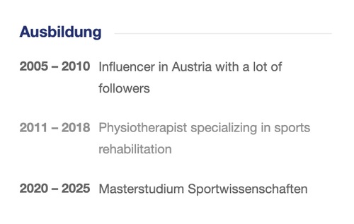
Best regards,
IsmaelJanuary 30, 2026 at 11:10 am #1494519ich weiss ehrlich gesagt nicht warum du dir das leben schwer machst.
Einfach eine Liste anlegen innerhalb eines Text-Blocks – die Jahre fett setzen, und dann nur noch diese Text Element mit einer Klasse belegen.
Den Rest macht das CSS. Da musst du nicht einmal html code setzen – oder ein Tabellen Plugin nutzen etc. Pures Enfold.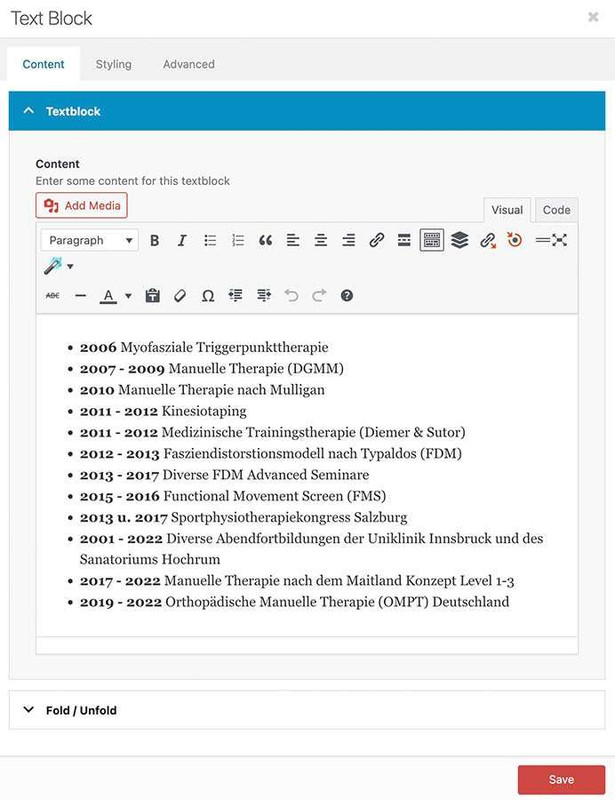
css auf der Seite: https://webers-testseite.de/joeconnert/
_________
To be honest, I don’t know why you’re making life difficult for yourself.
Just create a list within a text block – put the years in bold, and then just assign a class to this text element.
The CSS will do the rest. You don’t even have to set any HTML code.

CSS on the page: https://webers-testseite.de/joeconnert/
January 30, 2026 at 9:21 pm #1494528Hello Ismael,
entering the css didn´t really work. Not all of the frame was removed and all the background is slightly grey.
I actually don´t know, how to insert a screenshot in this message, otherwise i would have done. Maybe you can tell me for the future…
It also would be nice, if the colour of the font would be the same in every line.Johannes
January 30, 2026 at 9:37 pm #1494529Hallo Guenni007,
vielen Dank erst einmal für deine Vorschläge!
Ich habe es gerade ausprobiert. Irgendetwas scheint nicht zu funktionieren. Es wirkt so, als ob es den quick css-code nicht auf die Liste im Text-Element überträgt.
Ich habe, wie du gesagt hast
– die Jahreszahlen fett gemacht
– in die Benutzerdefinierte CSS-Klasse des Text-Blocks my-listings eingetragen und
– denn css code als ganzes kopiert und unter Allgemeines Styling in des Feld Quick CSS hineinkopiert.
In diesem Feld befindet sich darüber ein anderer CSS CodeWenn ich jetzt die Seite auf “Seite anzeigen” gehe, dann ist das Layout jedoch so, wie ich es in in den Text-Block eingetragen habe, d.h. die Änderungen vom Quick CSS werden irgendwie nicht angewedet. Hast du eine Idee, wo hier der Fehler sein könnte.
Wie bereits erwähnt, wenn ich wüsste, wie man hier Screenshots einfügt, dann würde ich diese hier posten :-).
Lg JohannesJanuary 31, 2026 at 4:24 pm #1494545Hi,
It looks like your “Über mich” page is a Draft, you need to Publish it and view the live page, when you view the Preview page WordPress doesn’t load all of the theme files. Give this try.Best regards,
MikeJanuary 31, 2026 at 9:40 pm #1494548PS: i see you. got some links on the text- see that it works even then on my testpage above if the whole text is the link ( as on your about page).
We can overcome this by setting the entire text on the right in italics using the “I” key, and then highlighting the individual word that should carry the link.
See the setting on the example page below the css code – (without that custom-class: my-linstings)
This may sound complicated, but it avoids having to set all “tables” as HTML. Use only the text block element. Also, take a look at the responsive behavior.February 1, 2026 at 3:45 pm #1494559Hello Mike, hello Guenni007
@ Mike: I published it, but it didn´t change anything.
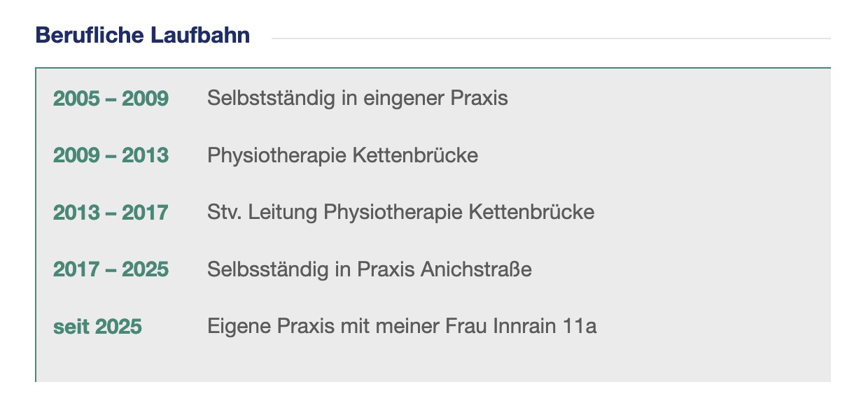
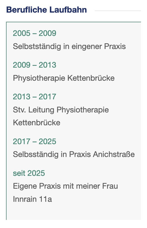
@Guenni007: Do you have an idea, why your suggestion doesn´t work (why the css code isn´t applied)?You can see the published page with the problemes here. The first table on the left ist the try from Ismael. The two below (years in green) on the left is the try from Guenni. The one at the right ist my try only with spaces between the year an the text.
Thank you!
JohannesFebruary 1, 2026 at 9:36 pm #1494566you are not using the list element :
on code view of the text-block it looks this way on my text page:
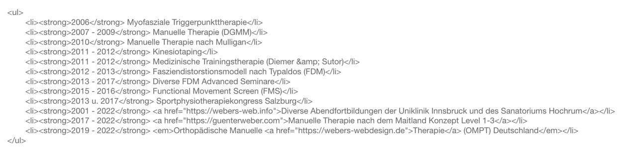
you have all p tags ( by line-break ) .
you know how get a unordered list?
just enter your text – make all years (the wohle years-block f.e. 2007 – 2009) bold.
Then highlight the wohle text and klick “bulleted List”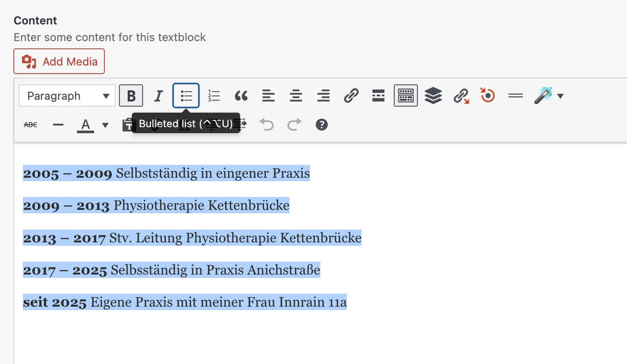 February 1, 2026 at 9:46 pm #1494567
Hello Guenni007,
now it works! Forgot the point with the “unorderd list”!
Thanks a lot! JohannesFebruary 2, 2026 at 3:28 am #1494568ok – du hast jetzt statt bold das mit der Farbe realisiert, das die Jahre in einen eigenen tag kommen. Das wäre so nicht nötig gewesen.
Denn die Farbe hättest du dann generell über dieses den strong-tag setzen können; so wie ich es auf der Beispielseite tat. Den bold style hatte ich dann ja mittels css zurückgenommen.damit meine Setzungen greifen, könntest Du jetzt eben das über dein span-tag machen:
#top .my-listings li {
  display: grid;
  gap: 0 20px;
  grid-auto-flow: row;
  grid-template-columns: 120px 1fr;
  justify-content: start;
  margin: 0;
  margin-bottom: 10px;
}

#top .my-listings li span {
  font-weight: normal;
  justify-self: end;
}

#top .my-listings li em {
  font-style: normal;
}

/* === responsive styling === */
@media only screen and (max-width: 469px) {
  #top .my-listings li {
    grid-template-columns: 1fr;
    justify-content: center;
    margin-left: 0 ;
  }

  #top .my-listings li span {
    font-weight: normal;
    justify-self: start;
  }
}
Das mit dem Kursiv setzen für den rechten Text brauchst du nur wenn du einzelne Begriffe dort verlinken möchtest. Wenn du immer den kompletten rechten Teil verlinkst, wie es in einem Beispiel auf deiner Seite war ist dies noch nicht mal nötig, da dann der ganze linke Teil in einem a-tag steht.
Diese Einstellung hier bestimmt wo die Jahre bündig sind:
#top .my-listings li span {
  font-weight: normal;
  justify-self: end;
}
wenn du z.B die lieber linksbündig hast, dann stelle justify-self : start
(ps kopiere und ersetze die my-listings Regeln komplett, da ich noch das margin-left der enfold Standard Einstellung damit überschrieb. Der #top selektor garantiert hier noch das ich keine unnötigen !important Regeln setzen muss um bestehende Regeln von Enfold zu überschreiben.bei deiner Schriftgröße würden für den linken Teil der Jahre auch 90px reichen:
grid-template-columns: 90px 1fr;wenn du die Jahre jetzt auf einen Schlag verändern willst, dann könntest du jetzt setzen ( bold und andere font farbe)
#top .my-listings li span {
  font-weight: bold;
  justify-self: start;
  color: #3f9681 !important;
}
(ps hier ist das !important nötig, da du einen inline-style gesetzt hattest – mit dem Einfärben im Textfeld)
wenn du der ganzen Liste ( also dem ul tag ) nur noch eigenschaften geben möchtest :
#top .my-listings {
  padding: 5px;
  background-color: #f8f8f8;
  border: 1px solid #3f9681;
  border-width: 1px 0px 0px 1px !important; /* unterschiedliche Border Weiten für : Oben, Rechts, Unten, Links */
}
Resultat wäre dann:
wenn dir der Abstand der Zeilen ( der li elemente ) zu groß ist, dann ändere diesen Wert bei den
#top .my-listings liauf z.B. 5pxdu siehtst, über diese custom class my-listings – ist dann alles geregelt. Sobald du eine Liste einsetzt, und den text-block mit der Klasse versiehst, wird die darin enthaltene Liste so dargestellt.
_____________
Responsiv ( für Mobile screenweiten im Hochkant Format)
 February 2, 2026 at 2:32 pm #1494589
Hallo Guenni,
vielen Dank für die ausführliche Beschreibung! Du bist manchmal schneller wie ich :-). Das mit dem Einfärben ist mir gestern nur zufällig aufgefallen, weil ich bei einer Liste vergessen habe, es auf bold zu setzen und die Jahre davor eingefärbt hatte. Jetzt habe ich es daweil so belassen und wollte es heute noch einmal auf bold ändern, aber du warst beim Kontrollieren schneller wie ich :-).
Werde es mir heute oder morgen noch einmal genauer anschauen und versuchen, dass ich CSS langsam etwas verstehe :-).
Lg Johannes
February 2, 2026 at 5:40 pm #1494594du kannst es auch so lassen. Da mit dem bold klick ist halt schneller als eine Farbe für das Jahr dann auszuwählen. Ebenso wenn du nur einzelne Worte im Text rechts als Link haben möchtest ist es leichter das kanze auf kursiv zu klicken und dann den Teil des Satzes verlinken. Das mit dem Kursiv setzen ist aber nur nötig wenn du eine kleinere Auswahl vom Text rechts mit einem Link versehen willst.
-
AuthorPosts
- You must be logged in to reply to this topic.