
-
AuthorPosts
-
February 20, 2025 at 11:42 am #1477473
Dear Support Team,
on the following page I have a problem with a few sections in the display on the tablet landscape format – all other devices are displayed correctly with a few settings, but for the ipad landscape, I just can’t get it to work:
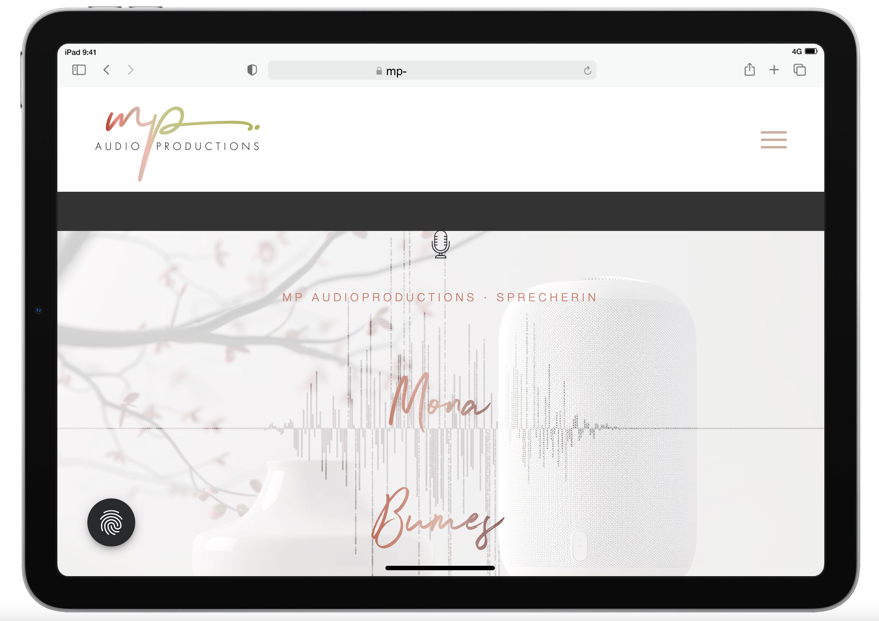
1. start section: Enter – movie in the background of the section
The Enter section exists twice: once only for the desktop version with the movie, and once with a still image in the background for the mobile devices. However, the desktop version is still displayed on the i-pad even though I have also hidden tablets in the settings. Here is a screenshot of the display on the tablet: https://mp-audioproductions.de/support/3.jpg > the movie doesn’t work, it looks messy with the black bars – or is there a way to scale the movie across the entire screen width? If not, then it would be good to switch to the section with the still image: Is that possible?2nd section Offers: https://mp-audioproductions.de/mona-bumes/#angebote
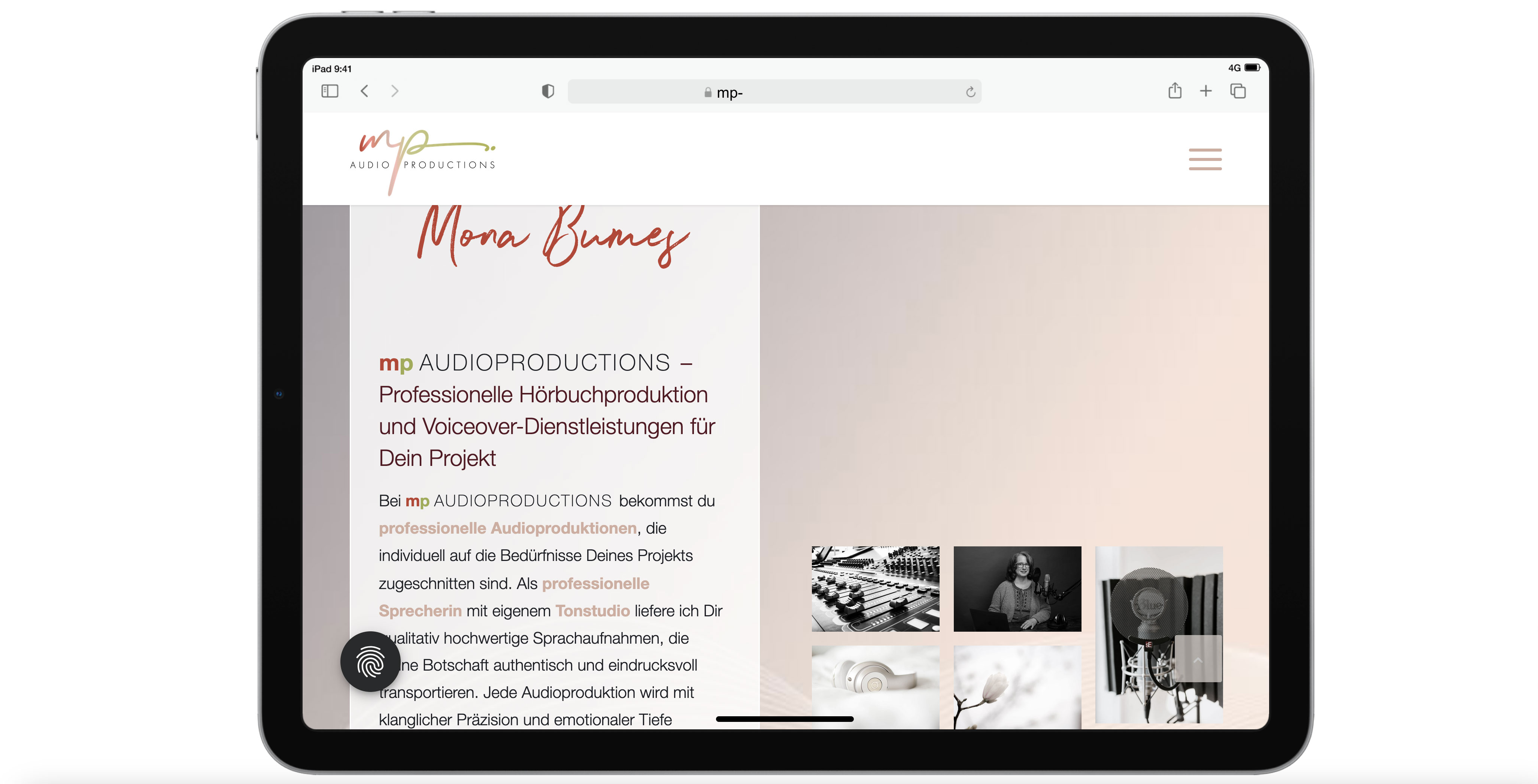
This also does not work correctly on the tablet: The cells are displayed next to each other (instead of below each other, as in other mobile versions): see screenshot: https://mp-audioproductions.de/support/1.jpg
> What setting do I need so that the cells are also displayed one below the other on the tablet landscape?3. contact section (last section): https://mp-audioproductions.de/mona-bumes/#kontakt
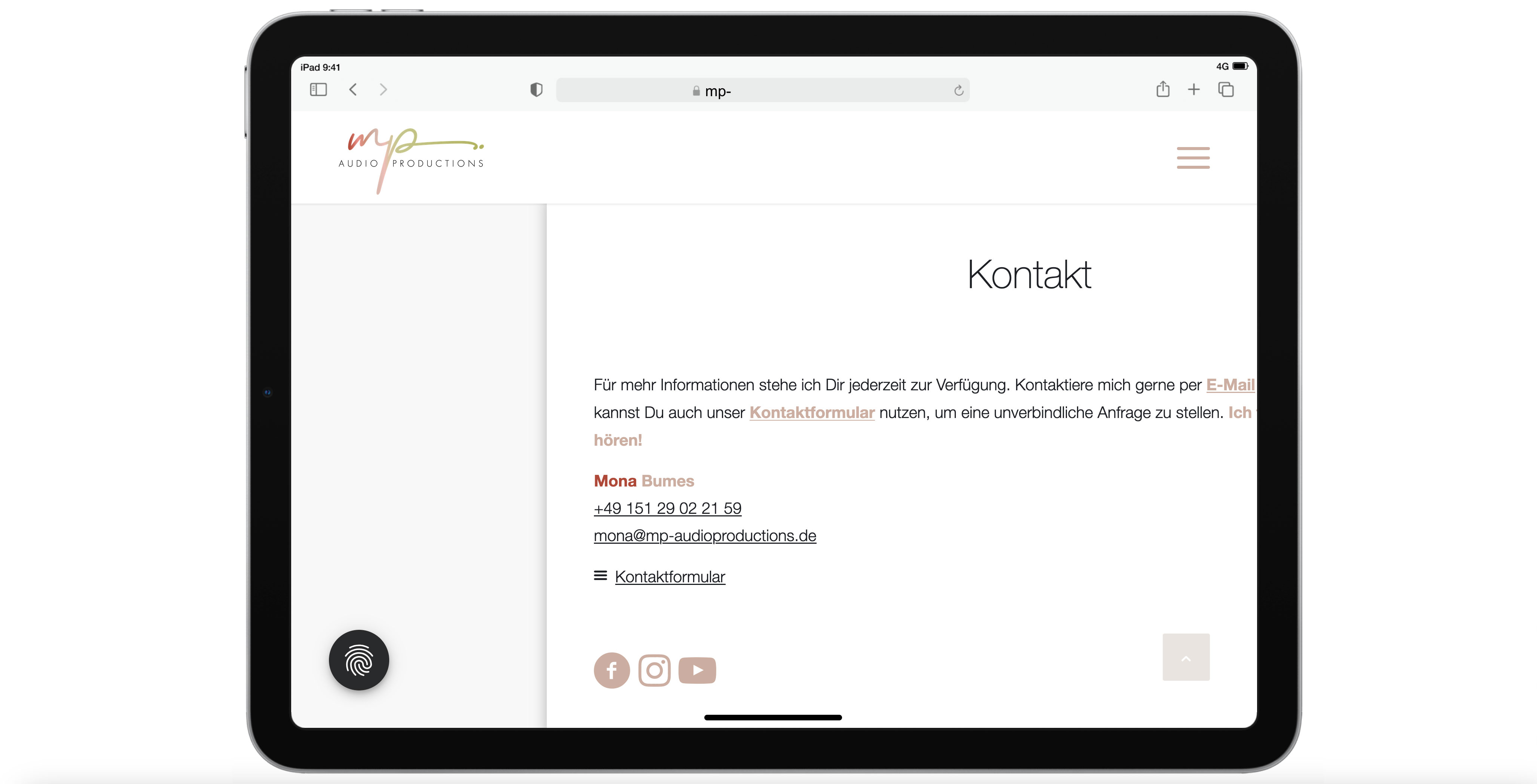
Display tablet landscape: truncated text on the right: https://mp-audioproductions.de/support/2.jpg
> In all other mobile versions, the cell with the contact details is displayed correctly centered, but not on the tablet landscape. What setting do I need here?With a request for support, best regards, Diana
February 22, 2025 at 10:08 pm #1477665Hey Diana,
Thank you for your patience, for the video on: https://mp-audioproductions.de/mona-bumes/
to remove the black bars, try this css:@media only screen and (min-width: 990px) and (max-width: 1360px) { #top .av-video-slide .avia-slide-wrap, #top .av-video-slide iframe { background: #fff; } #top .av-video-slide .avia-slide-wrap { height: 84%; } #top .flex_column.avia-builder-el-5.column-top-margin { margin-top: 0px; } #top #wrap_all .av-special-heading.av-m6wqj69t-b4e1d140677e492efdf2d8c0f9797c34 .av-special-heading-tag { line-height: 115px; } }After applying the css, please clear your browser cache and check.
Please note that testing with iPads & iPhones can be hard to clear the cache, often you need to also clear the history to fully purge the cache, following these steps for Safari and note Step 4 where you will Clear the History.Best regards,
MikeFebruary 23, 2025 at 12:56 pm #1477694Dear Mike
thank you very much for the script for the movie section and YES it works perfectly! :)
Now I still have the problem #2 and #3 regarding the tablet landscape optimization.
in addition to problem #2 (see also previous post): In the backend I have a color section here that contains 2 cells (half) next to each other. In one is the text (left) and in the other the masonry gallery. which css do I have to specify so that these cells are displayed BELOW each other and NOT next to each other even on the tablet landscape format.
and then to problem #3:
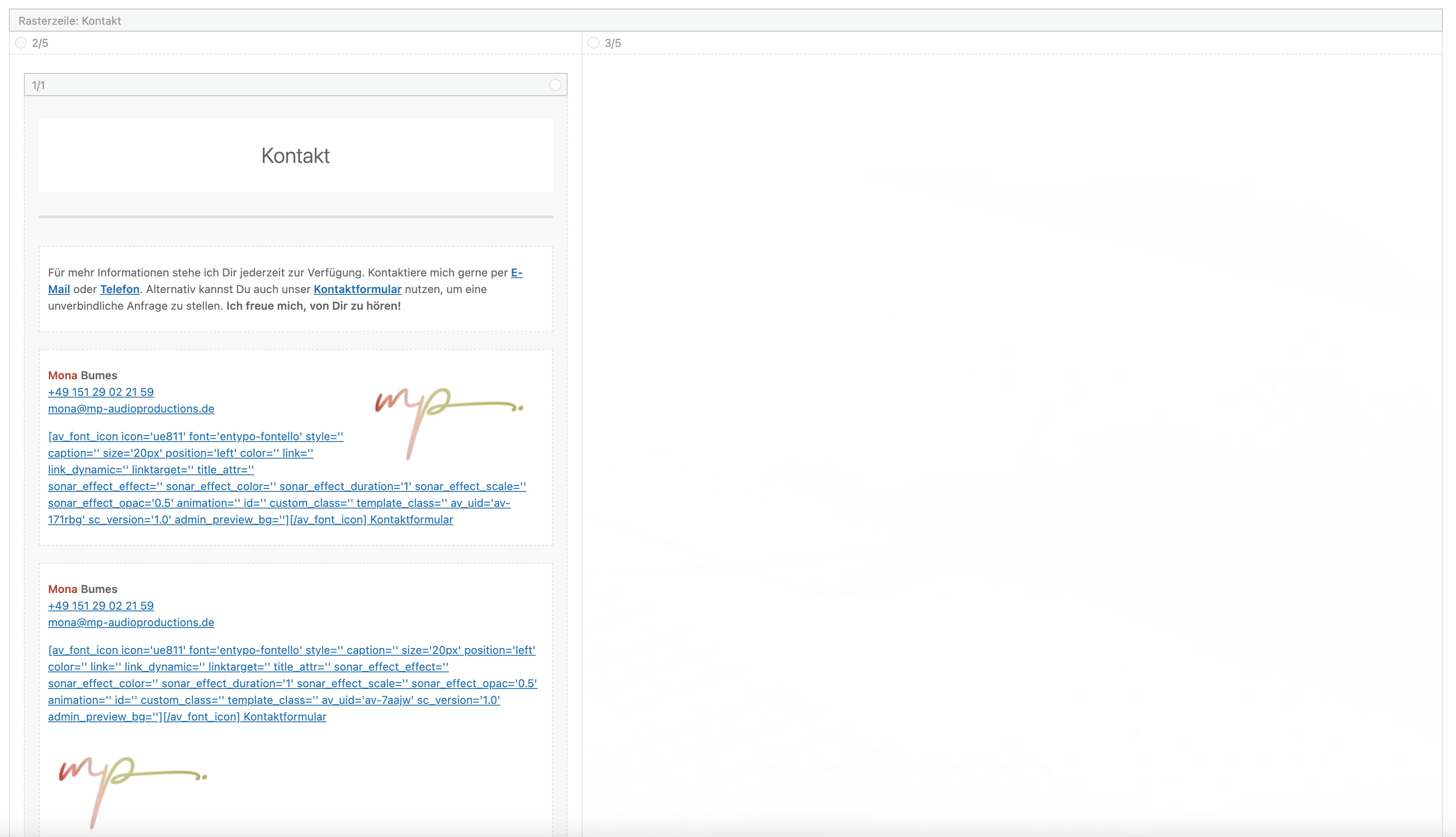
Here I have a gridrow in the backend > see screenshot: https://mp-audioproductions.de/support/4.jpg
The second cell on the right (3/5) is set to be hidden on mobile devices. So it works great on the cell phone and the tablet portrait format and only the left cell is displayed – even without the movement. And this is also how it should appear on the tablet landscape format. How can I achieve this?Best regards, Diana
February 24, 2025 at 5:43 pm #1477802Hi,
For the second issue try this css:@media only screen and (max-width: 1366px) { .responsive #top #wrap_all .flex_column.av-break-at-tablet, .responsive #top #wrap_all .av-break-at-tablet .flex_cell { margin: 0; margin-bottom: 20px; width: 100% !important; display: block; } #angebote .av-flex-placeholder { display: none; } }note that the media query is set to 1366px as I assume that is your iPad width, you can check your screen resolution here and adjust the css to suit.
Best regards,
MikeFebruary 26, 2025 at 9:17 am #1478003Hi Mike,
Awesome! It works PERFECT!
Could you please help me with Problem # 3 also?
Thanks a lot.
Best regrads, DianaFebruary 26, 2025 at 5:24 pm #1478041Hi,
Try this css:@media only screen and (min-width: 990px) and (max-width: 1366px) { #top.page-id-548 #kontakt .avia-builder-el-191 { transform: translateX(-200px) !important; } }Best regards,
MikeFebruary 26, 2025 at 7:32 pm #1478047Also awesome! I’ m so glad to finish this :)
THANKS A LOT :)February 26, 2025 at 7:45 pm #1478048Hi,
Glad we were able to help, if you have any further questions please create a new thread and we will gladly try to help you. Thank you for using Enfold.Best regards,
Mike -
AuthorPosts
- The topic ‘Mobile version Tablet landcape not working well’ is closed to new replies.