
-
AuthorPosts
-
December 23, 2024 at 11:32 pm #1474207
Hi all,
When I open my website ( https://www.nodem-it.com/dell-accessoires/ ) on mobile phone, it does not look good. The screen is weird. I can not see all my product.
How to solve this issues please ?I need to have the same result when even I open my website on PC.
Best regards,
December 24, 2024 at 11:39 pm #1474244Hi ,
Please some one. could help me ?
Best regards,
December 25, 2024 at 7:16 pm #1474256Hi ,
The tittle for each product is not appear in the right way. They customer can not read.
I need to reduce the size of the title of each product when I use mobile phone.
For instance When I open the “https://www.nodem-it.com/ubiquiti-switches/ ” in mobile phone . The text is not good and it is not possible to read anything.Please someone could help me ?
Thanks,
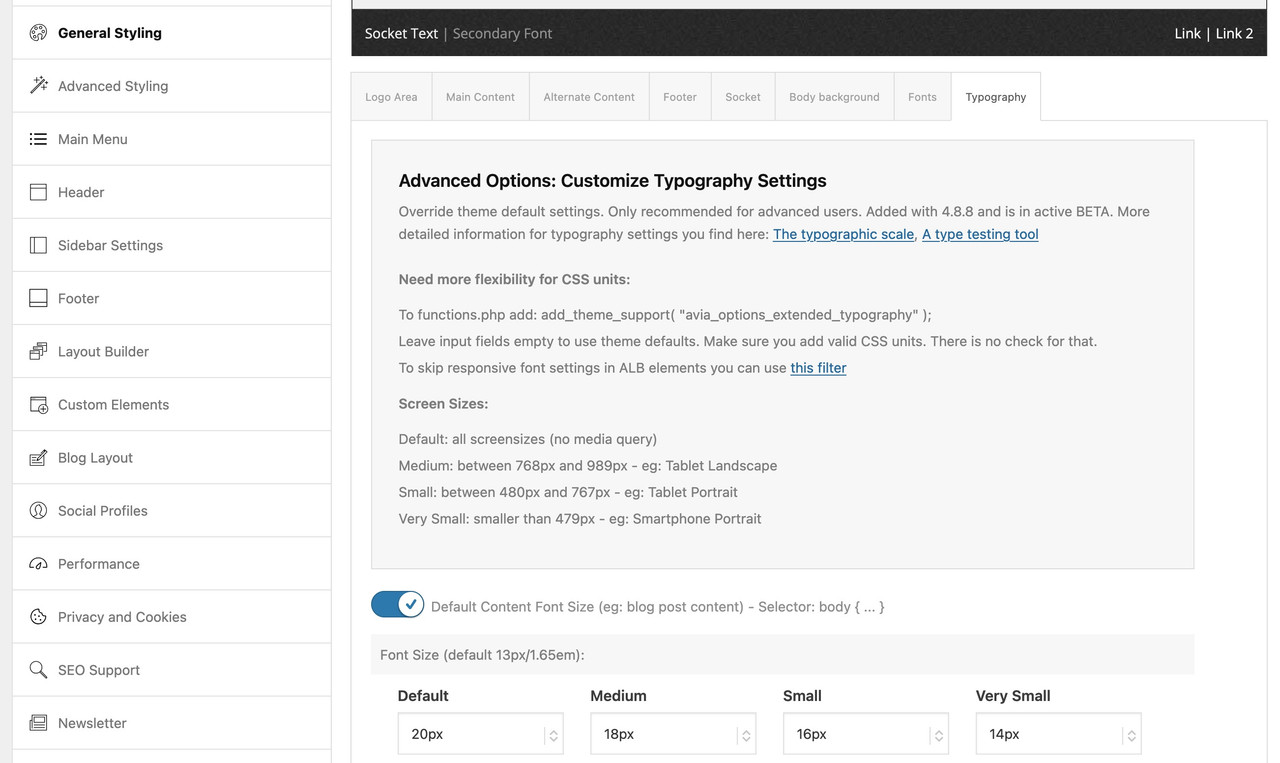
December 26, 2024 at 6:21 am #1474258You have to find these rules:
@media only screen and (min-width:768px) and (max-width:989px) {
  body,
  body .avia-tooltip {
    font-size:80px
  }
  h1 {
    font-size:60px
  }
  h2 {
    font-size:50px
  }
  h3 {
    font-size:42px
  }
}
@media only screen and (min-width:480px) and (max-width:767px) {
  body,
  body .avia-tooltip {
    font-size:66px
  }
  h1 {
    font-size:46px
  }
  h2 {
    font-size:37px
  }
  h3 {
    font-size:29px
  }
}
@media only screen and (max-width:479px) {
  body,
  body .avia-tooltip {
    font-size:53px
  }
  h1 {
    font-size:38px
  }
  h2 {
    font-size:28px
  }
  h3 {
    font-size:20px
  }
}
This is a very unusual scaling.
First of all, the value for the base (body) is set very high.
Even if you take the aspect of wai aria into account, a body font-size of 53 ( below 479px) is gigantic. For desktop screen widths, this is 13px.
Here I would rather go higher, e.g. to 16px.Because you have set a merging of the styles – i can not say where the rules comes from ( maybe it is a merging of W3total Cache ).
have a look if you have set on General Styling – Typography these values or in your quick css.
 December 26, 2024 at 9:29 am #1474259
Hi
I took the value that you told me .
Now it look better .Best regards
December 26, 2024 at 10:14 am #1474260Hi Guenni007,
Please could you know how do put the EAN to H1 for each product ?
I need to increase the size of EAN and SKY for each product. How can I do please ?
Best regards,
December 26, 2024 at 11:08 am #1474263Hey!
Please check this : https://kriesi.at/support/topic/sku-field/#post-1474262
Best regards,
IsmaelFebruary 20, 2025 at 9:00 pm #1477501Hi ,
the information that scrolls on my page when I open my website on the PC is not visible when I open my website on my mobile phone.
How can I solve this please ?February 21, 2025 at 5:46 am #1477533Hi,
Would you mind opening another thread and providing a screenshot of the issue? You can use platforms like Savvyify, Imgur or Dropbox to upload and share the screenshot. Here are the steps to follow:
1.) Visit the website of your chosen platform, such as Savvyify, Imgur or Dropbox.
2.) Locate the option to upload a file or an image.
3.) Select the screenshot file from your computer or device and upload it to the platform.
4.) After the upload is complete, you will be provided with a shareable link or an embed code.
5.) Copy the link or code and include it in your message or response to provide us with the screenshot.Thank you for taking the time to share the screenshot. It will help us better understand the issue you’re facing and provide appropriate assistance.
Best regards,
IsmaelFebruary 21, 2025 at 3:24 pm #1477561February 21, 2025 at 3:25 pm #1477562February 21, 2025 at 3:27 pm #1477563The following text: Cisco Meraki vous propose should be in the left position where there is the while color in my the image.
February 21, 2025 at 4:47 pm #1477571Hi,
Try this CSS in your Enfold Theme Options ▸ General Styling ▸ Quick CSS field:@media only screen and (max-width: 479px) { #top.home .slideshow_inner_caption { width: 50%; } #top.home .avia-slideshow .av-slideshow-caption .avia-caption-content p { font-size: 9px; line-height: 9px; margin-bottom: 0; } #top.home .avia-slideshow .avia-slideshow-button { margin-top: 10px; font-size: 9px; } }
Best regards,
MikeFebruary 21, 2025 at 4:59 pm #1477572Hi,
Thanks,
I did but nothing has changed
February 21, 2025 at 7:07 pm #1477578It is ok now
ThanksFebruary 21, 2025 at 10:17 pm #1477583Hi,
Glad we were able to help, if you have any further questions please create a new thread and we will gladly try to help you. Thank you for using Enfold.Best regards,
Mike -
AuthorPosts

- The topic ‘Mobile screen result’ is closed to new replies.