-
AuthorPosts
-
April 16, 2018 at 5:03 pm #942655
Hi Kriesi team!
I’m totaly new to Enfold but the First impression that it’s looking good!
I’m working on my new website and I’m struggling with some simple issues.
I already searched the forum but don’t get the right awnsers. I already tried several CSS codes but don’t get things fixed.Some menu issues I can’t figure out:
• I want to logo to be in one line with the topmenu buttons. So that logo and menu text is vertical aligned.
• The header picture must start underneath the semi-transparant menu. Just like https://kriesi.at/themes/enfold-restaurant/ that’s what I’m aiming for.
• I would like a dropshadow under the topmenu. At the Header Style settings I can choose for ‘Minimal with dropshadow’ but than I’ll loose the indicators and transparency which I like. It would be great if you can select the features. But can I add an dropshadow and keep the indicators and transparency? And can you also tell me how I set the transparency?I also have some page-issues, I will open a new ticket for that.
Thanks in advance.
BR Jolanda GoosApril 18, 2018 at 5:48 am #943405Hey goosgrafisch,
Thank you for using Enfold.
1.) Adjust the top position property of the logo.
@media only screen and (min-width: 768px) {
.logo img {
    top: 80px;
    position: relative;
}

.header-scrolled .logo img {
    top: 20px;
}
}
2.) Adjust the top padding of the first container.
.home .main_color.container_wrap_first.container_wrap.fullsize main.template-page.content.av-content-full.alpha.units {
    padding-top: 0;
}
3.) How do you want to apply the drop shadow? Please provide a screenshot on imgur or dropbox.
Best regards,
IsmaelApril 26, 2018 at 7:46 pm #9474371) solved. thank you. It would be nice if this could be set in the theme settings.
2) The header picture must start underneath the semi-transparant menu. Just like https://kriesi.at/themes/enfold-restaurant/ that’s what I’m aiming for. I tried to set the padding to a negative number but that doesn’t solves it.
3) Never mind the dropshadow. I’ll come back for this another time maybe.
April 28, 2018 at 7:36 pm #948432May 7, 2018 at 10:10 pm #952929.cb1 {margin-top: -50px !important; }
this solved the issue. Thanks Mike!May 7, 2018 at 10:15 pm #952935Sorry, it solved the slider under the menu issue but I still can’t set the height of an container/content section.
see http://www.testuweigenwebsite.nl/goosgrafisch/
I’ve made the container red. I want this to be 10 pix heigh. It’s just a visual thing.
Thanks in advance!May 8, 2018 at 12:12 am #952980Hi,
Thanks for making it red, it really helps :)
Please try:#top.home #main #av_section_1.avia-section { min-height: 10px !important; max-height: 10px !important; }Please clear your browser cache and check.
Best regards,
MikeMay 8, 2018 at 12:48 am #952983Thanks Mike!
And if I have the same issue with another container futher in the website?
Not now, but for in the future?
Contacting you or can I solve it myself?
BRMay 8, 2018 at 3:04 am #953022Hi,
We would be happy to help, but you could try using this code again, most likely the “#av_section_1” will be a different number like “#av_section_6” using your browser’s inspector tool would show you the number.Best regards,
MikeJune 28, 2018 at 11:02 pm #979134Hi Mike,
I assumed my issue regarding the top image on my page, underneeth the menu was solved. But when I checked on my iPhone, I get lots of space. Obvious because I said so in the code…
I tought i install the Enfold Restaurant theme but then i loose al my settings which I already have made :$
At the restaurant theme, on iPhone, the menu isn’t transparant but the image still starts at the top, underneeth the menu. At the restaurant theme it’s exactly how I want my menu.
Mybe it’s in my header slider (Master Slider plugin)? Can you tell me how the header/slider of the restaurant is made? With which plugin and settings. Than I will set my images exactly the same. Maybe that will help.So I want the page to start underneeth the transparant topmenu so the header image is visable underneeth the top menu.
I hope you can help me out again.
Thanks in advanceJune 29, 2018 at 4:11 am #979179Hi,
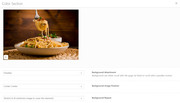
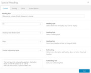
The restaurant demo uses the color section element with the image as a background and a Special Heading element on top.


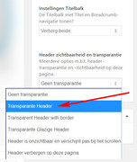
The reason the image is under the menu is because the header is set to transparent in the “layout” option

I hope these screenshots help, please let us know if there is anything else we can assist with.Best regards,
MikeJuly 2, 2018 at 9:57 pm #980309Hi Mike,
Yes that does help me a lot!!
It’s a hole different way of building the header then I used to with externa sliders. Much better like this.
Is it also possible to get the transparant header when it’s on “Scale to fit” I would love to have the full image always visable.
Or do you know another way to tackel this? Maybe to save my image on a different way? I now design my sites in Photoshop at 1920px width.Thanks in advance
Best regards,
Jolanda GoosJuly 3, 2018 at 2:21 am #980352Hi,
Sorry, I’m not sure that I understand, when I look at the page above, the image seems to be full width.
Although it looks like you are using the parallax effect causing a gap at the top near the header.Best regards,
MikeJuly 4, 2018 at 12:56 pm #981145Sorry Mike,
I was editing at a different website instead of Goosgrafisch.nl.. Please check http://www.testuweigenwebsite.nl/justbyhand/
I set the image to Scale to fit, then the images starts below the menu not underneeth.Thanks again.
Best regards, Jolanda GoosJuly 4, 2018 at 7:35 pm #981330July 5, 2018 at 10:41 pm #981768Hi Mike,
That was it! Stupid that I didn’t saw that myself.
Still have 1 small issue, below the image, there is a padding of approx. 10 px, I made the backgroundcolor of the section red, so you can see where. Can you tell me how I delete this?
And is there a way to put a nice shadow below an image?Thanks again.
July 6, 2018 at 1:43 am #981787Hi,
Please try changing the Background Attachment from parallax to scroll, if you still have some padding we can remove it and add a shadow.Best regards,
MikeSeptember 12, 2018 at 3:15 pm #1008972Hi Mike,
Evertyhing worked out fine with the header image underneeth the menu. BUT when I test on my iPhone, I don’t see the image at all.
Can you help me out with this?And can I change the transparant header to 50% transparant with a # color? I would like to have it 50% cyan.
September 13, 2018 at 4:39 pm #1009496Hi goosgrafisch,
Here is the code you can put in Enfold > General Styling > Quick Css, if it does not work, put into themes/enfold/css/custom.css
@media only screen and (max-width: 767px) {
   #av_section_1 .av-parallax-inner.avia-full-contain {
       background-attachment: scroll !important;
   }
}
If you need further assistance please let us know.
Best regards,
VictoriaSeptember 14, 2018 at 11:29 am #1009866Hi Victoria,
Thanks for the quick reply. I added the code in de Quick CSS and in the customs CSS but both didn’t give any response on my iPhone.
Do you know another option?
Can you check how it’s done at the Restaurant theme?September 14, 2018 at 11:31 am #1009867Note: I’ve got an cache cleaning plugin installed. Sometimes this blocks an adjustment. You can clear the cache at WP Fastest Cache, secend tab, 2 blue buttons to clear cache.
September 16, 2018 at 3:02 pm #1010407Hi goosgrafisch,
Here is the code you can put in Enfold > General Styling > Quick Css, if it does not work, put into themes/enfold/css/custom.css
@media only screen and (max-width: 767px) {
   #av_section_1 .av-parallax-inner.avia-full-contain {
       background-attachment: scroll !important;
	   background-size: cover !important;
   }
}
If you need further assistance please let us know.
Best regards,
VictoriaSeptember 19, 2018 at 9:22 pm #1012030Thank you Victoria!
That does get the image where I want it!
I’ve tried to make the image a bit smaller to adjust the width px / changed it in to max-height, but it I think that my iPhone doesn’t refresh correctly. :$Is it also possible to scale the image by percentage with another css code?
Is it correct that you de-activate the cache cleaning plugin?
Thanks in advance!
September 24, 2018 at 5:12 pm #1013709Hi goosgrafisch,
Well, background size is either cover or contain and contain will make the image very small.
Best regards,
VictoriaSeptember 30, 2018 at 5:33 pm #1016295Hi Victoria,
Is it also possible to choose another image for mobile view?
Or another way to tackle this?
Thank you!
Best Regards,
JolandaSeptember 30, 2018 at 6:28 pm #1016301Hi,
You can create another element that will show on mobile, and hide this one on mobile.
For example, often a slider doesn’t look good on mobile so it’s possible to hide it and show a simple image instead, or show a different slider made just for mobile.
Please see this post: how to hide some elements in mobile versionBest regards,
MikeOctober 1, 2018 at 8:51 pm #1016742Hi Mike,
Thanks, that’s exactly what i was looking for.
I now created 2 content sections with both an background image, 1 for large screens and the other one for small screens. I check the desired boxes at ‘screen options’ but I don’t see anything happen on my telephone.
The website is still showing the same content section, the other one isn’t visible on large screen, so that goes right. But on my mobile i keep the same first section visible, not the second.In the WP css editor I’ve added this code to get the background image visible in the first place.
I changed it to _2 but that didn’t make any change. (I’ve cleard by Safari browser but I doubt if it really clears correctly.)Do I need to change the previous added code??
@media only screen and (max-width: 767px) {
#av_section_1 .av-parallax-inner.avia-full-contain {
background-attachment: scroll !important;
background-size: cover !important;
}
}Thanks again in advance
October 2, 2018 at 3:55 am #1016836October 2, 2018 at 6:45 pm #1017176Hi Mike,
I send them over again. Hope it works now.
It is possible that you first get an colorfull page, it’s a securitypage. Please hit ‘I’m not a robot’ to proceed.Thanks again for your help.
Best regards,
JolandaOctober 3, 2018 at 6:19 am #1017355Hi,
Thank you for the login, I have looked at your homepage and found that the two different images are showing, for each screen size when testing on my Android with Chrome in a incognito window, that shows the site without a browser cache.
But I did find that in mobile there was extra space below the image and before the text. In desktop there was also this space.
I added this css to your WordPress > Customize > Additional CSS, also seen as the “customizer” in the black admin bar above your site when logged in.@media only screen and (max-width: 767px) { #av_section_2 .av-parallax-inner.avia-full-contain { background-attachment: scroll !important; background-size: cover !important; } #av_section_2 { height: 600px !important; } } @media only screen and (min-width: 768px) { #av_section_1 .av-parallax-inner.avia-full-contain { background-attachment: scroll !important; background-size: cover !important; background-position: center -200px !important; } }In the code you will see that the “av_section_2” is your mobile size and the width is a max of 767px, and I added a height of 600px to the “av_section_2” container to remove the extra space.
Where your desktop size is “av_section_1” and it has a min of 768px and I added background-size of cover, and then gave the image a -200px position to center the text of the image.
Please see the screenshots in Private Content area.
I hope this is in line with what you are trying for, if not then please remove the css and it will go back to the way you had it.
As for your Safari not clearing it’s cache, please see this article: How to Use Safari’s Private Browsing Mode and Delete Your Browsing History in iOS 11
Please let us know if this helps.Best regards,
Mike -
AuthorPosts
- You must be logged in to reply to this topic.


