Hi,
my menu is overlapping the logo (I suppose this is happening since I added another menu item), when resizing the window or using the ipad (example here).
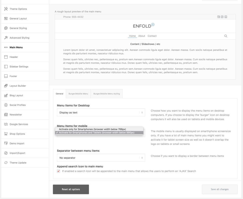
Is there a simple setting to define at which resolution the “burger-menu” should appear?
I already tried several quick CSS codes from older threads but they don’t work for me.
(I already use some “@media only screen” codes to address some other issues).
Could you please have a look (login data in private area).
BR
Florian
Hey Florian,
I simply went to Enfold theme options > Main Menu and choose to switch to mobile menu on tablets

Please review your website :)
Best regards,
Yigit
Thanks Yigit!! I was looking for an option like that, but couldn’t find it… :)
I tested it on my iPad and it works fine for the menu, but it turned out that the social icons shrunk down in size (see here).
How could that be solved?
BR
Florian
Hi,
So you would like the links to be the same size as the desktop.
Best regards,
Jordan Shannon
Hi,
the social icons should have the same size as the menu icon and the search icon.
BR
Florian
Hi Florian,
I added following code to bottom of Style.css file of your child theme in Appearance > Editor
@media only screen and (max-width: 989px) and (min-width: 768px) {
.responsive .main_menu ul > li > a {
    font-size: 18px;
}}
Please review your website :)
Best regards,
Yigit
thanks Yigit, it worked fine!!
