-
AuthorPosts
-
August 5, 2019 at 12:59 am #1124597
Hi,
I am working on the mega menu, see it for the BLOG https://www.ninserviziogratuito.co.uk/blogI tried to explain all in the screenshot https://www.screencast.com/t/S45BHP2fnyF2
7 categories in 2 lines, the second line are only 3, how do I align them on the left?
add border around at the sides of each category. A short border. Borders are already there, I just would like to make thicker and different color
Making sub-links and category titles bold (only for mega menu)thanks,
MarcoAugust 6, 2019 at 4:51 pm #1125168Hey Marco,
Thanks for providing the screenshot.
Can you try adding this css code in Quick CSS, located in Enfold > General Styling:#top #header .avia_mega_div > .sub-menu > li { max-width: 25% !important; display: inline-block; } #header .mega_menu_title, #header .avia_mega_div .avia-menu-text { font-weight: bold; }Hope it helps.
Best regards,
NikkoAugust 6, 2019 at 5:04 pm #1125176Hi Nikko,
thanks, it worked partially.The alignment of the 3 categories on the second line is now on the left, but how do I obtain bold links (only the links in the mega menu) and how I make the dividers thicker?
thanks
MarcoAugust 6, 2019 at 5:55 pm #1125186can you try this to see if it fits your needs – we had to use the flex model to style it:
#top #header .avia_mega_div { max-height: calc(100vh - 200px); overflow: auto !important; } #top #header .avia_mega_div > .sub-menu { display: flex; align-items: stretch; justify-content: flex-start; } #header .avia_mega_div .units { border-right: 4px solid #010660 ; } #header .avia_mega_div .avia_mega_menu_columns_first { padding-left: 15px; border-left: 4px solid #010660; } #header .avia_mega_div .avia_mega_menu_columns_last { border-right: 4px solid #010660; }- the max-height is necessary for example for ipad – that mega menu is scrollable inside.
- the stretch makes the columns inside the same height – so the borders can have the same length
- if you don’t liike the left border on first row and right border on last element – get rid of the last two rules
August 6, 2019 at 6:19 pm #1125192by the way – if this is the mega menu for your blog – each item got his own featured image ?
you can have infront of each mega-menu li your featured image
see here on a test page: https://webers-testseite.de/lepper/
look to “Was wir bieten” Mega Menuit is a code from ismael that works perfectly – see here:
https://kriesi.at/support/topic/on-mega-menu-show-in-front-of-list-points-the-featured-image/#post-688912after you only have to style these little images ! :
.main_menu .avia_mega_div .attachment-thumbnail.size-thumbnail.wp-post-image
on that line :if ($args->menu->name != 'Main Menu') return $sorted_menu_objects;you must enter the name of your main menuAugust 7, 2019 at 10:08 pm #1125727Guenni,
wow, you coming from the heaven :-)thank you a lot.
See the screenshot please https://www.screencast.com/t/3DbkXvI6Jp5
A few things do not work.
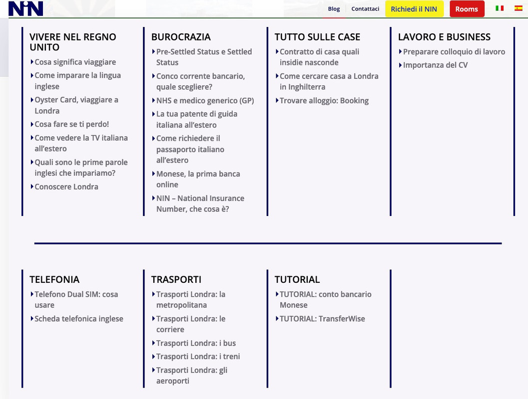
– For example, the boxes in top line are not aligned with the boxes in bottom line
– How do I get the middle line between top and bottom same as the borders at the sides?
– Notice the right border, is nor linear, has a little recess. Do you know why? (YOU WILL NOT SEE THAT NOW BECAUSE I MADE THE BORDERS ONLY 1PX)
– How do I change individually the size of the TITLE and the size of the Sub-links? I can change it but they both change. I would like to give them different sizes.
– How do I change the size of the mega menu container so that I do not need to scroll on desktop?
– How do I change the size of the bullets points? In this case triangles?
– Pics on mega menu, I loe this idea. I tried the code and changed the title menu. but I cannot obtain the pics. Any idea?By the way great great job :-) very happy
MarcoAugust 8, 2019 at 11:49 am #1125896can you first add this:
#top #header .avia_mega_div > .sub-menu > li {
    flex: 0 1 25%;
}

#header .mega_menu_title {
    font-size: 22px !important;
}

.avia_mega_div .avia-bullet {
  margin-top: 9px;
  border-top: 6px solid transparent !important;
  border-bottom: 6px solid transparent !important;
  border-left: 6px solid #010660;
}
then we will see how to go on …
August 8, 2019 at 12:20 pm #1125912that rule here:
#top #header .avia_mega_div {
    max-height: calc(100vh - 200px);
    overflow: auto !important;
}
is for scrollable mega menu.
If the height of the mega div is more than the screen-height the overflow is on .
you can play a bit with the value 200px 50px seems to be enoughAugust 8, 2019 at 1:17 pm #1125940it is hard to style a border-top width – means you can not influence it without making changes to ul itself.
but we can get rid of that little border top (dashed) and insert between these rows a html that we can style. Even a custom hr of enfold would be possible.so to get rid of dashed border:
#top #header .avia_mega_div > .sub-menu.avia_mega_hr {
	border-top: none;
}
put this to child-theme functions.php:
function insert_mega_div_separator() {
?>
<script>
(function($){
$('<div style="margin-top:20px; margin-bottom:20px;" class="hr hr-custom hr-center"><span class="hr-inner inner-border-av-border-fat" style=" width:90%; border-color:#010660;"><span class="hr-inner-style"></span></span></div>').insertBefore('.avia_mega_hr');
})(jQuery);
</script>
<?php
}
add_action('wp_footer', 'insert_mega_div_separator');
you see here that you can have influence via width 90% etc
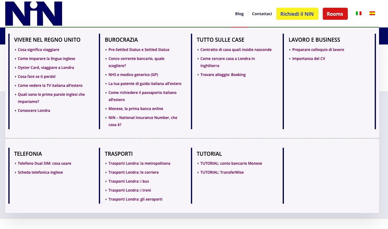
Result:
 August 8, 2019 at 6:00 pm #1125996
– Pics on mega menu, I loe this idea. I tried the code and changed the title menu. but I cannot obtain the pics. Any idea?
Hi Guenni,
first post all ok, changed according to your code and everything worked.Second post:
1) I actually do not need the scrolling bar. What I would need is that the mega manu scrolls down with the page. If I scroll down the page the mega menu has to stay above. By doing this I will not need the scrolling bar within the mega menu. Here you have an example of what I am trying to get
https://sos-wp.it/blog/ Put the cursor of the mouse on the blog above2) Separator is fine, how do I make 1px ? Margin bottom and top, even if I change them, I cannot make it closer. I would like to make the container a bit smaller leaving less spaces (right top left bottom)
3) I can hide the left bar but not the right bar with this (see below the code used to hide it)
#header .avia_mega_div .avia_mega_menu_columns_last {
border-right: 1px solid #010660;
}4) there is something that hid the hover of the triangle / bullet point:
this is the code used but it is not working anymore and I could not identify why.
#top #header .avia_mega_div li a:hover .avia-bullet {
border-color: #009CE1;
}Last think (number 5) would be the images in the menu a small image before each sub link
Again, thank you :-)
Marco
August 8, 2019 at 7:25 pm #1126013Hi again,
number 2) this is how I would like to have it https://www.screencast.com/t/B5TrV7q9Thanks
MarcoAugust 8, 2019 at 9:28 pm #1126039on insertion into functions.php : replace it with:
function insert_mega_div_separator() {
?>
<script>
(function($){
$('<div style="margin-bottom:10px;" class="hr hr-custom hr-center"><span class="hr-inner inner-border-av-border-fat" style=" width:80%; border-color:#010660;"><span class="hr-inner-style"></span></span></div>').insertBefore('.avia_mega_hr');
})(jQuery);
</script>
<?php
}
add_action('wp_footer', 'insert_mega_div_separator');
this has influence to the lines – add or change the existing rules to:
#top #header .avia_mega_div > .sub-menu {
padding: 20px 30px 10px;
}

.hr-custom .hr-inner.inner-border-av-border-fat {
    border-top-width: 1px;
}

#header .avia_mega_div :not(.avia_mega_hr) .avia_mega_menu_columns_last {
    border-right: none !important;
}
Well, I almost had to help with that, didn’t I? ;)
now i’m out sorry – the next patient is already waiting.btw: chrome on pc got the advantage that you can let the dropdown menus open when exploring them with a shortcut
believe it is F8Safari on Mac did the trick without shortcut.
August 8, 2019 at 9:41 pm #1126041on 1)
1) I actually do not need the scrolling bar. What I would need is that the mega manu scrolls down with the page. If I scroll down the page the mega menu has to stay above. By doing this I will not need the scrolling bar within the mega menu. Here you have an example of what I am trying to get
https://sos-wp.it/blog/ Put the cursor of the mouse on the blog aboveyou decided to have a sticky header – if this not the case ( like on your example page) the mega menu scrolls out .
August 8, 2019 at 10:54 pm #1126063Super,
thanks Guenni :-)August 9, 2019 at 12:30 am #1126076Nothing,
I cannot figure it out. For some reason the internal bars have disappeared leaving space to the dotted ones. I checked everything that you gave me, nothing, I cannot find where the mistake is. I also inspected the code and I can see the code of the dotted lines, but I cannot overwrite it with your instruction.

And the code used it he one you gave me
/* barra verticale tra categorie NOT WORKING WHY?? */
#header .avia_mega_div .units {
border-right: 1px solid #010660;
}Why?
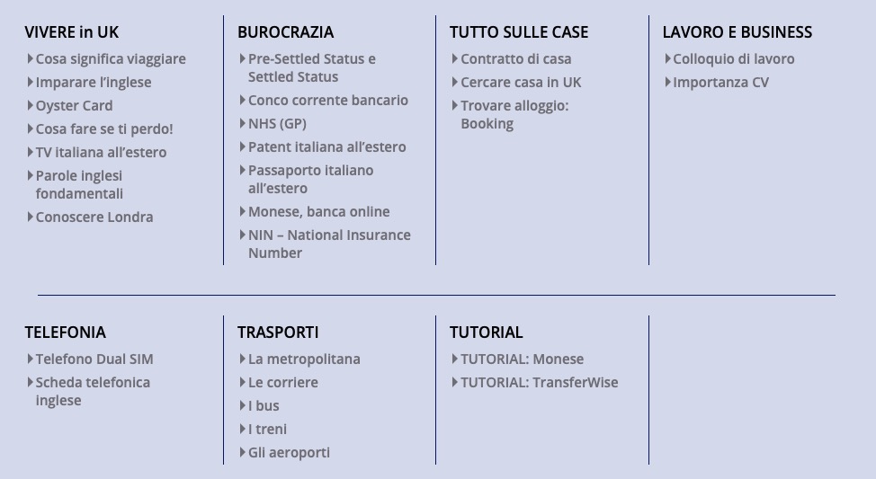
August 9, 2019 at 7:16 am #1126110this was the screenshot you gave me as you would like tlo have it:
my comment :this has influence to the lines – add or change the existing rules to:
add new rules gave to you – change existing ones gave to you!
so all have right border – except the first row last column
where is that rule gone:#header .avia_mega_div .units { border-right: 1px solid #010660 ; }On your screen there are no left lines to the first Columns
/* Nascondere per nascondere barra sinistra delle categorie OK */
#header .avia_mega_div .avia_mega_menu_columns_first {
    padding-left: 15px;
    border-left: none;
}
so you don’t like the border on the upper row right side – where is the new rule with the :not instruction:
#header .avia_mega_div :not(.avia_mega_hr) .avia_mega_menu_columns_last {
    border-right: none !important;
}
August 9, 2019 at 5:28 pm #1126301Hi,
I solved it, my error was using —————————- without thinking that even those dashes could be causing errors. I put them between /* */ and the middles lines have appeared again :-)One only last thing. How do I align the bullets to the writing? Bullets (triangles) appear slightly downer than writing https://www.screencast.com/t/buyFJ41vN
Amazing job
thank you Guenni
-
This reply was modified 6 years, 8 months ago by
marcoabis81.
August 10, 2019 at 7:39 am #1126381what do you think of those rules above could handle bullets ?
.avia_mega_div .avia-bullet {
  …
}
the border top, bottom, left creates that triangle (old trick to have a triangle in pure css)
but maybe the margin-top ? change your child-theme rule to/* Size bullets mega menu ok */ .avia_mega_div .avia-bullet { margin-top: 6px; border-top: 6px solid transparent !important; border-bottom: 6px solid transparent !important; border-left: 6px solid #6e6d75; }didn’t you like to get rid of outer lines ?
/* Nascondere per nascondere barra sinistra delle categorie OK */ #header .avia_mega_div .avia_mega_menu_columns_first { padding-left: 15px; border-left: none; } /* Nascondi per nascondere la barra di destra delle categorie solo in alto OK */ #header .avia_mega_div :not(.avia_mega_hr) .avia_mega_menu_columns_last { border-right: none !important; }August 14, 2019 at 8:24 pm #1127724August 18, 2019 at 6:44 pm #1128682Hi Marco,
Try adding this css code:
#top .avia_mega_div .avia-bullet {
    margin-top: 6px;
}
Best regards,
NikkoAugust 18, 2019 at 9:15 pm #1128730Super, I am done with mega menu for now.
Thank you Nikko :-)
August 19, 2019 at 3:49 am #1128791Hi Marco,
We’re glad that we could help :)
Thanks for using Enfold and have a great day!Best regards,
Nikko -
AuthorPosts
- The topic ‘Mega Menu layout’ is closed to new replies.


