-
AuthorPosts
-
December 4, 2024 at 3:33 pm #1472920
Please can you advise how I can increase the width of my Mega Menu columns in Enfold.
December 4, 2024 at 4:39 pm #1472923if you got the newest Enfold – you can set the mega menu as display fixed:
#top #header .avia_mega_div {
	position: fixed !important;
	width: 95vw;
	top: var(--enfold-header-height);
	left: 2vw !important;
	right: 3vw !important;
}
if you got a non shrinking header you can do that too for even older enfold versions – but you had to insert your header-height as top value.
see example : https://basis.webers-testseite.de/
December 4, 2024 at 5:08 pm #1472933December 5, 2024 at 12:17 pm #1473002That works beautifully, thank you so much.
December 6, 2024 at 11:52 am #1473097Hi Rikard
Firstly, thank you for your assistance. I now have another question – not sure if I should start a new thread. My Mega Menu is big which is fine for a laptop or desktop but on a mobile, it is a lot of items. Is there a way that I can bold the headings of the Mega Menu so that on the mobile you can differentiate between the headings and the actual product pages?December 6, 2024 at 3:51 pm #1473112Hi,
Thanks for the update. Could you post a link to where we can see the elements in question please?
Best regards,
RikardDecember 6, 2024 at 4:10 pm #1473114Hi Rikard,
In private link
December 7, 2024 at 10:04 am #1473135Hi,
Thanks for that. Please try the following in Quick CSS under Enfold->General Styling:
#av-burger-menu-ul > li > a {
  font-weight: bold;
}
Best regards,
RikardDecember 9, 2024 at 10:14 am #1473220Good morning Rikard
Thank you for this, but unfortunately this did not work.
December 9, 2024 at 11:28 am #1473228Hi,
Could you share a screenshot highlighting what you would like to achieve please?
Best regards,
RikardDecember 9, 2024 at 3:36 pm #1473249Hi Rikard
here is my screenshot
https://img.savvyify.com/image/Screenshot-20241209-161530-Chrome.9xca8the menu on a mobile is big so I would like the sub headings to be bolder or even blue #20316d so that they stand out from the sub-sub headings.
Hope this makes sense.
Regards
December 9, 2024 at 5:27 pm #1473266Hi,
Please try this instead:
#av-burger-menu-ul > li > a {
  font-weight: bold !important;
}
Best regards,
RikardDecember 10, 2024 at 8:01 am #1473295Hi Rikard
I have already tried that option, unfortunately does not work
Regards
December 10, 2024 at 9:30 am #1473307December 10, 2024 at 11:35 am #1473317maybe you can get comfortable with not having all top-level menu items open with a drop down.
You could, for example, only have one of them open at a time. When you click on another one, the one open menu item closes.December 10, 2024 at 12:25 pm #1473320Hi Guenni007
That could definitely be an option.
At Rikard, I will redo the link
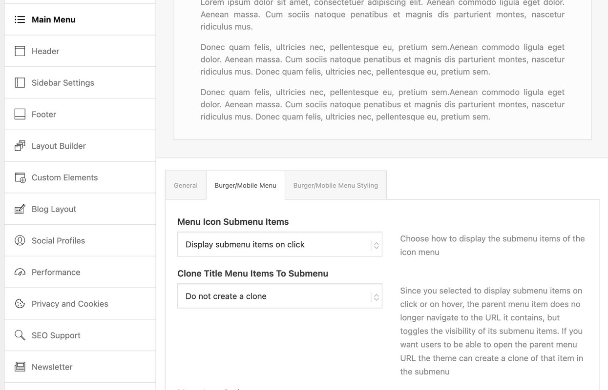
December 10, 2024 at 12:36 pm #1473324Well enfold provided the option to only show submenu items on hover or on click.

If you choose click we can edit that to only show one toggle open.
then put this to your child-theme functions.php:function only_one_submenu_open_on_burger(){ ?> <script> window.addEventListener("DOMContentLoaded", function () { (function($) { $('body').on( 'click touch', '.av-active-burger-items > a', function () { $(this).parent('li').siblings().removeClass('av-show-submenu'); $(this).parent('li').siblings().find('ul').slideUp( "fast"); }); $('body').on( 'click touch', '.av-active-burger-items .av-width-submenu > a', function () { $(this).closest('.sub-menu').siblings().find('li').removeClass('av-show-submenu'); $(this).closest('.sub-menu').siblings().find('ul').slideUp( "fast"); }); })(jQuery); }); </script> <?php } add_action('wp_footer', 'only_one_submenu_open_on_burger');after doing that i will have a look to your site to optimize if needed.
December 10, 2024 at 11:29 pm #1473382And maybe you decide to have the burger-menu on top:
#top #header #av-burger-menu-ul {
  vertical-align: top;
  padding: 125px 0 !important;
}
December 11, 2024 at 11:55 am #1473418 -
AuthorPosts
- You must be logged in to reply to this topic.
