
-
AuthorPosts
-
January 7, 2026 at 9:48 am #1493681
Hi, at a certain breakpoint (wide Screen) my gallery falls apart.
What am I doing wrong?
Thanks for helping …January 7, 2026 at 11:03 am #1493682Hey Sonno,
We cannot view preview pages unless logged in. Please link to the permanent URL instead.
Best regards,
RikardJanuary 7, 2026 at 11:21 am #1493683i do not really know what you mean by “falls apart” but there is a setting on wide screens in masonry-entries.css:
@media only screen and (min-width: 1800px)
{
	.responsive.html_stretched .av-masonry-col-flexible .av-masonry-entry,
	.responsive.html_av-framed-box .av-masonry-col-flexible .av-masonry-entry{
		width: 16.6%;
	}
	.responsive.html_stretched .av-masonry-col-flexible .av-masonry-entry.av-landscape-img,
	.responsive.html_av-framed-box .av-masonry-col-flexible .av-masonry-entry.av-landscape-img{
		width: 33.2%;
	}
}
so if you do not like to have that for (extreme) wide screens – you have to overwrite it by css in your quick css.
January 7, 2026 at 11:40 am #1493684Thanks for the quick answer!
If I go on fullscreen browser on my wide screen, the distance between the pictures is not staying the same and the gallery is not scaling completely.
Sorry, hard to describe.
I tried it with the css, but it is not working:-
This reply was modified 2 months, 3 weeks ago by
Sonno.
January 7, 2026 at 12:39 pm #1493686the css above is the rule from enfold – if you do not want that the width will be set by that – you had to overwrite this rule in quick css.
and it was only a suggestion what could happen on masonries on wide screens. So now i can see your masonry .After the grid container – you got that section with the masonry.
On Gallery Style – what are your settings there: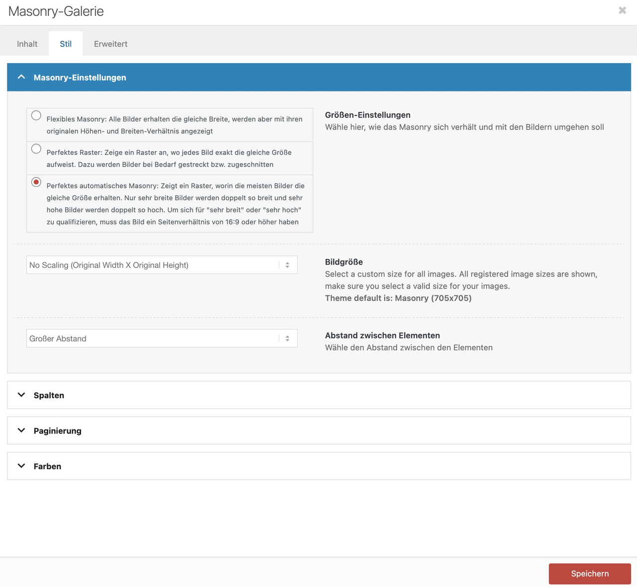 January 7, 2026 at 12:45 pm #1493687
One thing is that your images you use are not wide enogh to fill the column width.
you can test my suggestion on placing this to your quick css for that section on that page:
#top.postid-3536 #av_section_3 .av-masonry-image-container img {
  width: 100%;
}
or use the non scaled images ( original sizes ) : No Scaling (Original Width X Original Height)
January 7, 2026 at 1:38 pm #1493689January 7, 2026 at 1:58 pm #1493690Thank you very much Gunni007!
You made may day and you deserve your name.
You are a special agent!
Best
SonnoJanuary 7, 2026 at 3:18 pm #1493692Thank you – but I recommend using the unscaled images
f.e.:
http://www.interior-collection.de/wp-content/uploads/2025/12/IMG_7870-1.jpg : 135kb
http://www.interior-collection.de/wp-content/uploads/2025/12/IMG_7870-1-529×705.jpg : 285kb (imgSize: masonry – 705×705)so better resolution but less file size.
background on that : search for : avf_jpeg_quality
e.g: https://kriesi.at/support/topic/enfold-creating-images-larger-than-the-orginal/#post-1488786 -
This reply was modified 2 months, 3 weeks ago by
-
AuthorPosts
- You must be logged in to reply to this topic.