-
AuthorPosts
-
September 13, 2019 at 10:14 pm #1138210
Hi guys,
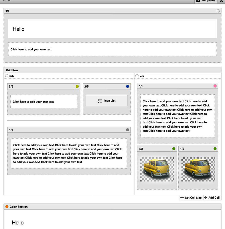
Is it possible to set a max-width on a grid row element with CSS?
#color-section .container {
max-width: 1000px;
}
Using the code above will set a max width for that color section. Is there a way to do the same thing or use a similar css snippet to do the same for a grid row element?
September 13, 2019 at 10:41 pm #1138219In principle yes, but you have no container div inside as surrounding container for content
the av-layout-grid-container could be set to but this conflicts with the background on the left and right of the reduced grid row.
To avoid this it will be nice to have a surrounding container which has the same settings as a color-section containing a 1/1 container in color relation.This comes to child-theme functions.php:
• Give to the grid-row element a custom-class: grid-notfull
Adjust it to your needs / settings on max-width of container width.
// Grid-Row Alb not set to full width but like container to max-width from default setting
function grid_layout_notfull(){
?>
<script>
(function($){
    $('.av-layout-grid-container.grid-notfull' ).wrap( '<div class="main_color notfullsize color1"></div>');
    $('.notfullsize').css({"clear": "both", "width": "100%" , "float": "left" , "position": "static" , "min-height": "100px" });
    $('.grid-notfull').css({"max-width": "1310px", "margin": "0 auto" , "padding": "0 50px"});
})(jQuery);
</script>
<?php
}
add_action('wp_footer', 'grid_layout_notfull');
the 1310px is the default value of Enfold – if you have a different one – adjust this value
After that you have a surrounding container with class: notfullsize and on default with background-color of : main_color
the code provides another class : color1 – if you want to adjust this.September 13, 2019 at 10:47 pm #1138221September 16, 2019 at 8:53 pm #1138920Hi bobfurgo,
Have you tried Guenni007’s solution or do you need more help?
Best regards,
Victoria -
AuthorPosts
- You must be logged in to reply to this topic.

