
-
AuthorPosts
-
March 17, 2026 at 4:23 pm #1496101
Hello,
I would like the logo in my homepage header to appear a bit bigger, so that it gets more readable.
How can I achieve that?
Credentials attached
Thank you.Elena
-
This topic was modified 3 weeks, 2 days ago by
elenagrassi.
March 17, 2026 at 7:26 pm #1496110Even with a vector-based SVG logo, this font (the smaller one in your logo) would no longer be legible.
You could make the header area larger overall, but then let it shrink so it doesn’t take up too much space.
_________________
Another option would be to display the logo larger at first and then have it move to the desired position inside navigation as the page is scrolled.
this for child-theme functions.php:function logo_shrink_navigation(){ ?> <script type="text/javascript"> (function($) { function initLogoScrollAnimation() { // ===== CONFIGURATION ===== var config = { maxScroll: 100, scaleStart: 2.3, scaleEnd: 1, translateYStart: 80, // Starting point shifted in the Y direction (e.g. 80px for down shift) translateYEnd: 0, // End point (must be 0 for the final position) translateXStart: -230, // Starting point shifted in the X direction (e.g. -100px for the left) translateXEnd: 0 // End point (must be 0 for the final position) }; // ========================= var ticking = false; var $menuLogo = $('#menu-item-logo'); var $menuLogoLink = $menuLogo.find('a'); var $menuLogoImg = $menuLogo.find('img'); var logoWidth; function updateLogo(scrollTop) { var progress = Math.min(scrollTop / config.maxScroll, 1); // Skalierung berechnen var scaleDiff = config.scaleStart - config.scaleEnd; var scale = config.scaleStart - (scaleDiff * progress); // Y-Verschiebung berechnen var translateYDiff = config.translateYStart - config.translateYEnd; var translateY = config.translateYStart - (translateYDiff * progress); // X-Verschiebung berechnen (NEU) var translateXDiff = config.translateXStart - config.translateXEnd; var translateX = config.translateXStart - (translateXDiff * progress); var extraSpace = (scale - 1) * logoWidth / 4; // Transform mit translateX ergänzt $menuLogoLink.css('transform', 'translateX(' + translateX + 'px) scale(' + scale + ') translateY(' + translateY + 'px)'); $menuLogo.css({ 'margin-left': -extraSpace + 'px', 'margin-right': -extraSpace + 'px', 'z-index' : '19' }); $menuLogoImg.css({ 'background-color': 'rgba(255,255,255,0.8)', 'backdrop-filter': 'blur(5px)', 'border-radius': '25px', 'border': '1px solid #FFF' }); } $(window).on('scroll', function() { var scrollTop = $(window).scrollTop(); if (!ticking) { window.requestAnimationFrame(function() { updateLogo(scrollTop); ticking = false; }); ticking = true; } }); // Logo-Breite messen und initial setzen logoWidth = $menuLogoLink.outerWidth(); updateLogo($(window).scrollTop()); // Initialen Scrollwert beim Laden berücksichtigen } $(document).ready(function() { setTimeout(function() { initLogoScrollAnimation(); }, 300); }); })(jQuery); </script> <?php } add_action('wp_footer', 'logo_shrink_navigation');the confic section is for the starting look of your logo (scale, shift x and y-axis etc)
look at start this way:
after scroll it is in the center of your nav.
March 17, 2026 at 9:21 pm #1496113Hi,
Perhaps if you want the logo just a little bigger and don’t mind the header to be a little bigger, then this css may help.@media only screen and (min-width: 768px) { #top #menu-item-logo svg, #top #menu-item-logo img { max-height: 150px; } .html_header_top.html_header_sticky.html_large .av_minimal_header #header_main .container,.html_header_top.html_header_sticky.html_large.html_main_nav_header .av_minimal_header .main_menu ul:first-child > li a { height: 150px; line-height: 150px; } }Best regards,
MikeMarch 18, 2026 at 12:32 pm #1496127Hi Mike,
that looks great, thank you. Just enough to make it clearer.
I may also use the shrinking option as suggested by Guenni007. I did not even know there was one. But if I do the logo itself does not shrink, it gets partially hidden in the upper part and partially overlays the page in the lower part. I do like the effect somewhat though.I also tried to use the other option of enlarging the logo as suggested by Guenni to see what it looked like. I added the text to the functions.php file but it did not work.
Best regards,
Elena-
This reply was modified 3 weeks, 1 day ago by
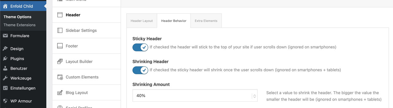
March 18, 2026 at 7:50 pm #1496141can you please activate the shrink option – then we can see what declaration is needed to have the automatic shrink for the navigation logo too.
Advantage you can have a much bigger header height – f.e. 200px – all your visitors can read the text of your logo – after scroll it goes to f.e. 100px height.March 18, 2026 at 8:00 pm #1496144Hi Guenni007, the shrink option is already activated.
March 18, 2026 at 8:02 pm #1496145@media only screen and (min-width: 990px) { #top #menu-item-logo a { display: inline-block; transform-origin: center top; } #top #menu-item-logo img { max-height: 150px; height: 100%; position: relative; top: 50%; transform: translateY(-50%); } }synchronise the max-height : 150px to what you have determined in the header enfold start height options.
March 18, 2026 at 8:09 pm #1496147by the way: you have to look if it is not possible to switch the menu to hamburger style on 768px. then the above ruleset had to be adjusted to media-query 768px too.
March 18, 2026 at 8:13 pm #1496149ok the logo now shrinks. I am not sure where the start height options can be set. It would be good if it was bigger than 150 at the start.
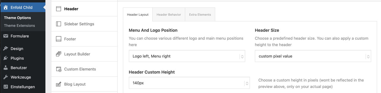
I don’t understand what you mean by your latest suggestion, sorry.March 18, 2026 at 8:22 pm #1496150you see on the first two images the position where you can enter a custom value:
https://kriesi.at/support/topic/making-the-logo-bigger-2/#post-1496110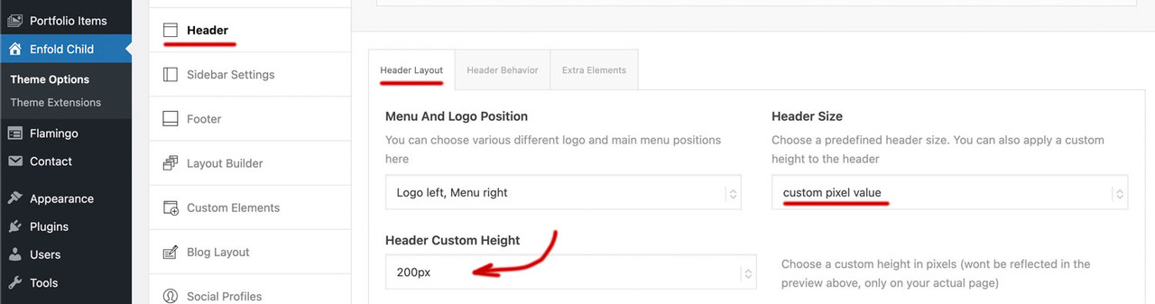
if you enter 200px there on “header custom height” ( i guess you are now back to “large” ) you had to synchronise that max-height value on #top #menu-item-logo img rule to 200px too.
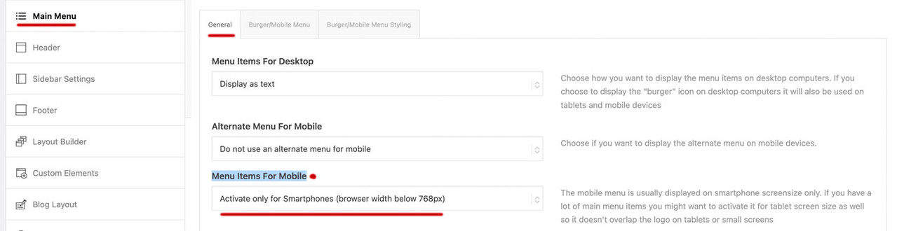
March 18, 2026 at 8:25 pm #1496151next : on Enfold – Main menu – “Menu Items For Mobile” have a look if it is possible to switch to burger at 768px
 March 18, 2026 at 9:34 pm #1496152
btw. : have a look what happens to your top divider on home page if you add this to your quick css:
#top.home #av_section_1 .avia-divider-svg.avia-divider-svg-top {
  transform: scaleY(-1);
  top: -39px;
}

#top.home #av_section_1 .avia-divider-svg.avia-divider-svg-top svg {
  fill: #FFF !important;
}

#top.home #av_section_1 .scroll-down-link {
  bottom: 25px;
}
March 19, 2026 at 5:22 pm #1496173Hi,
I have been able to set max height at 200px, changed that in the css too and the logo looked bigger at the start and shrunk when scrolling, but it did not shrink as much as before. It remained rather large, which I did not like, so I switched it back to 150px.
About the burger menu I have the following two choices: “activate for smartphones and tablets (browser width below 990px) or “activate for smartphones only (browser width below 768). Should I select the second one?I have tried to add the css in your last message but it doesn’t seem to change anything.
-
This reply was modified 3 weeks ago by
March 19, 2026 at 6:47 pm #1496176you see that image here:
https://kriesi.at/support/topic/making-the-logo-bigger-2/#post-1496150do not make it by mikes css – just use these settings on Enfold Header Options. Choose on the right custom pixel value – then the hidden input field will show – and enter 200px there – thats all.
put this to your quick css:
( or@media only screen and (min-width: 768px) {@media only screen and (min-width: 990px) { #top #menu-item-logo a { display: inline-block; transform-origin: center top; } #top #menu-item-logo img { max-height: 200px; height: 100%; position: relative; top: 50%; transform: translateY(-50%); } }after that you can decide to have more or less shrink-faktor on:
March 19, 2026 at 6:54 pm #1496180Should I remove the css? If I do, the header is larger but the logo does not enlarge
March 19, 2026 at 6:55 pm #1496182see my post above.
March 19, 2026 at 7:01 pm #1496186I understand now. That works. Thank you
March 19, 2026 at 8:03 pm #1496190March 19, 2026 at 8:04 pm #1496191Yes, that’s fine. Thank you
March 19, 2026 at 8:16 pm #1496194Hi,
Thanks Guenni007 for helping. If you have further questions please open a new thread and we will try to help. Thanks for using Enfold.Best regards,
Mike -
This topic was modified 3 weeks, 2 days ago by
-
AuthorPosts

- The topic ‘Making the logo bigger’ is closed to new replies.