
-
AuthorPosts
-
January 30, 2020 at 6:09 am #1179691
how can i make the tabular data table visually easier to view the rest of the table info? maybe an icon indicating scroll right for more options?
http://infinitycitizenship.com/dominica/ – i have 2 tables on this page
mobile screenshot – https://ibb.co/5F788n0
There are alot more data on the right but there is no indication to the user
Thanks as always
January 30, 2020 at 7:00 am #1179711Hi, I would like to change the layout of my website pages based on the resolution.
I am using the Enfold theme editor.
I wish some elements were visible for tablet and mobile devices and others for the desktop version.
I duplicated the elements, giving each one a different view based on the device, but it does not work.
Is it possible to hide some elements for desktop resolution and others for tablet and mobile resolution?
the webpage i’m trying to edit is: https://kaistudiotest.it/nuova-home/Thanks
Kind regards-
This reply was modified 6 years, 2 months ago by
kaskonauta. Reason: Enfold theme editor
January 30, 2020 at 4:58 pm #1180005@kaskonauta please do not reply to my thread. Instead, you should create your own. This will only push my thread down the order
Thanks
January 30, 2020 at 6:48 pm #1180051OK, i’m sorry
February 1, 2020 at 10:40 pm #1180560Hi,
Sorry for the late reply, Please try this code in the General Styling > Quick CSS field or in the WordPress > Customize > Additional CSS field:@media only screen and (max-width: 767px) { .avia_scrollable_table .avia-table:before { content: "Scroll \27A4"; font-size: 16px; float:right; } .avia_scrollable_table .avia-table > tbody > tr:nth-child(1) > td:nth-child(4):after { content: "Scroll \27A4"; font-size: 16px; top:-77px; position: relative; } }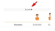
Best regards,
Mike -
This reply was modified 6 years, 2 months ago by
-
AuthorPosts
- You must be logged in to reply to this topic.