
Tagged: gallery element, gunter, mike
-
AuthorPosts
-
February 8, 2026 at 5:51 am #1494815
Hi Enfold team,
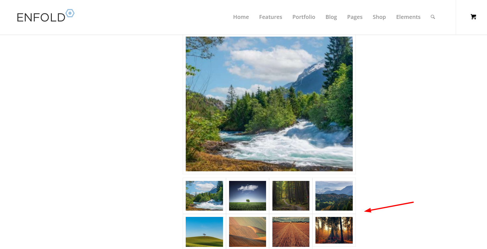
I’m using the Enfold Gallery element in WordPress (Avia Layout Builder). I’m trying to achieve a CSS-only UX like this:
The large preview image stays at the top and is sticky while the user scrolls down through the thumbnails below it.
Once the thumbnails end, the page continues scrolling normally to the next section.
I’m not using any JS. I added a custom class to the Gallery element and tried multiple CSS approaches. I can sometimes get sticky to work, but then the layout breaks (preview shifts left / preview becomes tiny / thumbnails become huge or microscopic / only a few thumbs show per row). When I fix thumbnail sizing, the sticky behavior stops working.
What I’m using
Enfold theme (latest) + WordPress
Gallery element style: big preview + thumbnails (the normal preview-on-top layout)
I added a custom class on the Gallery element: av-gallery-sticky-scroll
What I want (exact behavior)
Keep Enfold’s default layout: big image on top, thumbnails below
Make only the big preview sticky (position: sticky; top: …)
Thumbnails should remain a normal-sized grid below
No inner scrolling container — I want normal page scroll, with preview sticking until the thumbnail list ends
CSS attempts (examples)
I tried sticky on .avia-gallery-big and also .avia-gallery-big-inner (in case the inner wrapper is needed), plus forcing overflow: visible on likely parents. I also tried overriding thumbnail widths using flex/grid.
Example of my latest attempt:
@media (min-width: 990px){
.av-gallery-sticky-scroll{
–stickyTop: 120px;
–thumbSize: 140px;
}.av-gallery-sticky-scroll .avia-gallery-big,
.av-gallery-sticky-scroll .avia-gallery-big .avia-gallery-big-inner{
position: sticky;
top: var(–stickyTop);
z-index: 50;
}.av-gallery-sticky-scroll,
.av-gallery-sticky-scroll .avia-gallery,
.av-gallery-sticky-scroll .avia-gallery-big{
overflow: visible !important;
}.av-gallery-sticky-scroll .avia-gallery-thumb{
display: grid !important;
grid-template-columns: repeat(auto-fill, var(–thumbSize));
gap: 12px;
margin-top: 14px;
justify-content: start;
}.av-gallery-sticky-scroll .avia-gallery-thumb li{
float: none !important;
width: auto !important;
margin: 0 !important;
padding: 0 !important;
}.av-gallery-sticky-scroll .avia-gallery-thumb img{
width: 100% !important;
height: auto !important;
display: block;
}
}Result: thumbnail sizing becomes unpredictable (either microscopic or huge), and sticky often stops working.
My questions
Is it possible CSS-only to make the Gallery element’s big preview sticky (preview on top, thumbs below) without breaking Enfold’s internal thumb sizing/layout rules?
Is there a recommended selector/wrapper inside the Gallery element that is safe to apply position: sticky to?
If sticky fails because of an Enfold container overflow rule, which wrapper should I override (and is there an Enfold setting that influences this)?
If this isn’t feasible with the Gallery element, is there a recommended Enfold-native alternative (e.g., specific element/layout pattern) that support suggests?
Thanks,
RobFebruary 8, 2026 at 9:23 am #1494818see example page – with css code on:
https://webers-testseite.de/ajax-gallery/in my case it is at 768px switching
I even made sure that the heights of the large images adjust when hovering over them, which is not the case in Enfold’s standard behaviour.February 8, 2026 at 4:39 pm #1494832Wow Guenni, that is a lovely piece of code!! Thank you!! Enfold should consider adding this to core functionality as it is a huge upgrade to the Gallery element.
One question – how do I adjust the preview photo size and/or how much room the thumbnails have at the bottom of the sticky container?
Gallery with your css is now live on this page, towards the bottom:
https://www.thomashenthorne.com/26-mooring-road-san-rafael-ca/
Thank you!
RobFebruary 8, 2026 at 4:53 pm #1494835i can not see your page due to:
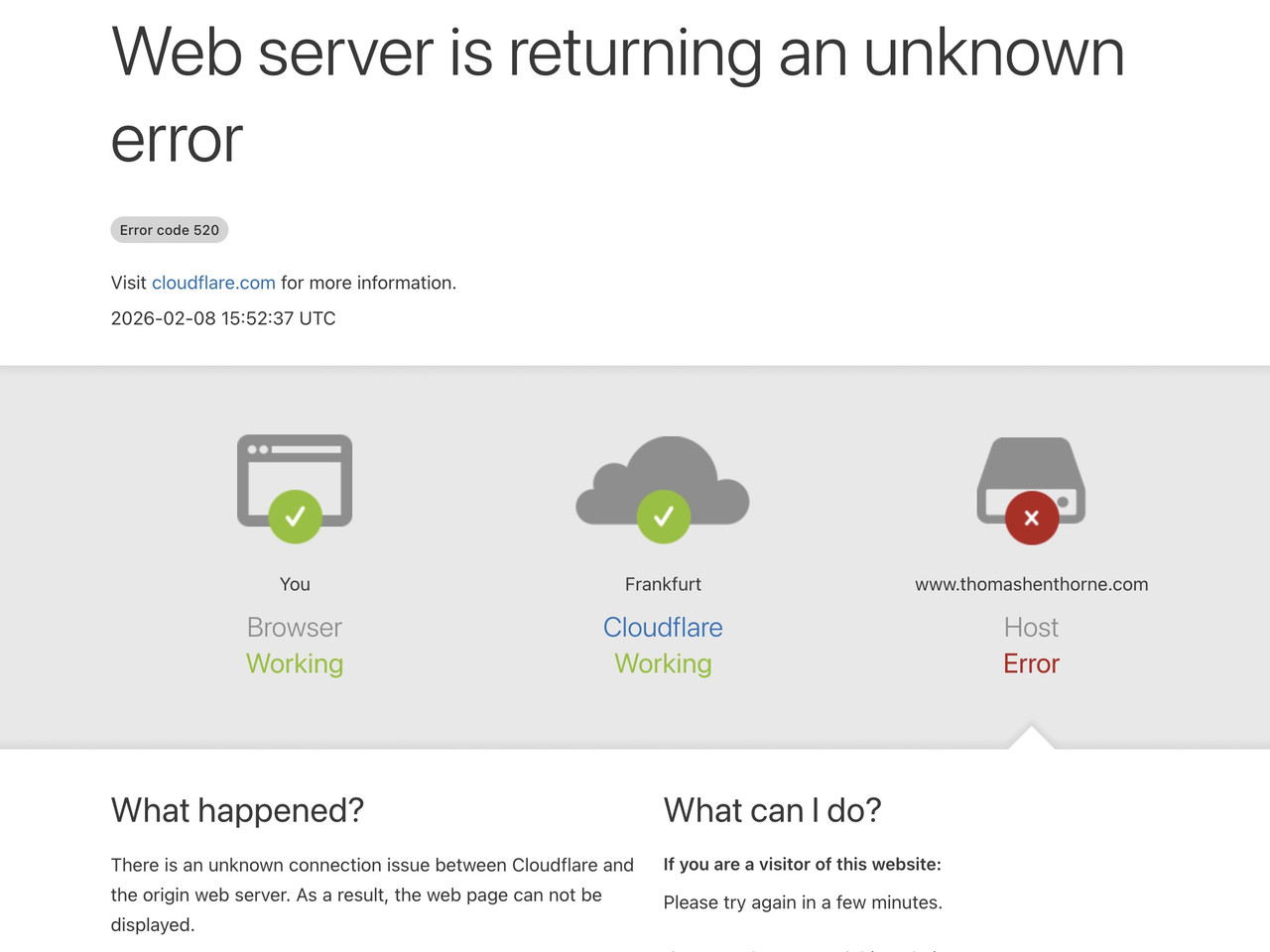 February 8, 2026 at 4:56 pm #1494837
Sorry Guenni, WP Engine seems to insist on geoblocking my website even though i have told them to disable it. Can you try again? You can also see the behavior on your preview page. The thumbnails are right against the bottom of the container / page. it would be great if the container had some padding around it just under the thumbnails.
Thank you!
RobFebruary 8, 2026 at 5:15 pm #1494841Also Guenni can you paste the ray ID from the bottom of the cloudflare error so we can investigate?
February 8, 2026 at 5:20 pm #1494842Your page is still the block – but
Can you take a screenshot of my page and then draw on the image to show which spacing needs to be changed?
Based on your description, I don’t understand what you want to change.February 8, 2026 at 5:25 pm #1494843If yo ucan give the ray ID from the cloudflare error (at bottom) we can fix.
Re the image, here you go… basically the thumbnails are against the bottom of the screen and dont start to display nicely until user hovers. We are 99% there, just need some padding between bottom of thumbnails and bottom of page.
February 8, 2026 at 5:28 pm #1494844Cloudflare Ray ID: 9cac7fcdcced65d6
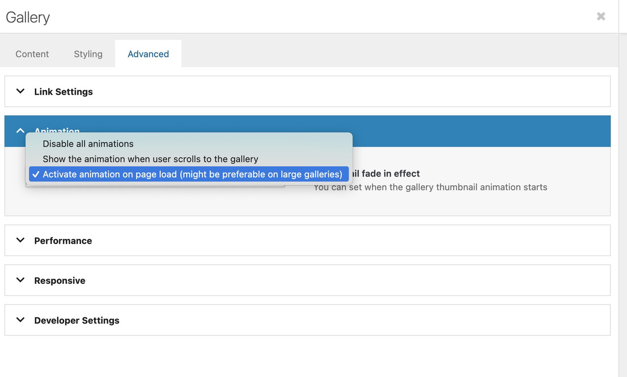
change the animation at advanced tab:
It’s exactly the problem you can see on my page now, where I’ve widened the gallery. At some point, the sticky large image is so big that you can’t see much of the thumbnails scrolling underneath it.
Therefore, it’s really only suitable if the column with the gallery is narrower.February 8, 2026 at 7:18 pm #1494851I’ll try that – in the meantime WP Engine just unblocked Germany (and the rest of Europe, so the mods here should be happy…)
February 8, 2026 at 7:20 pm #1494852It was already set to activate animation on page load.
February 8, 2026 at 8:04 pm #1494856Yes—now your page is opening. Now please explain to me how this is supposed to work with such large images above the thumbnails—it’s obvious that these images will cover the thumbnails below.
How about if the thumbnails scroll up to the side of the large sticky image?February 8, 2026 at 8:05 pm #1494857should i make images smaller? yes side would be great!
February 8, 2026 at 8:15 pm #1494858test :
/* 1. GLOBAL STICKY PERMISSION */
html.html_stretched,
html.html_stretched body#top,
#top #wrap_all,
#top #main {
    overflow: visible !important;
}

@media only screen and (min-width: 768px) {

    /* 2. MAIN CONTAINER
       We use CSS Grid for the 65% / 1fr split */
    #top .avia-gallery.av-gallery-sticky-scroll {
        display: grid !important;
        grid-template-columns: 65% 1fr !important;
        gap: 30px !important;
        align-items: start !important; /* Crucial: prevents big-wrapper from stretching to full height */
        overflow: visible !important;
        position: relative !important;
        width: 100% !important;
    }

    /* 3. STICKY WRAPPER (Left Column) */
    #top .avia-gallery.av-gallery-sticky-scroll .avia-gallery-big-wrapper {
        grid-column: 1 !important;
        position: -webkit-sticky !important;
        position: sticky !important;
        top: 100px !important; /* Adjust based on your header height */
        z-index: 100 !important;
        height: auto !important;
        margin: 0 !important;
        background: #ffffff !important;
    }

    /* 4. IMAGE ELEMENT */
    #top .avia-gallery.av-gallery-sticky-scroll .avia-gallery-big {
        position: relative !important;
        display: block !important;
        height: auto !important;
    }

    #top .avia-gallery.av-gallery-sticky-scroll .avia-gallery-big img {
        display: block !important;
        width: 100% !important;
        height: auto !important;
        max-height: 80vh;
        object-fit: contain;
    }

    /* 5. THUMBNAILS (Right Column) */
    #top .avia-gallery.av-gallery-sticky-scroll .avia-gallery-thumb {
        position: relative !important;
        z-index: 10 !important;
        padding: 0 !important;
        width: 100% !important;
      min-height: 100vh;  /*** we need the gallery thumbs container bigger than the big image *** /
    }
}
the min-height option is necessary only because my thumbs container is less high than the big image – guess your
And change the 65% to your needs in : grid-template-columns: 65% 1fr !important;
February 8, 2026 at 8:36 pm #1494860This one is worse, unfortunately.
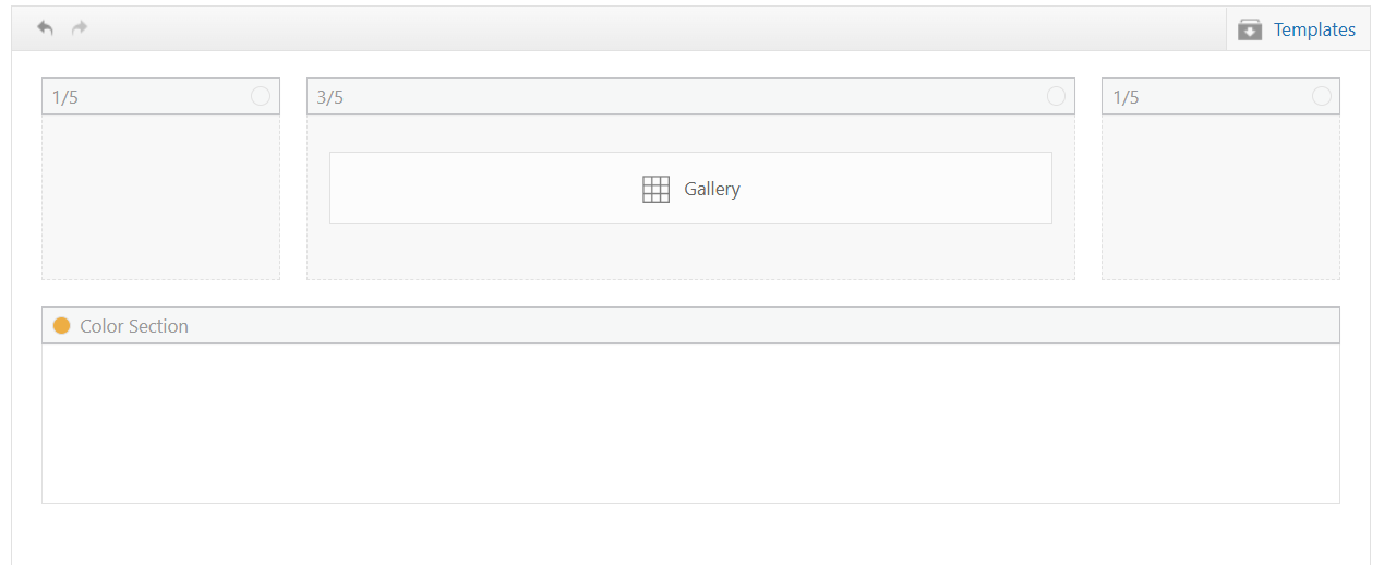
The entire screen inlcluding the sticky menu at top is now in a 3/5 container it appears.February 9, 2026 at 1:43 am #1494866hm – wasn’t it before in a 1/1 column?
February 9, 2026 at 1:48 am #1494867It was in 1/1 temporarily earlier today as I tried to get the code to work but it has always been in 1/5, 3/5, 1/5 mode.
thanks for trying, I will see if the mods have any ideas.
February 9, 2026 at 6:30 am #1494877Hi,
Thank you for the update.
We tried visiting the site, but it is still locked by Cloudflare. We’ve tagged @Mike on the thread so he can look into this further.
Best regards,
IsmaelFebruary 10, 2026 at 10:11 pm #1494938** private content **
February 14, 2026 at 5:40 pm #1495078Hi,
On your page https://www.thomashenthorne.com/26-mooring-road-san-rafael-ca/#av_section_42
I see your gallery but I don’t see the larger image that ment to change when hover over the gallery items, such as in Guenni007’s example. https://webers-testseite.de/ajax-gallery/#av_section_4 I assume that you like the second solution “Ajax Gallery – Thumbs at the right side”, because in the first solution the main image is hiding the gallery and most and not be clicked.
I also don’t find the classes on the page for Guenni007’scss to work, are you still tring to achive this layout?

Best regards,
MikeFebruary 14, 2026 at 6:56 pm #1495079Hi Mike! Yes, that is the layout I was going for, but as you saw we ran into some problems, and then also I found out that lazy load has not yet been added to the performance settings of gallery element, and since we are having some bandwidth issues, I returned to Masonry block. I actually would prefer the “hero” photo of Gallery on top with thumbnails below, and the hero to be sticky as user scrolls through thumbnails because sometimes there can be 60-90 photos in one gallery. I would also need to figure out how to lazy load it…
Thanks!
RobFebruary 17, 2026 at 10:52 pm #1495172Hi,
Thanks for your patience, please include an admin login so we can create a test page.Best regards,
MikeFebruary 18, 2026 at 4:06 pm #1495191the classes (yes two classes here – only because i like to show both on the same page) are
av-gallery-sticky-scroll and besides
Thats all.PS : on that code – you see that i manage the amount of thumb columns by pure css. Because i like to rule it differently on small screens and orientation – as you can see at the bottom of the snippet.:
@media only screen and (min-width: 768px) and (orientation: portrait) {
  #top .avia-gallery.av-gallery-sticky-scroll.besides .avia-gallery-thumb {
    grid-template-columns: repeat(2, 1fr);
  }
}
on mobile devices with small screens – ( iPhone etc. ) this behaviour makes no sense – not only because of missing hover style …
February 20, 2026 at 3:48 am #1495252Hi Mike, sorry for the delay in responding. Since this is just a standard Enfold element on a standard wordpress site, I’m not sure why you need access to my site? I am happy to provide it, but there’s nothing special about my Enfold that should impact this, right?
Thanks!
RobFebruary 21, 2026 at 6:49 pm #1495322Hi,
Thanks for your patience, I only asked for access to your test page so we would be looking at the same thing and so I would not need to recreate your layout on my site, nonetheless I created 1/5 + 3/5 + 1/5 columns with a gallery with large image on top and thumbnails below, and a color section with 100% min-height below that to simulate the rest of the page.
My sticky header is 90px, although I see yours is 157px.
My first impression of the layout is that the large gallery image on top is almost the full height of the screen, so the thumbnails are not really seen, I added 50px right & left padding to the 3/5 column and that helped a little
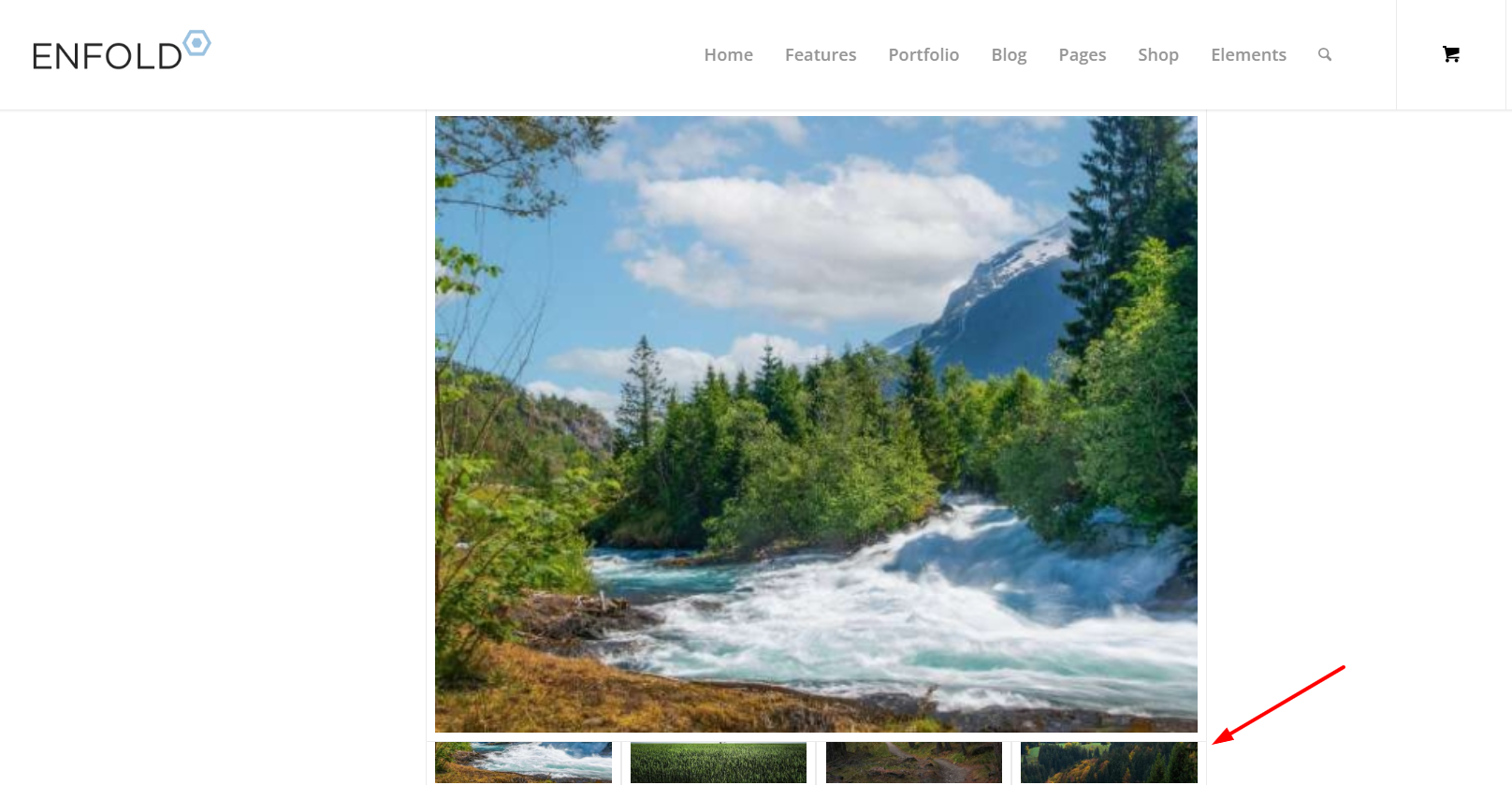
Adding 150px right & left padding to the 3/5 column was better
but I get the feeling that you want the large image to be as large as possible, and not so much empty space on the sides, so having it sticky would make the thumbnails hard to see. I tested Guenni007’s solution at: https://webers-testseite.de/ajax-gallery/#av_section_2 and other than adjusting the top: 70px to match my header it seems to work well.
But ypur current masonry layout https://www.thomashenthorne.com/26-mooring-road-san-rafael-ca/#av_section_42
seems much better because the user can see the thumbnails, it fills the page and the user can easily navigate the lightbox images (slideshow).Best regards,
MikeFebruary 21, 2026 at 6:55 pm #1495323Hi Mike, actually I dont want to large image to be as large as possible, just larger than the thumbnails, in a 3/5 layout. Your solution looks great. Thanks! See private details in case you want to try on test page on my site.
Best,
RobFebruary 21, 2026 at 10:45 pm #1495328There is no way around side positioning. The large image will always take up so much space that you will always find scenarios where you can only see very little of the thumbnails scrolling underneath.
iPad landscape etc.February 22, 2026 at 6:02 pm #1495339Thanks Guenni. Mike, I noticed you logged into the site yesterday – but I don’t see a test page so I wanted to circle back.
Thanks,
RobFebruary 22, 2026 at 10:03 pm #1495348Hi,
You are correct, I wanted to test the login before I headed out for an appointment. I created the test page today for you, linked below, as I had described above.
It seems to work better on your site because you have limited image sizes, most of yours seem to bet set to 0x0.
Nonetheless you can try adjusting the column padding and image sizes to make the large image the size you like.
The css for the page is in a code block element on the page, you could move it to your Quick CSS if you decide to apply this to other pages.
Also note that the page is saved as a draft right now, but you will need to publish it for the css in the code block to work, WordPress doesn’t load everything in preview mode, it’s a known issue that we don’t have control over.Best regards,
MikeFebruary 23, 2026 at 12:57 am #1495351Thanks mike, that looks great… any idea why the thumbnails are initially “whited out”? page is published so you can see it now. Thank you!
-
AuthorPosts
- The topic ‘Make preview image on top of Gallery element sticky as user scrolls thumbnails?’ is closed to new replies.