-
AuthorPosts
-
June 7, 2021 at 5:30 pm #1304454
Hi,
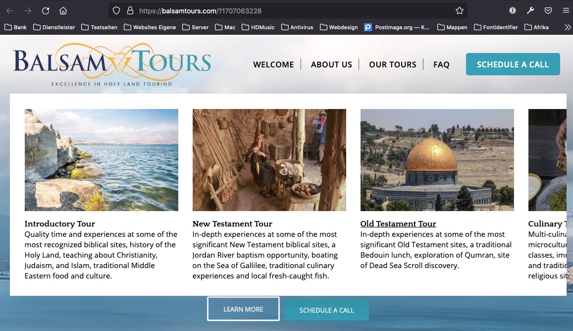
I have a 5-column Mega Menu highlighting 5 items/pages, beginning with an image, then title then brief description.
Although it looks really nice, what’s happening is the images are different sizes. the first and the last one a little larger then the 3 in between. All images are, in fact, the same size, 500 x 333 pixe.s
Is there a way to force all images to be the same size in the mega menu?
Thanks so much,
https://balsamtours.com/bypassJune 9, 2021 at 4:56 am #1304780Hey Eleina_Shinn,
Thank you for the inquiry.
Adding this css code should limit the width and height of the images inside the mega menu and align them correctly. We also added a 20px margin below the images to move the text downwards a bit.
#menu-item-71 .avia_mega5 .menu-item img {
    max-width: 240px;
    margin-bottom: 20px;
}
Let us know if that helps.
Best regards,
IsmaelJune 9, 2021 at 8:04 am #1304796or escape enfold settings – with different padding for first and last li.
Try this instead in your quick css:
#top #wrap_all #header .avia_mega_div > .sub-menu {
    display: flex !important;
    flex-flow: row nowrap;
    justify-content: space-around;
    padding: 2% 1% !important;
}

#top #header .avia_mega_div li {
    flex: 0 1 18%;
    width: unset !important;
    padding: 0 !important;
    margin: 0 !important;
}

#top #wrap_all #header .avia_mega_div > .sub-menu > li img {
    transition: 0.3s all ease;
    margin-bottom: 10px
}
and if you like to have some hover indicators on that try in addition:
#top #wrap_all #header .avia_mega_div > .sub-menu > li:hover img {
    transform: scale(1.05);
    transition: 0.7s all ease;
    margin-bottom: 20px
}
June 9, 2021 at 12:46 pm #1304859believe it or not – my solution works better.
look at the current page at narrower screen width:

remove the rules from Ismael and try it out ;)
SEE general solution next
-
This reply was modified 4 years, 10 months ago by
Guenni007.
June 10, 2021 at 9:49 am #1305031just besides the mega div with 5 columns – here are more general css code:
NOW : we have to see what happens to these rules when there is a second row underneath the first.
edited code to fit for new row in that mega div:
#top #wrap_all #header .avia_mega_div > .sub-menu {
    display: flex !important;
    flex-flow: row nowrap;
    justify-content: space-around;
    padding: 2% 1% !important;
}

#top #header .avia_mega_div li {
    width: unset !important;
    padding: 0 !important;
    margin: 0 !important;
}

/*** settings for different mega_div ***/
#top #header .avia_mega_div li.avia_mega_menu_columns_6 { flex: 0 1 14% }
#top #header .avia_mega_div li.avia_mega_menu_columns_5 { flex: 0 1 18% }
#top #header .avia_mega_div li.avia_mega_menu_columns_4 { flex: 0 1 23% }
#top #header .avia_mega_div li.avia_mega_menu_columns_3 { flex: 0 1 31% }
#top #header .avia_mega_div li.avia_mega_menu_columns_2 { flex: 0 1 48% }

#top #header .avia_mega_div li > .mega_menu_title {
    display: inline-block;
    margin-bottom: 0 !important
}

#top #header .avia_mega_div li > .mega_menu_title a {
	display: inline-grid;
    overflow: hidden !important;
}

#top #wrap_all #header .avia_mega_div > .sub-menu > li img {
    margin-bottom: 15px !important;
    -webkit-filter: saturate(0.2);
    filter: saturate(0.2);
}

/*** just to have some indicators for hovering ***/
#top #wrap_all #header .avia_mega_div > .sub-menu > li:hover img {
    -webkit-filter: saturate(1);
    filter: saturate(1);
}
see Mega Menu on page: https://consulting.webers-testseite.de/
June 10, 2021 at 10:21 am #1305038By the way: how did you style this menu ?
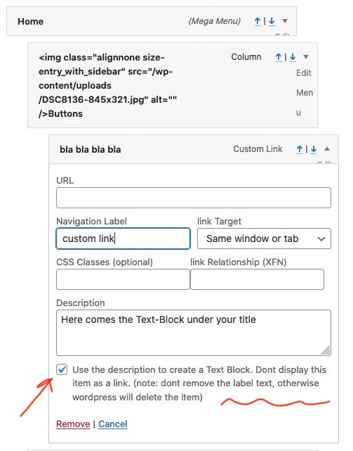
That the sub-menu levels of the mega-menu title did not have an anchor?Edit : oh i see – didn’t recognize that option on description
 June 10, 2021 at 3:12 pm #1305095
Oh my gosh, I can’t tell you how much I appreciate all of your help with this! (you must have a special place in your heart for the Holy Land?
Thank you , Thank You, !!!
I didn’t do the section part, with two rows – so if they do come up with more tours, your suggesting I place new tours right under same column right?
I honestly can’t tell you how much I appreciate all of your help!
~e
June 10, 2021 at 5:59 pm #1305114You see here: https://kriesi.at/support/topic/make-all-mega-menu-images-the-same-size/#post-1305031 that the space for calculating how many list points are next to each other is only made for the row. I assume that the classe at the mega-div itself depends on the maximum value of columns.
In a row, the list points then have a class that determines how many columns are next to each other.
So if you decide to start a new row – this code will work for the most circumstances.June 10, 2021 at 9:41 pm #1305123I do believe you are brilliant! Thank you Thank you!
Question, is it in the works at all for Enfold to make Header Option changes, like the ability to make a custom header just like you can for the footer?
June 10, 2021 at 11:31 pm #1305138Can you be more specific about what you want to achieve?
June 14, 2021 at 3:35 pm #1305630Well, there are so many things I’d like to achieve in terms of the header
For example, just look at a few of the header samples and all the capability the XTRA theme has:
When I have a local client, and CTA’s need to be in the Header, Enfold is just too cumbersome to create a custom header and change it around.
So I just wondered if more header customization might be in the works for the future, mainly because I prefer to use Enfold, but must choose other themes sometimes when I need more flexibility and ease in that area of the site.
June 17, 2021 at 7:22 am #1306126I like in particular the navigation, which creates a top level menu item in which omitted menu items are collected as a submenu. Only when it no longer works, the hamburger is offered as an alternative menu.
-
This reply was modified 4 years, 10 months ago by
-
AuthorPosts
- You must be logged in to reply to this topic.
