-
AuthorPosts
-
September 27, 2022 at 4:05 am #1366479
On my site – https://custompoolslongisland.com/home-redesign-balraj/ – I have a section titled “WHY CHOOSE CUSTOM POOLS LONG ISLAND?” which has a 5 column layout with icons/text. How can I make it 2 columns on mobile instead of the default 1 column on mobile?
September 27, 2022 at 9:16 am #1366482it is much easier to select such elements if they were separated only in one surrounding container.
Means if they were alone f.e. in one color-section. – next we do not need on grid-layout or on flex-layout the need to set same height option – we can do that on different ways.
It is alway a good practice to have for special solutions a unique selector – means f.e. a unique ID or class on that surrounding container.
so now let all as it is and put this to your child-theme quick css:#top.page-id-5864 #av_section_2 .entry-content-wrapper .flex_column_table .av-flex-placeholder { display: none !important } #top.page-id-5864 #av_section_2 .entry-content-wrapper .flex_column_table { display: grid !important; grid-auto-flow: row; grid-auto-rows: 1fr; grid-template-columns: repeat(5, minmax(0, 1fr)); gap: 20px; } #top.page-id-5864 #av_section_2 .entry-content-wrapper .flex_column_table .flex_column { width: unset !important; margin: 0 !important } @media only screen and (min-width:560px) and (max-width: 989px){ #top.page-id-5864 #av_section_2 .entry-content-wrapper .flex_column_table { display: grid !important; grid-template-columns: repeat(3, minmax(0, 1fr)); gap: 20px; } #top.page-id-5864 #av_section_2 .entry-content-wrapper .flex_column_table > .flex_column:nth-of-type(n+6) { left: calc(50% + 10px) /*** just if you like to center last 2 items *****/ } } @media only screen and (min-width:320px) and (max-width: 559px){ #top.page-id-5864 #av_section_2 .entry-content-wrapper .flex_column_table { display: grid !important; grid-template-columns: repeat(2, minmax(0, 1fr)); gap: 10px; } #top.page-id-5864 #av_section_2 .entry-content-wrapper .flex_column_table .flex_column:last-of-type { left: calc(50% + 5px) /*** just if you like to center last item *****/ } #top.page-id-5864 #av_section_2 .entry-content-wrapper .flex_column_table .flex_column p { font-size: 17px; line-height: 24px } } @media only screen and (max-width: 319px){ #top.page-id-5864 #av_section_2 .entry-content-wrapper .flex_column_table { display: grid !important; grid-template-columns: 1fr; gap: 10px; } }5 to 3/2 to 2/2/1 screen sizes lower than 320px will end in 1 column layout.
just shrink your window size to see what happens on responsive case.September 27, 2022 at 10:23 am #1366496PS : i wonder about the selector of
flex_column:nth-of-type(n+6)
this is on theory wrong – but i do not see why it has to be this way.If i layout it myself you see the right selection of the 4th and 5th element in that container is
.flex_column:nth-of-type(n+4)see here the way i would layout it: https://enfold.webers-webdesign.de/navi1/
this rule here:
grid-template-columns: repeat(3, minmax(0, 1fr));means that there are 3 columns besides each other – and they will have exactly the same width.
you will often see :grid-template-columns: repeat(3, 1fr);but these columns will only have the same width if the content inside will allow that. ;)
September 27, 2022 at 10:44 am #1366501Just for Info – no need to read
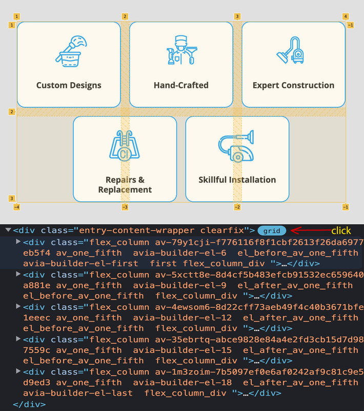
If you inspect the DOM in Chrome, for example, and click on the grid next to the grid container, the grid layout is displayed in the frontend.
Here you can see very clearly how a grid layout is structured. These hatched lines are the “gaps” – whereby you could even distinguish between row-gap and column-gap. And an ingenious feature is that gaps are only ever set between elements; if there is no neighbour, there is no gap.

You see now with the 3 column grid that I shift the 4th and the 5th element out of the grid, by ( 50% minus half the gap value).
_________________
PS:
The numbers could also be used – e.g. by giving the first item an extension. So grid-column: 1 / 3;
would mean that the item extends from line 1 to line 3. (borrowing a little from the table layout, there is also the possibility of defining a span. Span 2 extends over 2 widths or heights.September 27, 2022 at 2:24 pm #1366552by the way – have a look what happens to your divider if on that page :
#top.page-id-5864 #av_section_1 .avia-divider-svg-top {
  transform: scaleY(-1);
  -webkit-transform-origin: center top;
  transform-origin: center top;
  z-index: 40;
  pointer-events: none;
}

#top.page-id-5864 #av_section_1 .avia-divider-svg-top svg {
  fill: #000;
}
September 28, 2022 at 4:03 am #1366656YOU ARE MY HERO!!!
you fixed the columns and also fixed the divider which look so much better now!
THANK YOU THANK YOU
i have one final request on this page
How can I move the content slider titles below the images? I am trying to avoid the titles wrapping on two lines and the images not aligning properly
screenshot – https://ibb.co/Z6tF24P
thanks as alaways
September 28, 2022 at 9:13 am #1366666a quick way is to give the h4 a min-height:
#top.page-id-5864 .avia-content-slider-element-container .slide-entry-title.entry-title {
  min-height: 80px;
  display: inline-block;
  padding: 0;
  margin-bottom: 0;
}
September 28, 2022 at 4:06 pm #1366737Thank you
Finally, back to the top divider that you helped me with, on mobile the slider button is getting cut off
screenshot – https://ibb.co/8DG0DSS
how can we fix that?
thanks
September 28, 2022 at 9:12 pm #1366806it is easier to shift the button a littel to more distance from the bottom – and maybe on that case a less font-size.
September 29, 2022 at 3:08 pm #1366909Hi,
Please add following code to Quick CSS field in Enfold theme options > General Styling tab
.ls-hide-on-tablet.ls-hide-on-desktop .ls-wrapper.ls-in-out.ls-inner-wrapper {
  top: 100px !important;
}
Best regards,
YigitSeptember 29, 2022 at 8:39 pm #1367001or – because the overlapping takes place at the bottom, the distance is probably better set from the bottom.
.ls-hide-on-tablet.ls-hide-on-desktop .ls-wrapper.ls-in-out.ls-inner-wrapper { top: calc(100% - 100px) !important; } -
AuthorPosts
- You must be logged in to reply to this topic.
