
-
AuthorPosts
-
July 13, 2015 at 7:16 pm #472620
Hello,
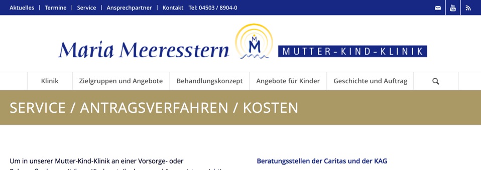
this is the Main Menu on a desktop:
On an iPad it looks like that:
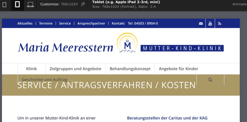
Is it possible to disable the search icon here and minimize the Menu fontsize, so that it fits again?
Glad about Help!
BerndJuly 13, 2015 at 8:36 pm #472662Hi Bernd!
Add this to your custom CSS.
@media screen and (max-width: 767px) and (min-width:900px) {
nav.main_menu .menu > li > a { padding: 0px !important; }
#menu-item-search { display: none !important; }
}
Best regards,
ElliottJuly 13, 2015 at 8:44 pm #472671Hi Elliott,
I added your code to the custom CSS, but it made no difference, it looks like before
Any ideas?
Thank you
BerndJuly 14, 2015 at 2:59 pm #473207Hi!
I went to Enfold theme options > Header > Mobile Menu > Header Mobile Menu activation and chose 990px. Please review your website now
Cheers!
YigitJuly 14, 2015 at 3:59 pm #473263Hi Yigit,
thanks, but that is not what I asked for.
I think that in case of a vertical iPad view it is better not to have the mobile menu already.
So what about disable the Search icon and make the Menu fontsize and/or padding a little bit smaller?
Thank you for Help
BerndJuly 14, 2015 at 5:49 pm #473343Hey!
Please add following code to Quick CSS
@media only screen and (max-width: 990px) {
#top .av_seperator_big_border#header .av-main-nav > li > a {
  padding: 0 3px;
  font-size: 12px;
}
li#menu-item-search {
  display: none;
}}
Please make sure that > sign is not converted to – http://i.imgur.com/IDXRZQ3.png in Quick CSS field
Cheers!
YigitJuly 14, 2015 at 9:15 pm #473438Hey Yigit!
That is almost perfect!
What makes me wonder is:
Why is there much more left and right spacing at “Klinik” and
Why has “Klinik” a border on the left side (while there is no one at the other side of the page at “Geschichte und Auftrag”)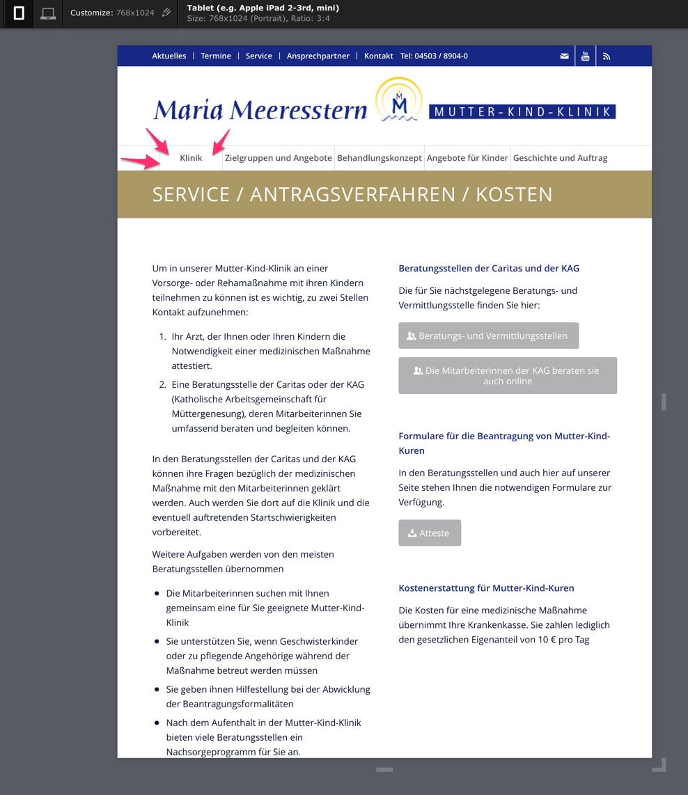
Glad about Help!
BerndJuly 15, 2015 at 2:19 pm #473748 -
AuthorPosts
- You must be logged in to reply to this topic.