-
AuthorPosts
-
December 10, 2018 at 4:14 pm #1043129
Hi guys
I have been searching this forum for a possible solution for my issue, but could not find anything that suits my needs so far.
I would to achieve that the logo is visible in the mobile/burger menu when expanded. It is configured like that so far:
Menu Overlay Style -> Sidebar Flyout Menu (Minimal)
Flyout width -> 250pxSo it currently always covers the logo when expanded on a smartphone. Is there any fairly easy solution to either make the logo visible in the mobile menu above all menu items as well or expand the mobile menu below the logo (which is displayed behind it in the header)? That would be really cool.
Any help or hints pointing me in a nice direction is very helpful.
Thanks a lot
MichaelDecember 10, 2018 at 9:49 pm #1043374Hey Michael,
Could you please give us a link to your website, we need more context to be able to help you.
Best regards,
VictoriaDecember 10, 2018 at 9:56 pm #1043382Hi Victoria
I just have a normal header (logo left, menu right) and therefore the mobile menu as described.
What else do you need to know?Thanks
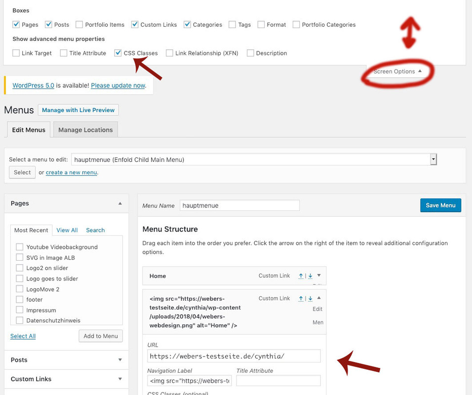
MichaelDecember 10, 2018 at 11:23 pm #1043423you can place in the menu an additional Home Menu point.
On top right postion of the menu dialog – there is a slideout . You can mark some things in Addition to the normal shown points like css classes.
Put in the field navigation label instead of home f.e.:<img src="https://home.url/wp-content/uploads/2018/04/webers-webdesign.png" alt="Home" />
click to enlarge:

with a custom class here you can manage it that this home link is only shown on hamburger menu and not on desktop menu. And vice versa the home link without the image only is shown on desktop menuBy the way on that link : https://webers-testseite.de/cynthia/ you can see it in action – and some other logo heading customizations.
December 12, 2018 at 4:13 pm #1044379Hi Günter
Thanks so much for your approach!
I did it exactly as you suggested, works like a charm. I styled it a bit by adding the following CSS code:
@media only screen and (min-width: 1005px) {
.logo-only-mobile {
display: none;
}
}
.logo-only-mobile {
margin-bottom: 30px !important;
}
@Victoria_d: You may close this thread now.Best regards
MichaelDecember 15, 2018 at 8:57 pm #1045715Hi,
Glad we could help!
Please take a moment to review our theme and show your support https://themeforest.net/downloads
Don’t forget to bookmark Enfold Documentation for future reference.Thank you for using Enfold :)
Best regards,
BasilisDecember 15, 2018 at 9:26 pm #1045724Hi Basilis
Please close this thread.
Thanks a lot
MichaelDecember 16, 2018 at 3:16 pm #1045907Hi,
Best regards,
Victoria -
AuthorPosts
- The topic ‘Logo visible in mobile menu’ is closed to new replies.
