
-
AuthorPosts
-
October 22, 2024 at 11:41 am #1469607
Hallo,
wenn man das Browserfenster zusammenschiebt, springt plötzlich das Logo und wird grösser.
Auch der button Ideen sprint hin und her.
Was kann man da machen?LG
PeteOctober 22, 2024 at 11:51 am #1469609Ok I know why its doing that. Because on small screen the logo is aligned the the left. And I set a different layout for the button on small screens.
Any chance of reducing the jump anyway?
October 22, 2024 at 12:48 pm #1469611den “Jump” wirst du ja nur an Desktop Browsern sehen. Ein Mobiles Endgerät wird nur in der Lage sein beide Zustände zu sehen, wenn die Größe des Displays im Querformat mehr als diese 768px beträgt. Durch das Kippen ist aber ohnehin soviel optisch im Umbruch, dass man das Springen hier kaum wahrnehmen kann. Das Phänomen tritt ja nur auf, bei Desktop Browsern, deren Größe durch ziehen des Fensters verkleinert wird.
Ich finde das Verhalten des Hintergrundbildes im responsiven Fall der ersten color-section da viel schlimmer.
___________
You will only see the “jump” on desktop browsers. A mobile device will only be able to see both states if the size of the display in landscape format is more than 768px. Due to the tilting, however, there is so much visual change anyway that you can hardly notice the jumping here. The phenomenon only occurs with desktop browsers whose size is reduced by dragging the window.
I find the behavior of the background image in the responsive case of the first color section much worse.
October 22, 2024 at 1:02 pm #1469613Next:
ich sagte Dir ja bezüglich der Zentrierung des Logs, das du mit dem Media Query probieren musst bis wann das noch gut aussieht.Du könntest also dieses css durch aus so verändern:
@media only screen and (min-width:449px) {
  .responsive #top .logo {
    display:inline-block;
    width:100%
  }
  .responsive .logo a {
    display:inline-block
  }
  .av-contains-svg {
    left:50%;
    transform:translateX(-50%)
  }
}
zusätzlich könntest du für alle Weiten folgendes setzen:
.responsive #top .logo img,
.responsive #top .logo svg {
  width: 250px;
}
October 23, 2024 at 10:44 am #1469680Ok jetzt ist es besser. Vielen Dank. Das hat funktioniert.
Nur noch eine Frage zum Ideen Button in der mobilen ansicht. Ich kann nicht finden, wie ich das padding veringer kann. Wenn ich den button ganz rausnehme ist der Header die grösse die er sein sollte. Mt dem Ideen badge wird er höher. Wie kann ich das ändern.October 23, 2024 at 5:58 pm #1469709überprüfe das mal ob wirklich der Header sich in den Maßen ändert. Ich denke die Section verändert sich dadurch, und da sowohl Header als auch Section ähnliche Hintergrundfarben haben siehe es so aus als würde der header höher. Da Logo bleib jedenfalls in seiner Größe gleich.
Ausserdem hast du ja unterschiedliche min-height Einstellungen gesetzt- und das mit unterschiedlichen Hintergrundbildern.
October 24, 2024 at 7:52 am #1469733sorry missverständnis. Es geht nicht um den header sondern um das Banner mit dem Mädchen darunter. Wenn ich das Bild Ideen rausnehme ist das Banner dünner, so wie es sein sollte. Also habe ich daraus geschlossen, dass es bei der grafic padding oder spacing geben muss. Wie kann ich die entfernen?
Bitte css schicken.
October 24, 2024 at 1:25 pm #1469765ich bin generell kein Freund von der Methode des doppelten Contents.
Sei es drum – du hast ja für diese zweite Section ( wie oben angemerkt auch eine unterschiedliche min-height definiert
bei av_section_1 ist es 300px – bei av_section_2 ist es relativ auf : 34vh
ob das sinnvoll ist es auf die Screenhöhe zu setzen ist fraglich. – ich wäre geneigt hier sogar es abhängig von der Screenweite zu machen.sieh mal hier : ein Hintergrundbild – eine Section : https://webers-testseite.de/ausgesonnen/
lediglich bei sehr kleinen Screens würde ich dann noch den Batch etwas mehr nach links rücken.October 24, 2024 at 6:51 pm #1469792also wenn es eine andere Methode gibt als doppelten content dann gerne.
Finde das obere Beispiel mit dem svg und dem waschbären bei roll over gut. Würde das gerne so übernehmen aber nichts erscheint, wenn ich den code aus dem source kopiere. Alles andere ist da aber der oebre Teil nicht. Kann auch das svg darstellen. aber weiss nicht wie ich da den Rollover einbaue.October 24, 2024 at 6:53 pm #1469793Du sagst – Sei es drum – du hast ja für diese zweite Section ( wie oben angemerkt auch eine unterschiedliche min-height definiert
bei av_section_1 ist es 300px – bei av_section_2 ist es relativ auf : 34vh
ob das sinnvoll ist es auf die Screenhöhe zu setzen ist fraglich. – ich wäre geneigt hier sogar es abhängig von der Screenweite zu machen.
mit doppelten ontent meinst du dass ich ein Element für Desktop und ein anderes für mobil einsetze? Dachte das macht man so. Habe lange rumprobiert bis es einimassen gut aussieht. Wenn es ein andere möglichkeit gibt dann gerne. Finde es sowieso sehr leidvoll, dass es nur diese presets gibt. Verstehe nicht was du meinst von abhängig machen von screenweite?October 25, 2024 at 10:35 am #1469830Hi Günni,
leider reicht mein Wissen nicht um deinen Vorschlag mit SVG mit Roll over umzusetzen. Auch werde ich aus dem Source nicht schlau. Selbst wenn ich den Code genauso kopiere erscheint bei mir nichts.
Leider muss ich also passen, es sein denn du schickst mir direkt welchen code ich in einen code block setzen muss, damit es funktioniert.Danke
October 25, 2024 at 3:56 pm #1469843zunächst. Ich arbeite dort also nur mit einer Section und die hat auch nur ein Hintergrundbild. Dein Hintergrundbild hat eine aspect-ratio von : 423/1210
als ca. 35%.
Innerhalb den Optionen der Color-Section gibt es die Einstellung : min-height – dort nimm dann die “responsive section” und setze das auf 35%. Früher ohne diese Option habe ich das dann via css gemacht. Die % bedeuten hier nämlich das bezüglich der Screenweite die Höhe 35% beträgt .
das ist 35vw ( meint von 100 videoscreen width (vw) ist die Höhe 35 vw ). Das ist allerdings eine Höhe – keine Mindest Höhe – man muss also aufpassen, das der Content genug Platz hat und nicht dann übersteht.
Dadurch richtet sich nun die Section in Ihrer höhe nach dem Verhältnis der Hintergrundgrafik.
_______Dem Batch gebe ich auch eine relative Größe, damit der im responsiven Fall nicht unproportional groß ist. – Das ist wie bei Dir auch ein img ALB Element.
Mit der Überblendung zu einem anderen Bild bei hover ( leider eben nicht auf mobile devices ). Das es bei mir ein inline svg ist liegt an einem code snippet das mir alle img[src=*.svg”] in inline svg ausgiebt. das ist aber egal – es geht auch mit dem svg im img tag._________
Das mit dem Reinrollen – geht ja bei Img Element : Advanced Tab : Animation : “Roll in”
Das Überblenden ist etwas drunter bei “Image Hover Effect”: Fade to another image.
Damit das Rund wirklich gut klappt, sollte das andere Bild ein 1:1 Seitenverhältnis haben.October 25, 2024 at 8:09 pm #1469863Aber wie bekommst du das SVG ins image Tag? Bei mir erscheint es nicht und als ich vor einigen Wochen mal fragte atwrtete Ismael glaube ich, dass das nicht geht und ich muss den code des SVG ermitteln und in ein Code element pasten. Also wie bekommst du das svg in eine img element sodass man roll in und fade into anther. Das war ja genau der grund, warum ich auf PNG umgesattelt bin. Ich bin gespannt.
October 25, 2024 at 10:08 pm #1469870aber hochladen der svg geht doch in der Media Library – oder?
svg’s benötigen absolute Größen Angaben! Manche svg codes haben Weiten und Höhen Angaben intern – Viele bevorzugen jedoch ausschließlich viewbox Angaben. Dann musst du im Quick css eine absolute Weite setzen. Bei den meisten Elementen bestimmt dann der umgebende Eltern-Container die Größe.
z.B über das Quick css:
#top img[src*=".svg"],
 #top #main svg {
  width: 900px;
}
muss man dann halt sehen.
October 28, 2024 at 8:45 am #1469971Ach so, jetzt ist es sichtbar. Super danke dafür. Nächstes Problem – es springt ganz furchtbar wenn man das Fenster verkleinert. Und wird am Ende riesengross.
Es soll einfach in der Ratio bleiben wie bei dem Breitesten setting.Hats du da CSS?
October 28, 2024 at 10:01 am #1469978das liegt daran, dass Du bei Dir 1/4 columns verwendest. Auf meiner Beispielseite habe ich eine 1/1 column. Das Image habe ich auf left gesetzt, und dem per css ein (relatives) margin-left verpasst, damit es in die richtige Position kommt. Ausserdem erhält es bei mir auch noch eine Größe die sich nach der Screen-Weite richtet – da es ja ein Bild mit Überblendung ist, und es bei mir einmal ein inline svg ist und einmal ein img tag muss ich für beide die gleichen Regeln setzen.
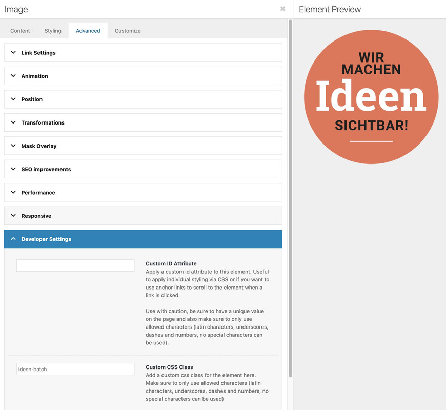
(ich vergab eine custom css dem IMG Alb Element: ideen-batch
.ideen-batch svg,
.ideen-batch .avia_image {
  width: 20vw;
  margin-left: 10vw;
}

@media only screen and (max-width: 549px) {
  #av_section_1 {
    background-position: 75% 100%;
  }
  .ideen-batch svg,
  .ideen-batch .avia_image {
    margin-left: 3vw;
  }
}
October 28, 2024 at 10:49 am #1469985Das klingt gut aber ich befürchte ich brauche eine mehr detaillierte Anweisung um dir folgen zu können. zB wo vergeben ich IMG Alb Element etc?
Kannst du bitte für das Ganze detaillierte Schrittte für Dummies auflisten?October 28, 2024 at 11:35 am #1469989ALB Element ist Advance Layout Builder Element – also das was du in dein Layout einsetzt. z.B. Image – vielen (wenn nicht sogar alle) diese ALB Elemente haben die Option eine benutzerdefinierte Klasse zu erhalten. Also im Edit Modus dann auf Advanced Tab dort Develper Settings (bitte dort in den Eingabefeldern die Bezeichnung ohne Punkt eingeben).
 October 28, 2024 at 12:44 pm #1469996
Das hatte ich tatsächlich schon gemacht, weil CSS ist mir bekannt. Aber es tut sich noch immer nichts :(
Das bild ist riesig und in der Mitte und das Rollover Bild ist eckig :(
October 28, 2024 at 2:39 pm #1470009du hast es noch auf bild mittig!
und auf Grund der Setzung der allgemeinen svg weite, müssen wir hierfür dann selectiver werden:#top .ideen-batch svg, #top .ideen-batch .avia_image { width:20vw !important; margin-left:10vw }October 28, 2024 at 3:54 pm #1470013Ok jetzt hab ichs. Nur auf Mobil ist der Kreis mini geworden. Wie kann der grösser sein? Also ab einer bestimmten Screen width einfach die grösse behalten?
October 28, 2024 at 3:59 pm #1470014zunächst – ist das intentional, das der Kreis zunächst ohne die Inhalte gezeigt wird?
da oben habe ich ja auch schon eine Anpassung angedeutet. Da kann natürlich auch die width mit hinein.
Hast du eigentlich wirklich die container weite auf 1130px gestellt? ( in dem Fall wäre die margin-left hier nicht nötig).
October 28, 2024 at 7:31 pm #1470033zunächst – ist das intentional, das der Kreis zunächst ohne die Inhalte gezeigt wird?
Ja das ist noch nicht final. Ist grad nicht so wichtig.da oben habe ich ja auch schon eine Anpassung angedeutet. Da kann natürlich auch die width mit hinein.
Wo genau kann die width hinein? Ich lerne noch und habe noch nicht ganz den Durchblick. Bitte schicken wo genau das reinkommt.Hast du eigentlich wirklich die container weite auf 1130px gestellt? ( in dem Fall wäre die margin-left hier nicht nötig).
Wo kann ich das machen?October 29, 2024 at 11:56 am #1470093Also nochmal, mir geht es darum, dass der Kreis auf Mobil jetzt Mini erscheint. Wie kann der grösser sein? Also ab einer bestimmten Screen width einfach die grösse behalten?
Kannst du bitte so gut sein, mir ein konkrete Lösung zu schicken?Ich selber kann den Fehler leider nicht aufspüren. Bitte um fertiges CSS.
Es eilt jetzt leider. Die Webseite soll diese Woche life gehen.
October 29, 2024 at 12:17 pm #1470095hier oben : https://kriesi.at/support/topic/logo-springt/#post-1469978
sieht Du ja das da eine margin-left drin ist. Bei der Screenweite jedoch macht es keinen Sinn.wenn du lieber über die gesamten Breiten den Batch gleich groß haben möchtest:
(also dann den margin-left weg und doch eine absolute Größe definieren.#top .ideen-batch svg, #top .ideen-batch .avia_image { width: 200px !important; }October 29, 2024 at 1:17 pm #1470109Super danke. Jetzt passt es. Ist es möglich den Ideen Kreis beim Laden noch mehr ploppen zu lassen? Am best dass erst nur ein oranger kreis geladen wird un im letzten Moment die Schrift dazukommt?
October 29, 2024 at 1:38 pm #1470113nicht mit dem svg als img tag. Wenn da ein inline svg wäre, dann könnte man sogar auf das image overlay verzichten.
wenn du nochmal auf meine Beispielseite gehst: https://webers-testseite.de/ausgesonnen/
und dir jetzt den leicht geänderten Quellcode des svg ansiehst, dann bemerkst Du, dass jetzt jede Zeile eine eigene Klasse hat.
Diese sind via quick css ansprechbar..ideen-batch svg { width: 20vw; margin-left: 10vw; } #av_section_1:hover .ideen-batch svg .sichtbar { fill: #FFF; transform: scale(1.2); transform-origin: center 90px; } #av_section_1 #Ideen-Kreis :not(.kreis) { opacity: 0; animation: batch 1s ease 3s forwards; } @media only screen and (max-width: 549px) { #av_section_1 { background-position: 75% 100%; } .ideen-batch svg, .ideen-batch .avia_image { margin-left: 3vw; } } @keyframes batch { to { opacity: 1; } } -
AuthorPosts
- You must be logged in to reply to this topic.