-
AuthorPosts
-
March 15, 2023 at 2:14 pm #1401252
Hi,
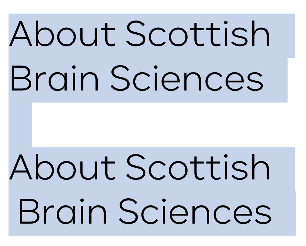
When I add a line break within a p tag. The second line has one character of whitepace after the <br> tag and before the first text character.
How it looks in the ALB:
<p class="de-homepage-title lightblue" style="text-align: left;">About Scottish<br>Brain Sciences</p>How it looks on screen and using Chrome Inspect:
-
This topic was modified 3 years, 1 month ago by
DigitalEssence.
-
This topic was modified 3 years, 1 month ago by
DigitalEssence.
March 15, 2023 at 4:12 pm #1401263do you really believe that there is a whitespace ?
This seems to be normal typographic behavior – for example : Carmen Sans ( not the same font but nearby ) – see first two lines without whitespace after break
and at the end with a whitespace:
( i just activated those lines that you can see the alignment better )
You see that a blank space in typography is a quarter square. ( half n-dash space )
this is like fonts in that the baseline of curves is always slightly below the straight lines of a font.March 15, 2023 at 4:27 pm #1401266You can try that yourself
duplicate your heading and after the line break (br-tag) insert and compareor start your second line with an A too! Just to see what happend to second line
March 15, 2023 at 4:39 pm #1401270Hi,
you are so right. Thank you. it wasn’t a whitespace but half n-dash. I should know as I used to work for a typesetters but I was IT support/systems so didn’t pay too much attention to the world of books.
If I make the second line start with an A then they line up correctly.
March 15, 2023 at 4:41 pm #1401271on to it is not even half n-dash it is just nearby the stroke width.
March 15, 2023 at 4:47 pm #1401272Now just need to work out how to line them up.
March 15, 2023 at 4:50 pm #1401275I added a span around the seconbd line then nudged it left by 7px;
.de-nudge {display:inline-block; outline:1px solid red; text-indent:-7px;}March 15, 2023 at 4:53 pm #1401276But why ?
this is typographically correct – have a look to a Sentence where all round Letters on the bottom ( o, e, c, etc ) are on the same line like the n, m, z etc.
This looks horrible. The same here.March 15, 2023 at 4:55 pm #1401277It does.
I’ve scrapped it. It was only when I sat back and looked properly I realised how hideous it looked.
Thank you for your time and help. It’s appreciated
March 15, 2023 at 7:02 pm #1401304 -
This topic was modified 3 years, 1 month ago by
-
AuthorPosts
- You must be logged in to reply to this topic.
