-
AuthorPosts
-
July 25, 2024 at 9:49 am #1462944
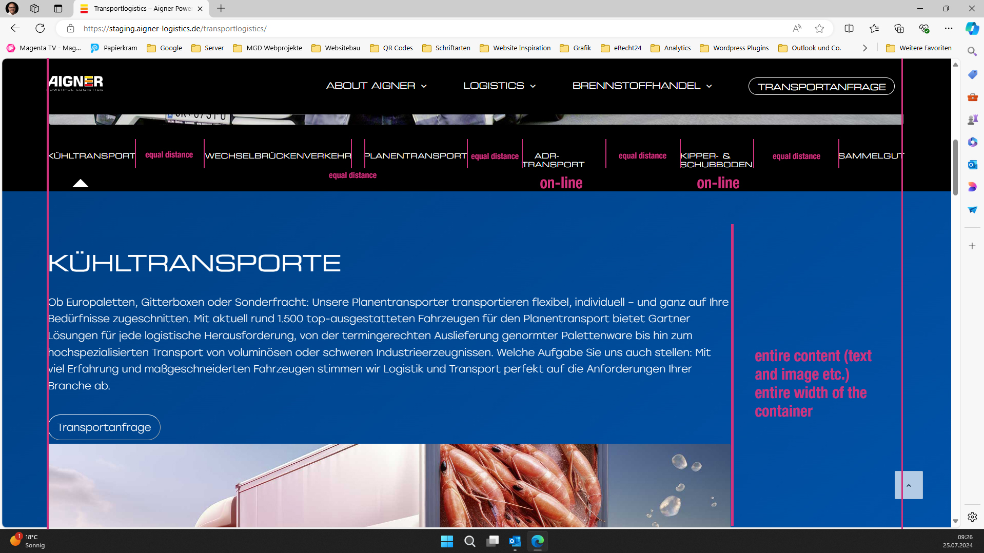
Hello, I would like to adjust the tab section. See pictures
1. Title bar, all titles in one line, centered and evenly spaced.
2. Active tab should be underlined without an arrow
2. Content box to the entire width, regardless of content (see picture)
 July 27, 2024 at 5:28 pm #1463117
Hey Markus,
Thank you for the link to your site, for the tab content width, it looks like you have this custom css:.av-layout-tab-inner { margin-right: 20% !important; margin-left: 1% !important }please remove it, and add this css instead:
.responsive .av-layout-tab-inner > .container {
	padding: 0;
	max-width: 95%;
}
To have a line under the tabs instead of an arrow, add this CSS:
.avia_transform .av-tab-arrow-container span {
  left: 0;
  width: 100%;
  transform: none;
}
.av-active-tab-title .av-tab-arrow-container {
	top: -9px;
}
.av-inner-tab-title, .av-tab-arrow-container, .av-tab-section-icon, .av-tab-section-image {
   width: 100%;
}
this also increases your tab width so some of your tab titles are not over two lines.
After applying the css, please clear your browser cache and check.Best regards,
MikeJuly 29, 2024 at 8:44 am #1463204Hi Mike,
perfekt thank you
Another question: How can I make the distance between the underline and the text a little smaller?-
This reply was modified 1 year, 8 months ago by
markmade.
July 29, 2024 at 11:08 am #1463227Hi,
Try this CSS in your Enfold Theme Options ▸ General Styling ▸ Quick CSS field:#top .av-tab-no-icon.av-tab-no-image .av-inner-tab-title { margin-bottom: 0; }After applying the css, please clear your browser cache and check.
Best regards,
MikeJuly 29, 2024 at 11:36 am #1463232could we make the underline a little narrower in height
July 29, 2024 at 11:41 am #1463235July 29, 2024 at 11:43 am #1463239and the line width smaller
July 29, 2024 at 11:49 am #1463240Is it possible for individual containers within the tab container to be full screen width? As shown in the second image I added? So, for example, both images are full width, as is the section where the truck is graphically displayed.
 July 29, 2024 at 5:30 pm #1463251
Hi,
You can make the inner section full width with this css:.responsive .av-layout-tab-inner > .container { max-width: 100%; }then you can add padding to the elements in the inner tab that you don’t want full width, like the text element.
Best regards,
MikeJuly 30, 2024 at 9:43 am #1463303almost perfect, you just have to add padding: 0px; and then it will fit
July 30, 2024 at 9:44 am #1463304How can I make the underline a little smaller?
July 30, 2024 at 4:37 pm #1463348 -
This reply was modified 1 year, 8 months ago by
-
AuthorPosts
- You must be logged in to reply to this topic.
