Tagged: language switcher, mobile, wpml
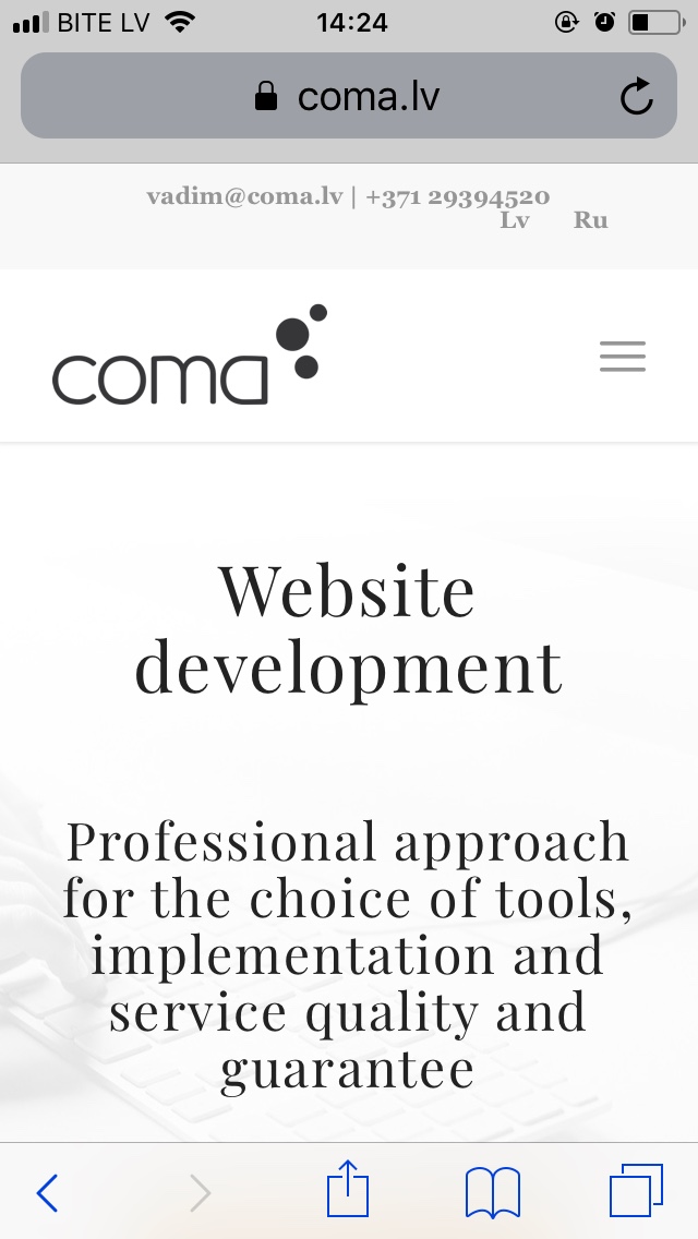
Hello, I’m trying to add custom language switcher to Enfold right top bar, but I get very strange looking switcher.
Is there a way to add switcher there?
I’ve added screenshot of what I would like to see in top bar.
Website – https://www.coma.lv/en/

We’ve added some CSS code, but it still doesn’t work
.lang_sel_list_horizontal {
float: right;
margin-top: -13px;
margin-left: 10px;
border: none;
}
But it looks strange on mobile, please see attachment
link – https://www.coma.lv/en/

Is there a way to place language switcher nice in the middle on mobile?
Hey vadikcoma,
Thank you for using Enfold.
You can use these css codes to adjust the style of the language selectors.
.wpml-ls-legacy-list-horizontal a span {
    vertical-align: middle;
    text-transform: uppercase;
}

@media only screen and (max-width: 767px) {
  /* Add your Mobile Styles here */
  .lang_sel_list_horizontal {
    float: none;
    margin-top: 0;
    margin-left: 0;
    border: none;
  }
}
Best regards,
Ismael
Thank you Ismael, seems to work perfect!
Hi,
Great, glad we could help. Please let us know if you should need any further help on the topic or if we can close it.
Best regards,
Rikard
Please consider this as resolved
Hi,
Thank you for your update.
We appreciate it a lot.
Best regards,
Basilis
