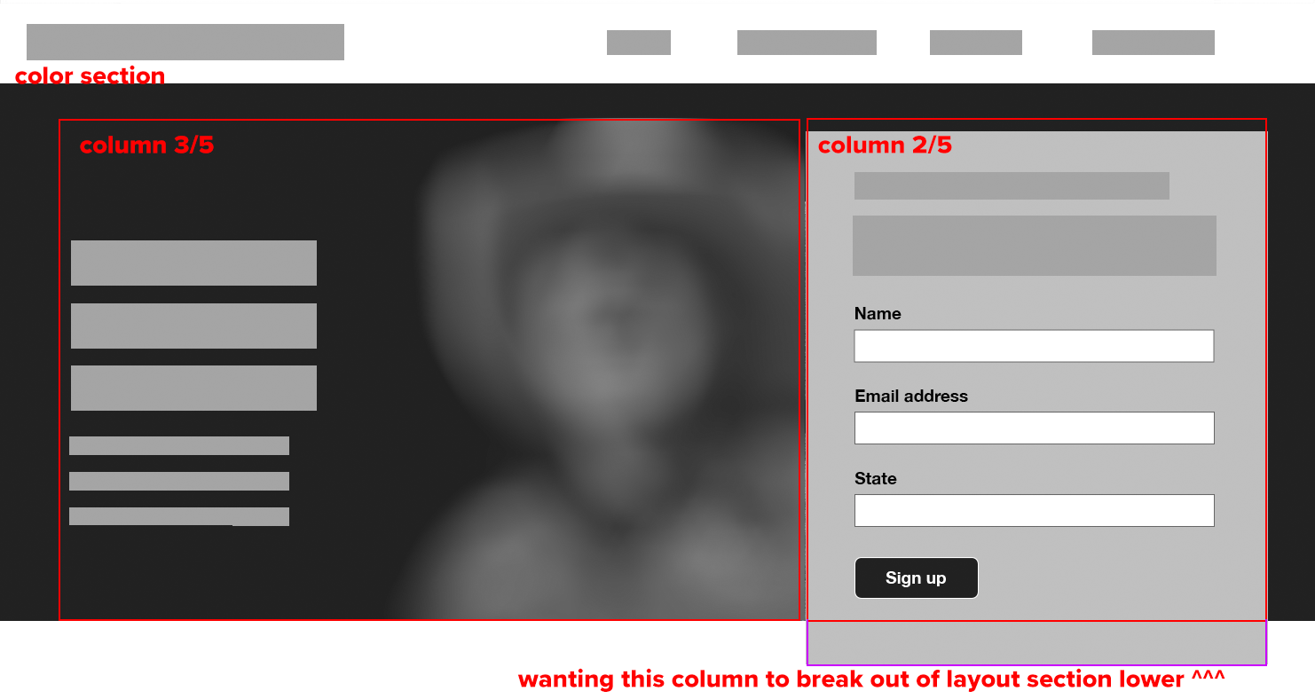
Hi! We have a big “hero” image with a headline and line of text at left, and a signup box at right — but we’d like to have the color section slightly lower than the color section it is contained in.
Here’s a mockup of what we’re looking at:
https://www.dropbox.com/s/h866i98k6mdkfmd/screenshot.png?dl=0

Is there a css snippet for something like this?
Hey mocreate,
Thanks for the mockup. Could you post a link to where we can see the actual elements as well please?
Best regards,
Rikard
Why don’t you define on the 3/5 column that they have same height.
Only to give advice from a screenshot it is hard to more precise.
