Tagged: image in menu, menu, mobile menu
-
AuthorPosts
-
September 28, 2021 at 4:21 pm #1322655
Hi there,
I need your support.
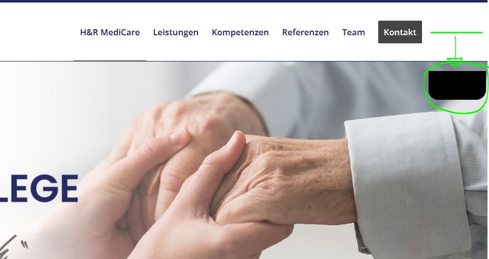
I have inserted an image into a menu with the following code, which otherwise works wonderfully with other themes.<p style="text-align: margin 0.0.0.0;"><img class="alignnone size-full wp-image-111" src="https://hr-pflege.de/wp-content/uploads/2021/09/1.png"/>But the whole thing is not in line with the other menu items. See the following picture.

But the whole thing is not in line with the other menu items. See the following picture. Even with margin settings nothing changes.
With the following code, it is in a row, but I cannot make the margin settings here, because I would like to have the image a little further above.<img src="https://hr-pflege.de/wp-content/uploads/2021/09/1.png"/>Do you have a solution?
September 29, 2021 at 8:24 am #1322741Hey FORMATIG,
Could you post a link to where we can see the actual results on your site please?
Best regards,
RikardSeptember 29, 2021 at 9:04 am #1322751This reply has been marked as private.September 29, 2021 at 9:40 am #1322761This is something that could not work:
p style="text-align: margin 0.0.0.0;"text-align: ?
margin : no colon is noted above – and no dots between the values (0 0 0 0) – if all have the same value shorten to:
margin: 0i do not know why there had to be a p-tag but if so – a closing p-tag had to be there too
<p style="text-align: left; margin: 0;"><img class="alignnone size-full wp-image-111" src="https://hr-pflege.de/wp-content/uploads/2021/09/1.png"/></p>September 29, 2021 at 10:04 am #1322770Oh Thx! Now it works, and i can make margin settings. Thx u vermy much!
I use the same code for formatig.host (login icon)
<p style=”text-align: margin 10.0.0.0;”>`
You are right about the p tag – that was my mistake.
September 29, 2021 at 10:15 am #1322771no – definitly not only the closing tag
that was a completely wrong way to write down the css. I would be very surprised if it would work anywhere.
on margin – no separators between the values !
if you have 4 values on it it is: margin: 10px 0 0 0 ;
( means margin-top: 10px ; margin-right: 0; margin-bottom: 0; margin-left: 0 )
if there are three values: margin: 0 10px 0
( means magin-top: 0; margin-right and margin-left: 10px; margin-bottom: 0; )
if there are two values: margin: 10px 0;
(means margin-top and margin-bottom : 10px ; margin-right and margin-left: 0 )semicolons between different style settings please ( so text-align and margin had to be separated by semicolon )
allowed values for text-align: left|right|center|justify|initial|inherit;
All this is not bad, we are all still learning. And no question is too stupid – only not asking is stupid.
September 29, 2021 at 10:28 am #1322773The text aglin makes sense to me. Even embarrassing for me :) Would you help me to reduce the code?
So that only margin and size settings are left?`<p style=”text-align: left; margin -10 0 0 0;”>

The entered values, image source and dimensions are for testing purposes only. – Just in case you wonder about the meaning of the values etc. :)
Thx for ur support
September 29, 2021 at 10:30 am #1322774sorry here the code:
<p style="text-align: left; margin -10 0 0 0;"><img class="alignnone size-full wp-image-111" src="https://hr-pflege.de/wp-content/uploads/2021/09/1.png" width="20" height="20"/></p>September 29, 2021 at 10:47 am #1322779and even here there is the colon missing after margin -and the units of the value ( zero could be without unit ) !
<p style="text-align: left; margin: -10px 0 0 0;"><img class="alignnone size-full wp-image-111" src="https://hr-pflege.de/wp-content/uploads/2021/09/1.png" width="20" height="20"/></p>September 29, 2021 at 12:00 pm #1322795thank u a lot! bzw. Vielen Dank Guenni :)
-
This reply was modified 4 years, 6 months ago by
FORMATIG.
September 29, 2021 at 12:30 pm #1322801nicht dafür ! ;)
September 30, 2021 at 5:11 am #1322918Hi,
Thanks for helping out @guenni007 :-)
Is everything working as it should now @FORMATIG? Please let us know if you should need any further help on the topic or if we can close it.
Best regards,
RikardSeptember 30, 2021 at 8:34 am #1322941by the way : i do not now why you like to have that png in your menu –
but if you look into the appearance – menu settings on window top right there is “screen options”
if you activate to see css classes on menu-items you can give a class ( in my case : gradient ) to menu-items then. And with that class you can even have animated backgrounds on menu-items. see : https://webers-testseite.de/li.gradient .avia-menu-text { color: #fff; background: linear-gradient(-45deg,#FFA63D,#FF3D77,#338AFF,#3CF0C5); background-size: 600%; border: none !important; animation: anime 14s linear infinite; padding: 10px 20px !important; border-radius: 10px !important; }next way – you can have the enfold options on that menu page to mark the option : “Button Style colored”
this color can be changed to what ever you like. ( see same link : Impressum )
and with a border-radius valued with 4 values you can influence each corner separatly of that rectrangle:
( top-left top-right bottom-right bottom-left – nomenclatura goes clockwise from top-left corner )#top #wrap_all .header_color .av-menu-button-colored > a .avia-menu-text { background-color:#aea410; border-color:#aea410; border-radius: 0 0 10px 10px; }and f.e. on your screenshot above – you can have that for your contact button too ;)
September 30, 2021 at 3:16 pm #1323026 -
This reply was modified 4 years, 6 months ago by
-
AuthorPosts
- You must be logged in to reply to this topic.
