
-
AuthorPosts
-
July 31, 2018 at 2:48 pm #991947
Hi there,
I have 2 questions :
1. On the home page, I have a section called “The Relics”. This is an image gallery, which when clicked opens up lightbox view of the corresponding image. However I don’t want to open the lightbox, I want to associate it with a link, which when clicked opens up with the specified link. How can this be achieved? Reference Image attached here here
2. On the Patron’s pages, I have a 4 column team member layout, working all fine on the desktop. Ref Image
However, when viewed on mobile devices (Chrome Inspector > Toggle Device Sidebar > Choose any mobile device) :
a) The 4 column layout switches to 1 column with large full-width images Ref Image – How can I have 2 or 3 column layout on the mobile devices with thumbnail sized images.
b) there is a bug w.r.t to the layout when viewing on high-resolution mobile devices (Chrome Inspector > Toggle Device Sidebar > Choose IphoneX or Pixel 2) that the one particular image as shown in the ref image here breaks the layout to be smaller than the other images. Why is this happening and How can this be solved to avoid repeating this issue in the future.Thanks
August 1, 2018 at 8:16 am #992242Hey panoramist,
Thank you for using Enfold.
1.) This is possible with the Masonry Gallery because you can apply a Custom Link to the gallery items. The items will then direct to those links instead of opening a larger version of the image on a lightbox. You can also use the Image element.
2.a) Use this css code to adjust the width of the container on mobile view.
@media only screen and (max-width: 767px) {
.responsive #top.page-id-3650 #wrap_all .flex_column.av_one_fourth {
    width: 24%;
    margin-left: 1%;
}
}
2.b) I’m not sure why it would resize like that. Please try to upload a larger version of the image, twice that of the current one.
Best regards,
IsmaelAugust 1, 2018 at 9:29 am #992279hey Ismael i think you misunderstood him – he is concerning to 768 til 989px 2b
and he likes to have the 4th entry not on 24% but as all the other on 48%the result is caused by an old “bug” of maybe wpautop function.
on the source i see that there is a <p></p> construct inserted between the flex-columns.:
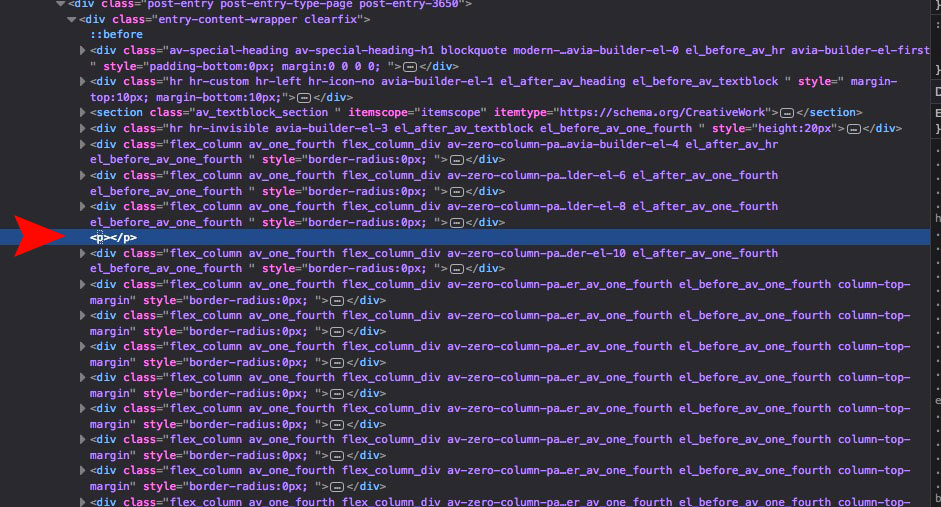 August 1, 2018 at 9:48 am #992285
i can simulate this by checking the following code in the javascript console in Firefox
(function($){
   $('p:empty').remove();
})(jQuery);
so this would probably solve the issue in functions.php of your child theme:
because i don’t know how this comes into that source code maybe this would not solve it:
remove_filter( 'the_content', 'wpautop' );
remove_filter( 'the_excerpt', 'wpautop' );
so that will do it:function remove_empty_ptags(){ ?> <script> (function($){ $('p:empty').remove(); })(jQuery); </script> <?php } add_action('wp_footer', 'remove_empty_ptags');August 1, 2018 at 9:53 am #992289August 1, 2018 at 10:02 am #992295sure :lol
2a) and to have the images not full-width you can do that for smaller screens:
@media only screen and (max-width: 767px) {
.av_one_fourth img {
    width: 50vw;
    float: left;
}
}
PPS: what kind of plugin is it on your image gallery? – very nice !
August 2, 2018 at 5:36 am #992690August 3, 2018 at 10:25 am #993145Dear @Ismael and @guenni007 thanks a lot for your thoughtful inputs.
August 3, 2018 at 10:35 am #993151Dear @ismael,
Following code works, howerver it is also messing up my footer
@media only screen and (max-width: 767px) {
.responsive #top.page-id-3650 #wrap_all .flex_column.av_one_fourth {
width: 24%;
margin-left: 1%;
}
}also what changes need to be made to make it 3 column layout
August 3, 2018 at 11:14 am #993184Hi there, I am having an issue with high-resolution mobile devices where my div even if its set to squarish dimensions are going full width.
https://imgur.com/a/L0ts4a3August 3, 2018 at 11:16 am #993185High-resolution mobile devices – Pixel 2 , iPhone X
Chrome Inspector > Toggle Device Sidebar > Choose IphoneX or Pixel 2August 3, 2018 at 3:57 pm #993301On the Patrons Page , this particular item’s (Team Member Name) is flowing out of div when view on mobile devices? How can this be solved ?
August 6, 2018 at 7:52 am #993819Hi,
Looks like you manage to fixed the issue with the footer columns. If it’s not fixed yet, try to insert the “template-page” selector right after the “#wrap_all” selector.
.responsive #top.page-id-3650 #wrap_all .template-page .flex_column.av_one_fourth {
   width: 24%;
   margin-left: 1%;
}
Decrease the font size of the team member name for smaller devices.
.team-member-name {
    font-size: 11px;
}
There are two version of that section, called “blog-grid” and “blog-grid-hd”. Why is that? The images look fine on both galleries, so I’m not really sure what the issue is.
Best regards,
IsmaelAugust 7, 2018 at 8:30 pm #994554Hi Ismael, thanks for your input.
In the following video, You can see how the relics section and workshop section appear one after the other; this view is on normal mobile devices. However, on high res mobile displays like Pixel 2 , Iphone X etc, you can see how the relics and workshop section appear side by side.
How can I achieve them to appear one below the other even on high-resolution displays?Also in the video, you must have also seen the titles of relics and workshop section are capitalized (upper case), has there been any updates to the theme and changes to css? Intially they were under normal case.
August 8, 2018 at 4:02 am #994674Hi,
Thanks for the update.
1.) This is a css media query used specifically for iPhone X, iPhone 8 and Plus, or mobile devices with the same specs.
@media only screen
    and (device-width : 375px)
    and (device-height : 812px) {
    #blog-grid-hd .flex_column.av_one_half, #blog-grid .flex_column.av_one_half {
        width: 100%;
        clear: both;
        margin: 20px auto;
   }
}
It is going to adjust the width of the columns inside the “blog-grid” sections, so they stack up on top of each other.
2.) The title are actually set to uppercase by default.
.template-page .entry-content-wrapper h1, .template-page .entry-content-wrapper h2 {
    text-transform: uppercase;
}
You can adjust the text-transform value to “none” if you don’t like the headings capitalized.
Best regards,
Ismael -
AuthorPosts
- You must be logged in to reply to this topic.