-
AuthorPosts
-
January 23, 2024 at 7:57 am #1431751
Hey,
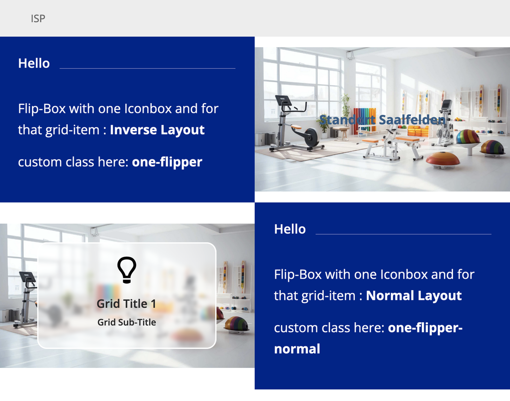
I only want one image flipping by mouse hover and then text on the back side. The problem is, that the image here doesn’t fill the whole table…How can I make it, that the image is on the full right side?
https://p654165.mittwaldserver.info/index.php/our-clinic/about/?preview_id=950&preview_nonce=cb8f796753&preview=true
Thanks a lot.
Best regards,
EveJanuary 23, 2024 at 10:54 am #1431773first of all – your link does not work.
next on those alb elements ( grid-row and the cell that has the flip-box) set all paddings to zero. If you do not set – there will be default ones set by enfold.
Do not set min-height for those! – i used for grid-item that option : Inverse Layout – Ignored For Tooltipgive a custom class to the grid-row – i tested it with my setting : one-flipper
synchonize the break-point at media-query to the grid-row breakpoint.
i have set 767px but if you like you can do it with 989px@media only screen and (min-width:768px) { .av-layout-grid-container.one-flipper { min-height: 28.12vw; } .av-layout-grid-container.one-flipper .avia-icon-grid-container, .av-layout-grid-container.one-flipper .article-icon-entry { min-height: 28.12vw; } } @media only screen and (max-width:767px) { .av-layout-grid-container.one-flipper .avia-icon-grid-container, .av-layout-grid-container.one-flipper .article-icon-entry { min-height: 56.25vw; } }now for understanding: your image has a 16/9 ratio because the image is set to cover the background hat to be of that aspect ratio.
the screenwidth is 100vw – and the height than must be in a 32/9 ratio ( because only the half container should be 16/9)
9/32 = 28.125
the whole grid-row now has to be 28.125vw in height !Sample Page: https://webers-testseite.de/isp/
and css for normal flipJanuary 23, 2024 at 11:03 am #1431774i try now your setting of background-image on front- and normal flip under that demo
btw. this only works – if the content of the other cell does not need more space than the height-setting
then you have to break at 989px – and if that does not work too – you have to live with those spaces ;)
Because the cell with more content (space for that content ) determines the height of the grid-row.January 24, 2024 at 5:51 pm #1431924i see that you have set on the page /our-clinic/about for the other cell a min-height – that will be possible if you want only the flip-background image to cover only ( including crop ) – you have to remove all paddings on that cell with the flip-box and set the same min-height / height option there !!!
my method above is only to have totaly responsive bg-image for flipyou can test if for the above page by:
.av-layout-grid-container.av-li73q-e1db10c26939acc99331ee70921182c6 .avia-icongrid-flipbox .av-icon-cell-item .avia-icongrid-flipback,
.av-layout-grid-container.av-li73q-e1db10c26939acc99331ee70921182c6 .avia-icongrid-flipbox .av-icon-cell-item .avia-icongrid-front {
  margin: 0 !important;
}

.av-layout-grid-container.av-li73q-e1db10c26939acc99331ee70921182c6 {
  min-height: 500px !important;
}

.av-layout-grid-container.av-li73q-e1db10c26939acc99331ee70921182c6 .avia-icon-grid-container,
.av-layout-grid-container.av-li73q-e1db10c26939acc99331ee70921182c6 .article-icon-entry {
  min-height: 500px !important;
}

.responsive #top #wrap_all .flex_cell.av-5cyqiu-1b136132ec762676c6173331de16be40{
  padding: 0 !important;
}
i would give the grid-row a custom class or ID and set the css for that.
January 29, 2024 at 7:55 am #1432336Thank you so much! It works and I am really happy now! :)
Best regards,
EveJanuary 29, 2024 at 8:34 am #1432344Hi,
Glad to know that @Guenni007 was able to help you out! Please feel free to open another thread if you have more questions about the theme.
Have a nice day.
Best regards,
Ismael -
AuthorPosts
- The topic ‘Image to flip’ is closed to new replies.

