-
AuthorPosts
-
August 5, 2022 at 12:32 pm #1360789
Hi,
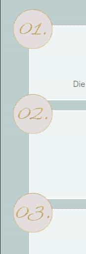
I would need a second help with Responsive customization. On the website (link in private content) there are 6 pages with offers. There is a row of 3 dots (01, 02, 03) following each offer. The dots are created as an image and adjusted in position so that they can be seen in the upper left corner of the column. (see screenshot in dropbox – link in private content).
Below 767px screen width there are two problems:
1. there is too little space between the columns, so the dots always protrude into the top column. How to change this
2. the position of the images is different far left at 767px and at 464px, so the image is cut off (images in the dropbox).It concerns each of the 6 pages under the menu item ANGEBOTE.
Thank you very much and best regards, Sabine
Translated with http://www.DeepL.com/Translator (free version)
August 5, 2022 at 6:20 pm #1360839Hey Sabine,
The page you linked to results in a 404 error page, please check the URL.
Best regards,
RikardAugust 5, 2022 at 7:21 pm #1360854Oh Rikard,
a double error today – I’m sorry – it is the heatwave …
The new link is in the private content.
Best regards, Sabine
August 5, 2022 at 8:38 pm #1360864Hi,
Thanks for that. The page you linked to works, but the elements in your screenshots are not on the page. Could you link to where we can see the elements which are in your screenshots please?
Best regards,
RikardAugust 6, 2022 at 3:27 pm #1360917Hi Rikard,
the link of all 6 pages are in the private content and the screenshots are in the dropbox – link in the last private content
Best regards, Sabine
August 8, 2022 at 3:17 am #1361035Hi,
Thank you for the info.
The css code below should adjust the position of the dots on smaller screens.
@media only screen and (max-width: 768px) {
    .avia-image-container.av-67cea-136ddc8b145abc744c886b5819885f00, .avia-image-container.av-4hwii-ef140ae0612800d65a56956f82b14b3f, .avia-image-container.av-2ofye-558b2f838626b4d4afd94927f17a28e6{
        position: relative;
        top: -75px;
        left: -40px;
    }
}
We are using the unique class name of the image elements in the css rule above, but the class names can be replaced with custom ones if necessary. Please check this documentation.
// https://kriesi.at/documentation/enfold/add-custom-css/
Best regards,
Ismael`August 8, 2022 at 12:27 pm #1361100Hi Ismael,
I am sorry, the code doesn’t work. Even if I change the pixels, the points do not move.
I created the CSS class “roundbutton” on one page (link in private content) and experimented with it – but even there the position of the dots below 767px screen width doesn’t change unfortunately.
Are there any other possibilities?
Many greetings, Sabine
August 13, 2022 at 11:25 am #1361590Hi,
is it possible to have informations till monday?
Thank you so much.
Best regarsds, Sabine
August 13, 2022 at 4:49 pm #1361604Hi,
Thank you for your patience and the login to your site, so for the page linked below where you added the custom class roundbutton, I don’t find any css in your Enfold Theme Options ▸ General Styling ▸ Quick CSS field or in your child theme ▸ style.css.
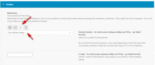
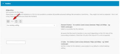
It looks like you mostly add your custom css to the WordPress ▸ Customize ▸ Additional CSS field, which is good, but I don’t find the customization that Ismael recommended anywhere, so I assume that you have removed it. I see that instead of using custom css you are using the element Advanced ▸ Position ▸ Image Position, which is good.

but please note that this was for the desktop resolution only, for the other sizes the position is using the same desktop position:

so you will want to set each resolution size position option, for example for small screens (between 480px and 767px – eg: Tablet Portrait) I set it to top -40 & left -40

and now the position is better:

for the smallest screens you have the element hidden, so there is no need to set the position:

and for medium sized screens (between 768px and 989px – eg: Tablet Landscape) the current desktop position seems to work fine, so there is no need to set the position:

please clear your browser cache and check this page and if you find it working now please adjust your other pages accordingly.Best regards,
MikeAugust 15, 2022 at 12:10 pm #1361691Hi Mike,
thanks for the help, I now understood what it is all about and now I could also customize the round buttons on the smartphone. I had forgotten that I had turned them off for the smallest screen sizes … um. That’s why Ismael’s version couldn’t work at all. I had – I think – applesauce in my head that day. And I actually didn’t check that you can already set the image position directly on the image on all devices. I was surprised that there is no such thing ….. well, that was not my best day. But now everything works. Thanks again and enjoy the coffee :)
You can close the topic – thanks
Many greetings, Sabine
August 15, 2022 at 12:28 pm #1361693Hi,
Glad we were able to help, if you have any further questions please create a new thread and we will gladly try to help you. Thank you for using Enfold.Best regards,
Mike -
AuthorPosts
- The topic ‘Image position in mobile view’ is closed to new replies.
