
Tagged: image in image, picture in picture, stick to corner
-
AuthorPosts
-
July 21, 2023 at 1:45 am #1413884
I can’t figure out the css to place a small image in the top corner of the color block — a 100% color block.
Hope to use a bigger image, with a small image in top right corner for a temporary page until website truly up. A maintenance page.
I tried a 4/5 and 1/5 block, but that still will require css in order to actually put the small image super close to top in right corner.
Could you tell me what I should do to achieve this?
Thanks in advance!July 21, 2023 at 10:24 am #1413929Hey CharlieTh,
Thank you for the inquiry.
The current setup looks fine, but it might require some css adjustments. Please add the following css code to adjust the position of the last column containing the image.
#top .av-bs38t-ba24cd12277f26a24231226326f8c3e9 {
    position: absolute;
    right: 0;
    top: -100px;
}
Best regards,
IsmaelJuly 22, 2023 at 3:25 am #1414014Thank you.
What I was trying to achieve was a full page picture, with a small picture in the top right. I fear I didn’t explain well!
So, the full picture is image background of color block.
The smaller image is right up at the top right corner, WITHIN the color block.
I find if I use your css, I will have to alter it for every screen size.
I hoped top:0; right: 0; in some combination, would put the image up in the right-hand corner for EVERY screen size. Maybe I believe in magic?
I have created another page at:The (poor) css I’ve tried to use is:
/*Overflow auto makes div same size as image, otherwise is skinny horizontal line only*/
.my-container{overflow:auto!important;background:aqua!important;float:right!important;border: solid blue 3px!important;padding-top:0!important;padding-bottom:0!important;position: relative!important;top:-80px!important;}But…I think what I need to do is to move the my-container to the upper right AND ALSO put the image in the upper right.
I got the image in upper right of the container, but the container is still not, say, 10 pixels from both top and right side of color block. Hoped it would stay there!
Any direction you can suggest?
Thanks for any help you can give.
July 23, 2023 at 3:28 pm #1414135Hi,
Thanks for the test page, I believe that the issue is that for desktop the container max width is 1310px so top 0, right 0 is not putting the image at the edge of the screen:#top #main .my-container { right: 0; position: absolute; top: 0; }
but on mobile it is:

So a possible solution is to remove the max-width limitation and the padding:#av_section_1 .container { padding: 0; width: 100%; max-width: 100%; } #top #main .my-container { right: 0%; position: absolute; top: 0; }You would probably want to add a page ID to the so it doesn’t affect other pages, but I don’t know if this will cause any issues with other content you want to add to the page.
Your other option is to use media queries to adjust the negative right placement for each screen size like this:@media only screen and (max-width: 890px) { #top #main .my-container { right: -8%; position: absolute; top: 0; } } @media only screen and (min-width: 891px) and (max-width: 1310px) { #top #main .my-container { right: -6%; position: absolute; top: 0; } } @media only screen and (min-width: 1311px) and (max-width: 1456px) { #top #main .my-container { right: -10%; position: absolute; top: 0; } } @media only screen and (min-width: 1457px) { #top #main .my-container { right: -28%; position: absolute; top: 0; } }Please note that this doesn’t cover evey screen size after 1456px, but gives you a good start depending on how precise you want to be noting that there are a limited number of actual screen sizes.
Best regards,
MikeJuly 25, 2023 at 11:09 pm #1414432Wow, Mike, that certainly is reeal close to magic!
I will play around with it more, but particularly intriguing how close your first choice is to working in every case in the responsive design mode.
Thank you so much for explaining your solution, as well as providing it.
I wanted to put, say, an author’s picture or a logo in the top of a bigger picture — useful lots of times.
I shall tuck this treasure away for future use.
Thank you so much for putting on your thinking cap…apparently yours is larger (or just more effective!) than mine!July 25, 2023 at 11:36 pm #1414434July 25, 2023 at 11:42 pm #1414435do not try to put an extra container to that color-section.
Just place two background-images for that container.
so remove the image inside and place just a quick css :.avia-section.av-lkbs50gw-4f6252733029933ed3712caa877cf044{ background-image:url(https://asiantradeassociation.com/wp-content/uploads/2023/05/92d074ce-66c0-4850-8020-88c18c9d9ebd-231x300.webp), url(https://asiantradeassociation.com/wp-content/uploads/2023/07/pexels-karolina-grabowska-40221071.jpg); background-position: calc(100% - 50px) 50px , left top; background-size: 200px auto , cover !important; background-repeat:no-repeat; background-attachment:scroll; }see here: https://webers-testseite.de/multiple-background-images/
July 26, 2023 at 12:08 am #1414441if you like to preserve your column setting – do not place an empty 4/5 and an 1/5 – just use a 1/1 container
inside an image alb with image position right. Choose the image size on entering your media.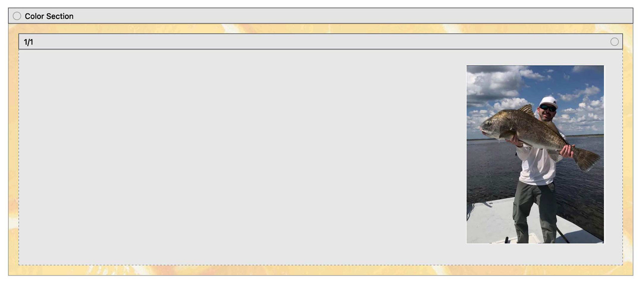
this is my css for that page : https://enfold.webers-webdesign.de/charlie/
in this case it might be the best to use a custom class – f.e.: image-right-top then:
#top .avia-section.image-right-top  .container {
  width: 100% !important;
  max-width: 100% !important;
  padding: 0;
}

#top .avia-section.image-right-top .content {
  vertical-align: top !important;
  padding: 0;
}
July 29, 2023 at 3:07 pm #1414820There are several items relating to the later answers to this question. I am giving each one a separate message. Please bear with me. Think this might be clearer for anyone who might want to read these!
July 29, 2023 at 3:08 pm #1414821Small image within big image — using one column and one image within column — ATTEMPT:
Guenni007, this is my implementation of your idea, as you described…with one column and one image within column.
Works great — tried on ALL settings on Responsive Design Mode in Mozilla — and looked great on all of them!Originally wanted a small inset image (size of image stays same, so sometimes on small screen, looks LARGE…).
So, tried playing with your settings to move in from side and top a little.July 29, 2023 at 3:08 pm #1414822Small image within big “image” — using only Color Section and multiple images — ATTEMPT:
Guenni007, tried the section with the multiple background images — worked a treat!
Learned that if I want a border-radius on little image, seems I must do that on image two via photoshop or other processor, prior to using — no problem!
Really terrific
July 29, 2023 at 3:09 pm #1414823CUSTOM SVG DIVIDER ATTEMPT:
My colors aren’t attractive here, but helped me understand the concept.
Discovered (dumb) that only top gets the “creative look” — cuz that’s what you told it to do in the javascript top_divider_moves_outwards!
Perhaps the name was a clue?!?!?Also discovered, if two color sections under each other — maybe don’t set the bottom divider of the upper section…affects look of the top divider of the second color section beneath it!
My first svg divider — sort of flashed and disappeared…cuz page title bar hid it! Discovery is a wonderful thing!
Didn’t NEED that to show, just assumed it would. Now I understand!For my second color section, chose NOT to bring to front in Enfold option…seemed better effect.
The color of the effect is always the same as the color section itself, yes? I.E., it doesn’t take svg divider enfold option color?
And opacity stays same no matter tne Enfold option setting?
Just trying to understand.
Cool idea!
Thank you so much for sharing.
Question: On your https://webers-testseite.de/divider-on-sliders/
it looks marvelous. But note the divider appears to be moving. Was this accomplished with css or javascript or….?July 29, 2023 at 3:09 pm #1414824MULTIPLE IMAGES BACKGROUND, per Guenni example ATTEMPT:
This was based on Guenni’s
https://webers-testseite.de/multiple-background-images/s https://webers-testseite.de/multiple-background-images/Must have missed something, cuz I goofed on bottom: three-big-images css code.
However, the seal looks VERY neat.
Thanks, Guenni!
July 29, 2023 at 3:10 pm #1414825And, finally, thank you, Gentlemen, for letting me pick your brains. Unattractive term, but boy did I learn lots.
Appreciate all the ideas.July 29, 2023 at 5:11 pm #1414831 -
AuthorPosts
- You must be logged in to reply to this topic.