-
AuthorPosts
-
July 6, 2018 at 7:20 am #981868
I figure this is fairly basic but can’t figure it out. I have a text box paragraph with a small image set to alignleft. The text wraps underneath the image. I would like the text to not wrap and keep the left alignment the same for the entire paragraph, essentially creating whitepsace under the image for the entire length of the paragraph.
July 7, 2018 at 5:38 am #982317Hey hobart,
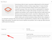
If I understand correctly, you would like to achieve this:

To do this first enable custom classes for your elements by checking the option at Enfold Theme Options > Layour Builder > Show element options for developers.
Then add a custom class for your text block element, such as “no-wrap-text”

Then add this code in the General Styling > Quick CSS field:.no-wrap-text img { padding-bottom: 100vh; }If your paragraph is smaller, then you maybe able to change the setting to 50vh (50% visual height), try some different settings to see what works best for you.
Best regards,
MikeJuly 7, 2018 at 7:57 am #982324Thanks for the detailed reply, Mike. I greatly appreciate it. In theory, this is exactly what I was hoping to achieve. Unfortunately, I have about 25 difference places where I need to apply this and they all are different length and will change depending on responsiveness of the screen. I was hoping there was a way to extend the bottom padding 100% of the current text box height, but was not coming up with a logical way to do this. I will attempt to do a different page layout design to see if I can figure out an alternative method.
Thanks again!
July 7, 2018 at 3:54 pm #982499Hi,
Another alternative is to place a image element and text block element in the same column element.
First give the column element a custom class of “row” (I used a 1/2 column on the page)
Then give the image element a custom class of “column1” (my image is 180px wide & on the left of the text)
and give the text block element a custom class of “column2”
Then use this css:.row { display: flex; justify-content: flex-start; height: 100%; } .column1 { width: 100%; float: left; } .column1 img { min-width: 180px; } .column2 { width: 100%; float: right; }This is responsive to all screen sizes, just adjust for your image width.
Sorry I couldn’t post images, I site I use seems down right now.Best regards,
MikeJuly 9, 2018 at 8:30 pm #983378This is outstanding! I really appreciate the thoroughly help on this. I have a quick question to see if there is an adjustment off the top of your mind that may get me 100%. I have all of the content within a 3/5 column so on a full width screen it doesn’t take up the entire width for aesthetic reasons. If I add a 1/5 column on left, then use this code for the 3/5 it aligns to left of page (see private link). Is there a quick adjustment to offset this. You’re awesome!
July 10, 2018 at 4:16 am #983472 -
AuthorPosts
- You must be logged in to reply to this topic.
