
Tagged: icon list
-
AuthorPosts
-
March 8, 2023 at 5:46 pm #1400493
Hello support,
I am using the ICON-LIST on two pages of my website, and it does look great on computer, but not so much on smartphone.
On large screen, the icon is on the left side, title is “left” and legend is “justified”.
On smartphone, it is basically the same, so that the text is concentrated on the right side of the screen in a narrow column.
The objective would be that on smartphone, the icon is “above” and “center”, the title is “center”, and the legend remains justified, but covering the whole screen width.
I have been trying to solve this by following a mix of your advices here: https://kriesi.at/support/topic/icon-list-on-mobile-crunched/ and here: https://kriesi.at/documentation/enfold/icon-list/#toggle-id-3
Therefore, I created a custom css for one of my icon lists, and added in my quick css the following:
@media only screen and (max-width: 480px) {
.my-custom-class {
float: none;
display: inline-block;
vertical-align: middle;
}}
But… it doesn’t work at all ;)
Worst, it changed the layout on large screen, but not at all for smartphone.
Any insights or ideas ?
Thanks a lot !
ClémentMarch 9, 2023 at 9:09 am #1400530well – i do not see your page – but on the demo page with left and right list :
you had to know how you like to have the left right big lists.
I would bring them all to the left side in responsive case:
( maybe some more important settings are neccessary )@media only screen and (max-width:989px) { .avia-icon-list.avia-icon-list-left.av-iconlist-big .iconlist_icon { float: none; margin-bottom: 25px; } .avia-icon-list.av-iconlist-big .iconlist-timeline { display: none } .avia-icon-list.avia-icon-list-right.av-iconlist-big .iconlist_icon { float: none; margin-bottom: 25px; margin-right: 30px; margin-left: 0px !important; } .avia-icon-list.avia-icon-list-right.av-iconlist-big .article-icon-entry * { text-align: left !important } }March 9, 2023 at 10:50 am #1400538Hello Guenni007,
Thanks a lot for taking time to answer my question.
The website is this one: https://strategies-marines.fr/en/our-offer/
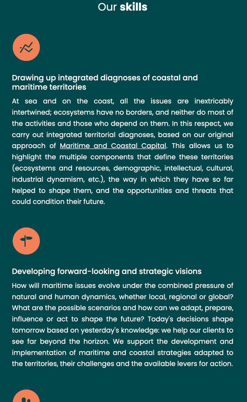
The icon list i’m referring to is the one below “Our Skills” (in dark blue background). It is a “big list” format, already positionned on the left side (such as in the demo page).
The idea would be to change this to a vertical layout on smartphones.
Basically, going from :
– large screen:
>icon>Title +Legend
to smartphone:
>Icon
>Title
>LegendDo you think this would be possible ?
Thanks again,
Clément-
This reply was modified 3 years, 1 month ago by
smlcd.
March 9, 2023 at 1:59 pm #1400562isn’t this what my code does:
 March 10, 2023 at 1:33 am #1400607
That is definetely better indeed, thanks a whole lot !
Do you think it would even be possible to get the icon centered in that case ?March 10, 2023 at 9:48 am #1400645Yes – remove the whole code and replace with:
@media only screen and (max-width:989px) {
  .avia-icon-list.av-iconlist-big .iconlist_icon {
    float:none;
    margin: 0 0 25px;
    position: relative;
    left: 50%;
    transform: translateX(-50%) !important;
  }

  .avia-icon-list.av-iconlist-big .iconlist-timeline {
    display:none
  }

  .avia-icon-list.avia-icon-list-right.av-iconlist-big .article-icon-entry * {
    text-align:left !important
  }
}
on that page you do not use icon on the right side – but if – this will be there too.
PS: i see your columns break at 767px so if you change the media-query to 767px instead of 989px it will be synchronised with your columns
March 10, 2023 at 11:55 am #1400666This works great, thanks a lot again Guenni007 !
The last detail would be to get the “title” to be centered as well… (while leaving the legend “justified” as is).
I tried to change the “text-align” parameter to “center !important”, but it did not make a difference. Any last ideas ?March 10, 2023 at 1:21 pm #1400675well then, piece by piece – again, it’s better to remove all the code I gave you and replace it with this one:
@media only screen and (max-width:767px) {
  .avia-icon-list.av-iconlist-big .iconlist_icon {
    float:none;
    margin: 0 0 25px;
    position: relative;
    left: 50%;
    transform: translateX(-50%) !important;
  }
  .avia-icon-list.av-iconlist-big .entry-content-header {
    text-align : center !important;
  }
  .avia-icon-list.av-iconlist-big .iconlist_content  {
    text-align: left !important
  }
  .avia-icon-list.av-iconlist-big .iconlist-timeline {
    display: none
  }
}
March 10, 2023 at 8:43 pm #1400759March 11, 2023 at 11:15 am #1400816That is working perfectly, awesome, many thanks again !
March 11, 2023 at 12:26 pm #1400826Hi,
Glad Guenni007 could help, thank you Guenni007, if you have any further questions please create a new thread and we will gladly try to help you. Thank you for using Enfold.Best regards,
Mike -
This reply was modified 3 years, 1 month ago by
-
AuthorPosts
- The topic ‘ICONLIST – different layout for smartphone’ is closed to new replies.